What should be considered when designing an online store, so that you do not have to redo the floor of the site to start the promotion.
The article is divided into two parts.
Theory: about what, in principle, can be taken into account in the SEO of an online store and how it works.
Checklist: 80 points that make it easy to check how convenient it will be to promote your site after development
According to this checklist, we check all the prototypes in the studio, which greatly simplifies further work with the site for users, the administrator and for the support / promotion team.

So the theory
Basic site requirements can be grouped like this
- Partition Structure and Navigation
- Page structure
- Building semantics
- Commercial factors
- Technical factors
Partition Structure
Search engines normally rank pages of sites on three levels of nesting (four, but we do not consider the main one). That is, pages that cannot be found in three clicks from the main page will remain unexplored and will not occupy high positions in the results.
This does not mean that a directory can have a maximum of three levels of nesting. But this means that you need to help the search engine reach them in the required number of transitions.
Firstly, 2-3 levels of the catalog can be displayed on the main one in the form of a drop-down menu.
It is important that the menu is loaded with the page, and not loaded dynamically on hover.
Here is an example of how we designed the menu for a clothing site. Several sections fall out of each item on the top menu, and several subsections fall out of them. This allows search engines to index several hundred “one-click” pages.
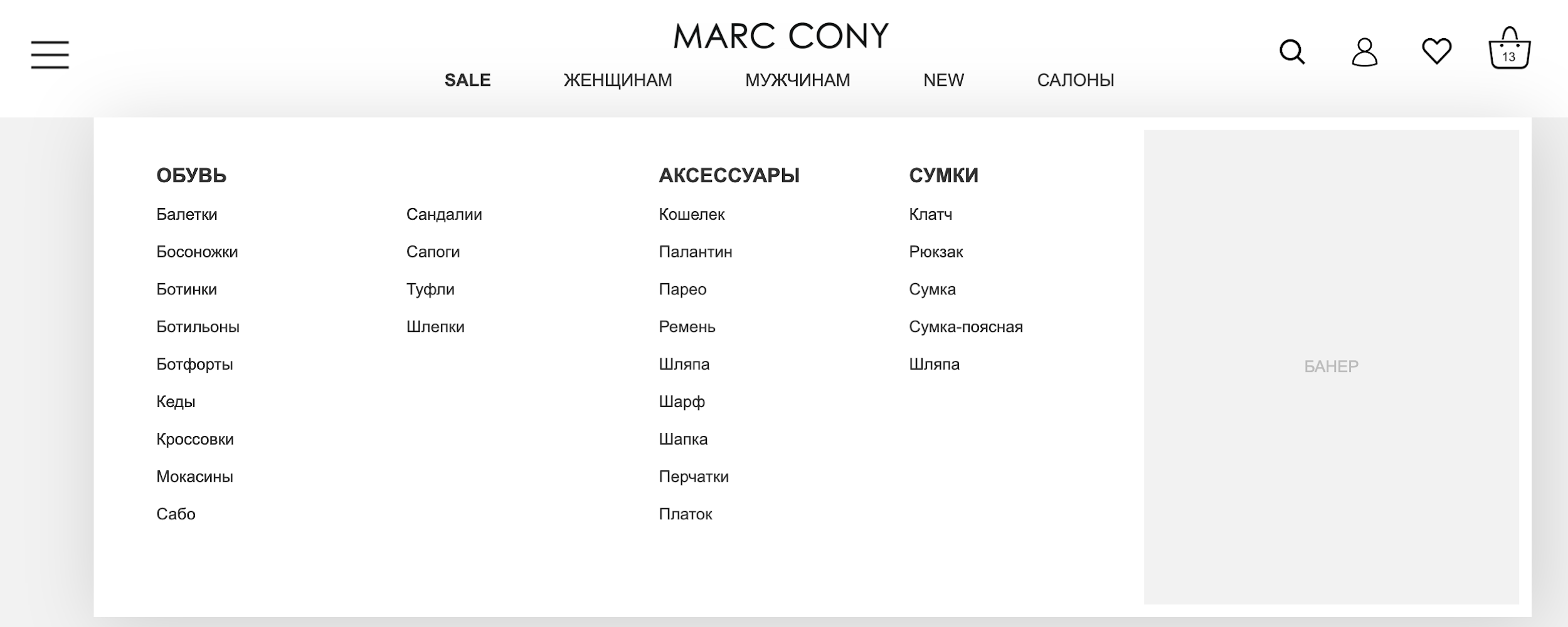
If for some reason this cannot be done, then the sections of the first two levels of the catalog can be duplicated in the basement of the main page of the site. Here is an example from the same site
Thus, the search engine will be able to collect the main pages of the catalog in one transition from the main one and index the catalog with five levels of nesting in 3 transitions.
Page structure
Yandex ranks sites using the
Matrixnet algorithm, the essence of which is to determine the common features of sites useful to the user. Therefore, when designing the main pages (main page, listing of goods and product cards), it is important to determine what requests they should correspond to and what are the common features of the pages that occupy don’t issue on these requests.
Google is much simpler in this matter: it is still strongly focused on texts and links. So the space for the texts on the pages is also important to lay.
Here is part of the analysis we performed for the online flower shop.
We take the request “Buy a bouquet of red roses”.
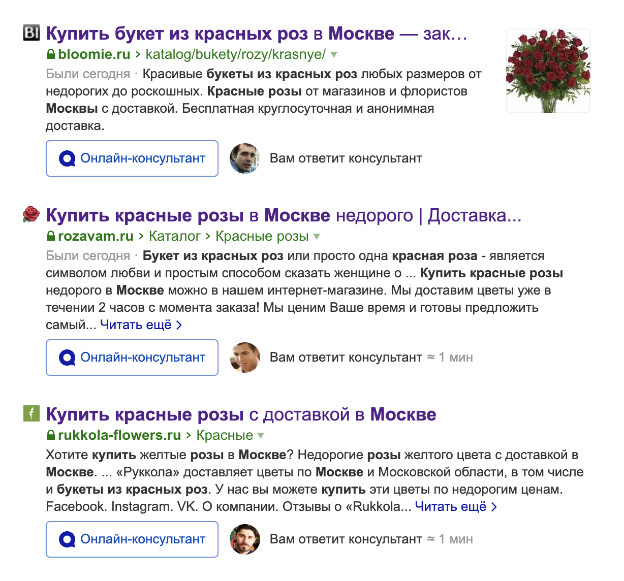
We open the first 4 sites
What unites them
- All these are lists of goods (the request does not lead to a single product)
- About 30 products per page
- Parameter Filter
- The word krasnye in the link
- Sort by price and popularity
- H1 and title with the words “red” and “roses”
What does not unite them
- Not everyone has text below
- Different length title
- H1 and title do not always include the word “bouquet”
- So these parameters are not critical in this request
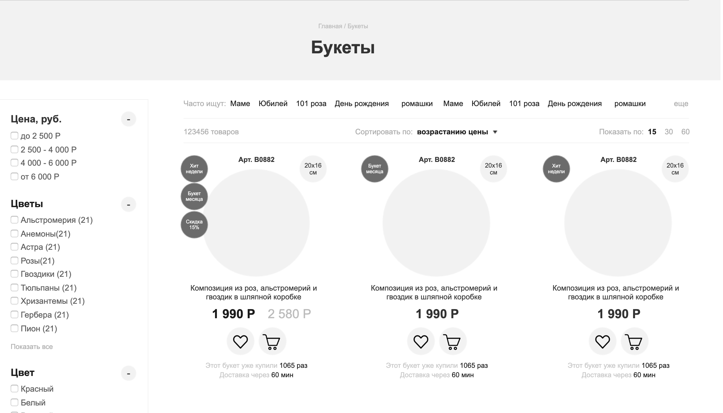
And here is how we put the collected requirements into a prototype site.
What is important here:
- Place for a big headline
- Navigation chain
- Filtration
- Sorting
- Landing Page Tags
- Discount and hit
- Mini info on delivery
 What you can basically look at when analyzing sites from the top of the SERP
- Number of goods
- Prices of goods (not all products may be published)
- Text availability
- Filters
- H1
- Product Photos
- Availability of a navigation chain
If the response to the request is a product card, then
- Description
- Reviews
- Instructions
- Delivery (directly on the card)
- Payment Methods
A more complete list will be further on the checklist for commercial factors.
Building semantics
A great source of additional semantics on the site is the properties of the goods.
By grouping products based on properties, you can create thousands of pages for various requests.
On the page with the goods selected by property, a human-friendly address (CNC) is made, h1, title, corresponding to the request, description for the snippet, sometimes text.
To do this, you should initially lay on the site a place for tags for filtering. They can be used both for indexing the site by search engines and for the convenience of the user, supplementing them with a choice of products by sections.
For example, in the “baths” section, you can create tags for the properties “steel” “170x70” “kaldewei”
As a result, we get a page that perfectly answers the low-frequency request.
Where can I put these tags
In a small amount - over the goods (the most popular). They can also be provided with explanatory pictures.
Here is a fragment of a prototype for a flower delivery site. Here I highlighted the “tags” to go to the landing pages.
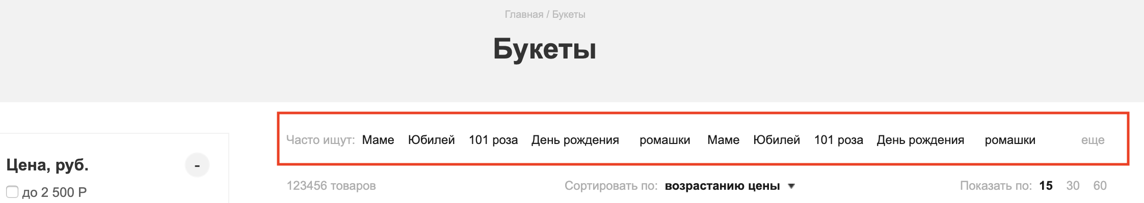
In large quantities - under the goods. This will reduce the level of nesting for such pages.
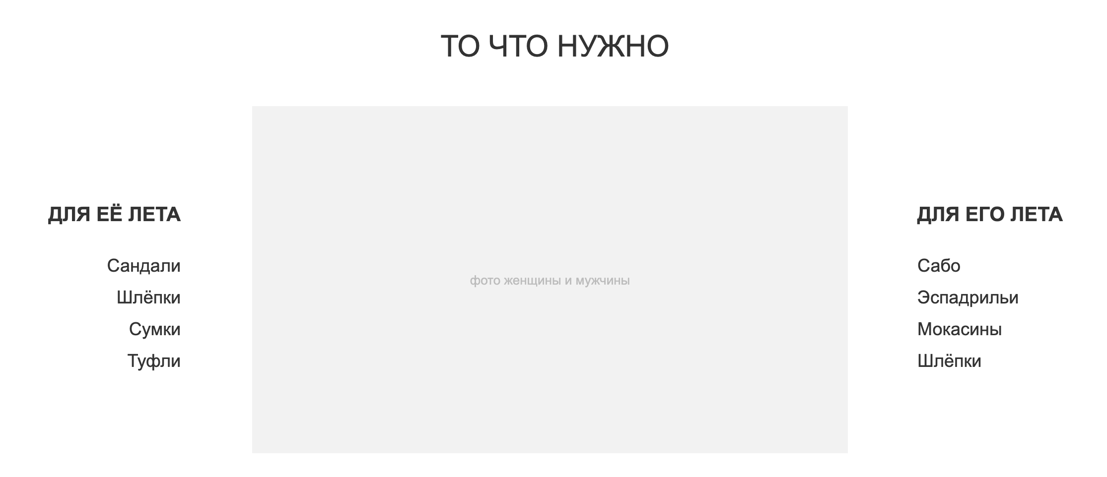
Another option is in additional menu items. An example is the “occasion” field on the same color site

The universal option is in the filter. Usually the filter on the site is not indexed by search engines, as it is a form that involves sending it by the user. However, links to open specific pages can be linked to properties on the form.
Commercial factors
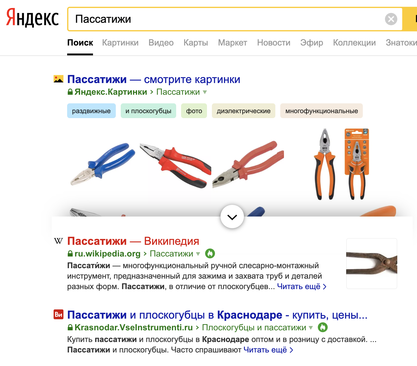
Yandex clearly divides the pages into informational and commercial. As a rule, commercial ones are issued in response to requests involving a purchase. For example, a request may contain the word “buy” or a toponym (geographical name). Pliers in Krasnodar - commercial request. And "How to choose pliers" - informational. But the request for “Pliers” will lead us to a mixed issue: here are Wikipedia and tool stores.
Yandex uses the so-called commercial ranking factors for commercial pages.
In total there are more than 150 of them and the most detailed about them is described in the report of Ashmanov for 2018.
I’ll give here 10 main ones, and I’ll put an extended list in the checklist
- Adaptive version available
- Availability of the price of goods
- The presence of currency (he does not perceive the ruble sign)
- Payment options
- Landline number
- Working hours
- A photo
- Description
- Guarantees
- news
- About company
Behavioral factors
Search engines use PF to understand how much a site will be useful to a visitor for a particular request.
What are behavioral factors?
The time spent on the site.
At the same time, the search engine takes into account mouse movements and page scrolling to determine the visitor’s interest.
Last click on search
If a visitor after a visit to the site closed the search engine, then he found what he was looking for. The site receives a plus sign.
Single click on search
If the widget so attracted the visitor that he opened the site first. And while the site was so useful that the visitor closed the search. This is also a plus sign.
BounceQuick exit from the site after opening the page is a minus for the search engine.
What is important to lay in the design for improving PF
Link pages with semantic links: place analogues and articles on use in the product. In the product listing, place quick links to product collections and “soup kits” for specific tasks (screwdriver + charging + drill + bits).
Prominent action buttons and calls to action (CTA)
An example from the same flower shop.
On the page: 2 purchase buttons (standard and in 1 click), favorite button and store advantages

Content
Post maximum information so that it doesn’t have to be “collected” in other sources: photos, videos, reviews, specifications, reviews, instructions.
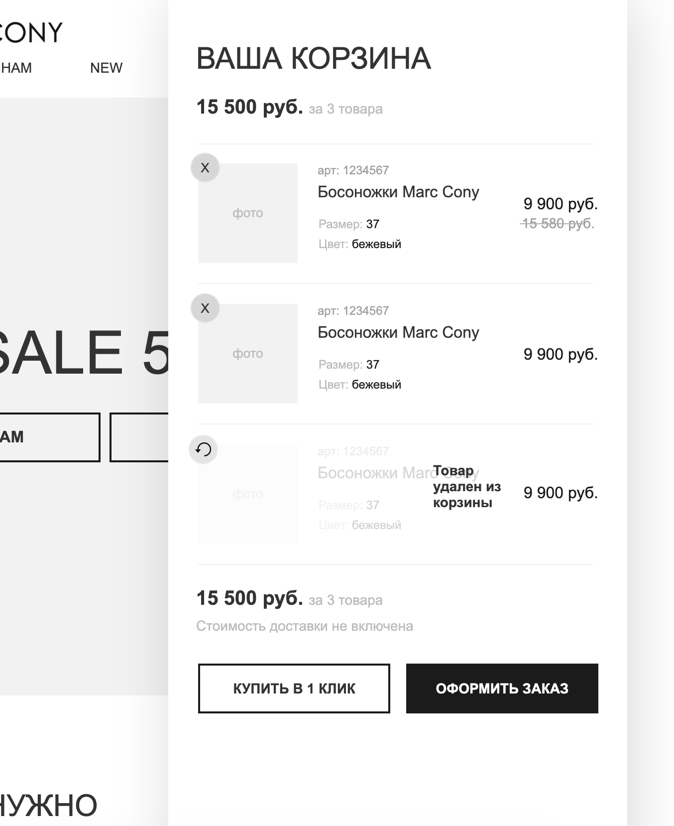
Highly visible basket
At the time of adding the product to the basket, the buyer must understand where it is, see the quantity of goods in it and its value. This will help you basket widget, temporarily appearing after adding to the basket.
As an example: a basket widget from an online clothing store
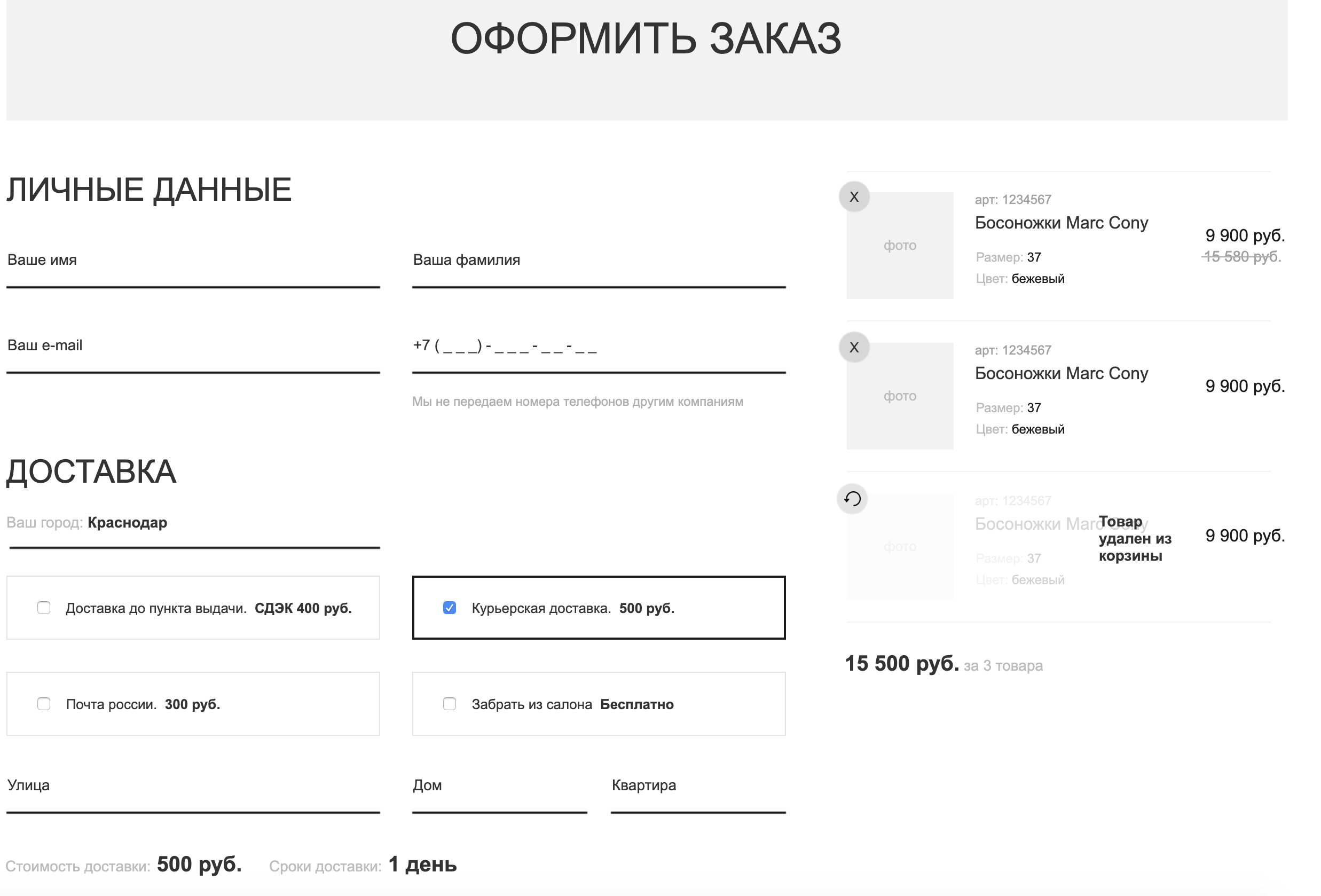
The most convenient order
At the stage of placing an order, all fields should be as logical as possible and it should be clear why this or that data is being collected. It is foolish, for example, to ask the buyer's address for delivery by self.
Analytics and conclusions on the basket and the order in the online store are collected in the article
Usability of the basket and checkout: analysis of the top 20 Russian niche online storesThe photo shows an example of how we designed an order for online clothing. All the necessary fields, a basket widget, payment and delivery methods fit into one screen.
Technical factors
Although this block has a very conditional relation to design, it is still worth studying at this stage so as not to overload the pages beyond the necessary, and choose the right technology.
Site speed
There is a myth in the market that Google Pagespeed measures website speed.
In fact this is not true. GPS shows a checklist for page layout optimization.
Caching by the browser.
Compression of transmitted data.
Image redundancy.
Redundancy scripts.
It is important, but it is not speed.
Therefore, we regard its indicators without fanaticism.
So we brought the site to 100 units on PC and mobile. Neither the visual speed nor the SEO position was affected.
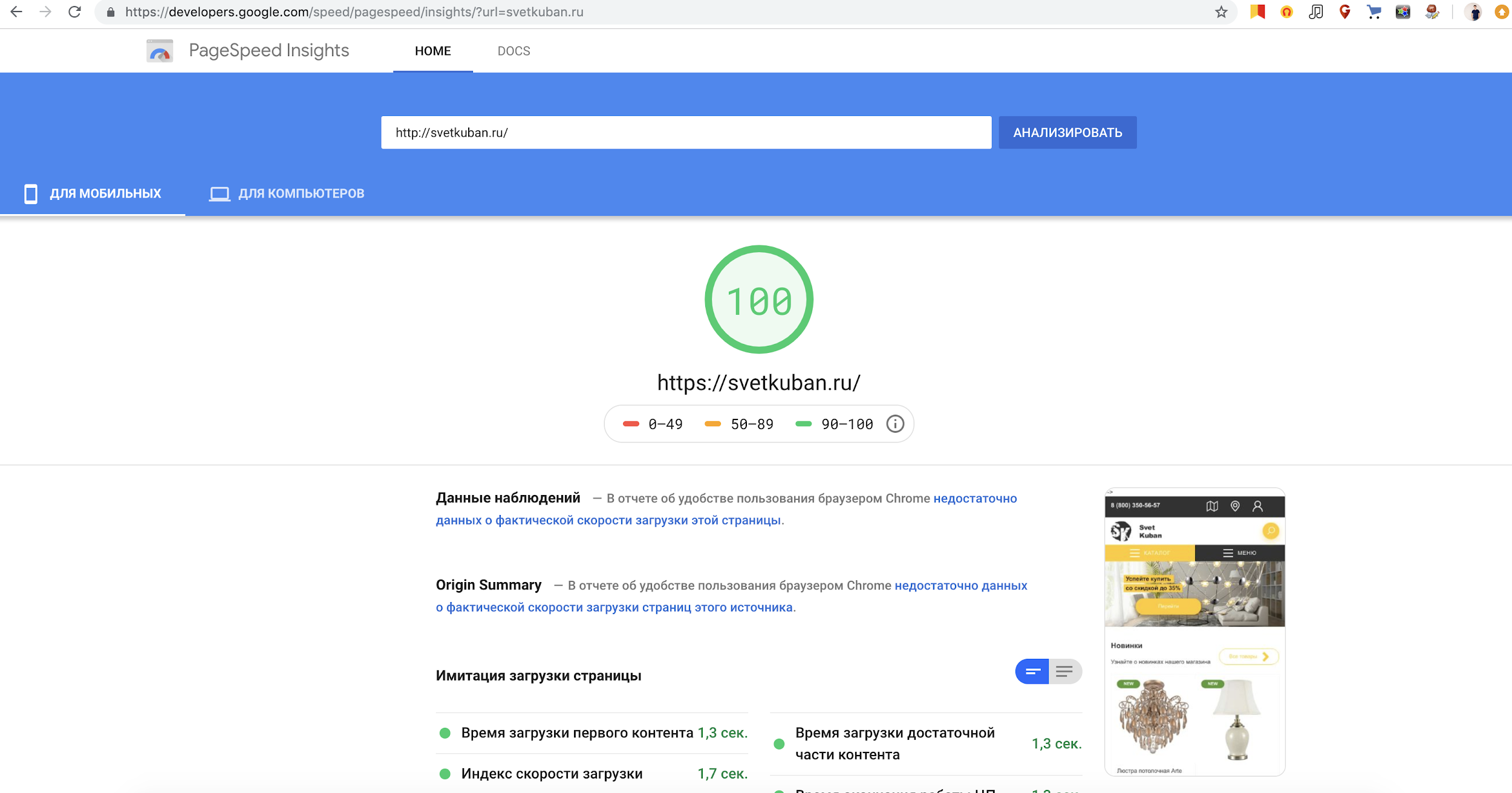
So if the site is not in the "red zone", then this is already enough.
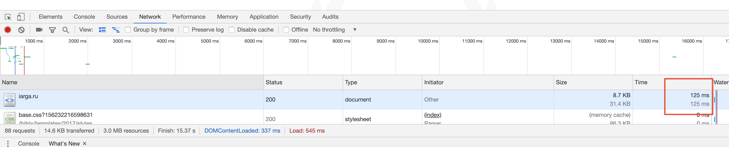
Page Response Rate
You can try on the browser. Here is a simple example. Here the less, the better, but if the page is served by the server in less than half a second, then this is already good.
Page size
Can be measured through pingdom tools. There are no universal tips, but usually if the page is more than 3 megabytes, then this is a reason to beware.
Technology and Navigation
The site will be easily indexed if the links lead to pages containing the requested content. If the site is built on AJAX, it is important that when requesting data, the URL of the page changes and when you open this URL (or refresh the page), the same data opens as received without a reboot.
Check list
It can be seen from the theory that the same item can be both a commercial factor and a usability factor and a technical factor and can be evaluated by Yandex in the framework of the Matrixnet. Therefore, the checklist is not grouped by type of factors, but by the place of their application.
Common factors
- Lightweight adaptive version
- Layout without jambs
- Missing spelling errors
- Lack of intrusive pop-ups
- Search line
Main page
- Expanded directory
- Contacts in the header
- Reviews on the main
- Big banner with stocks.
- Featured Products
- Hits / Promotions
- Copyright and basement terms of service
Company / Contacts
- Landline number
- Hotline 8-800
- Contacts of departments and employees
- Office and branch addresses
- Delivery Cities
- Requisites
- Facebook
- Instagram
- VK
- Company Description
- Company reviews
- Certificates / Licenses
- Email in the site domain
- Ability to leave a request
- Online chat
- Driving directions
- Table with prices in services
Directory Logic
- The catalog is organized from general to private
- Obviously, where to look for a particular product
- The product is available in 3 clicks with the main
- Navigation chain
- Product filtering
- Landing pages for property sets
Product List
- Large photos
- Price
- Currency (rubles are better denoted as rubles.)
- Product Discounts
- Star Ratings
- Indexable Page Navigation
- The number of products in the list is similar to the top sites for the desired request
- Sorting (price, popularity, reviews)
- Product Compare Feature
Card Product
- Product availability
- Delivery time in the absence
- Delivery terms
- Detailed description
- Maximum performance
- A few photos
- Video
- Instruction manual
- Offer related products (within 2 screens of the product)
- Offer analog products
- Product Reviews
- Offer to leave a review
- Question answer
- Warranty & Returns
- Marked “add to cart” button
- One click purchase
- Favorite
Basket
- Cart widget visible on pages
- There is a price in the widget
- The widget has a total
- Unit price and quantity (on the cart page)
- Quantity selection
- Active product links in the list
- Product Photos Listed
- At least a minimum product description
- The ability to postpone the goods
- Recount without page refresh
- Minimum Delivery Terms
- Offer related products
- Lack of analogues (do not reassure the one who has already chosen)
Checkout
- Multiple Delivery Methods
- Availability of pickup
- Free Shipping Availability
- Several payment methods
- Buyer contact capture
- A logical sequence of fields (first city, then address)
- The absence of extra fields (the address is not needed for pickup)
- Field hint when filling out
- The total amount of the order with delivery is visible
- Offer and agreement prominently
As a summary, I want to say that when the requirements for subsequent promotion are not taken into account when developing the site, as a rule, this leads to the fact that the site that is already ready has to be reworked and refilled by 30-50%, which delays the results by at least six months.
PS To keep abreast of new publications, follow me on
Facebook .