In search of an interesting and simple DataSet, I came across this handsome man .
About this beauty
It contains data on the growth and weight of 10,000 men and women . No description. Nothing extra". Only height, weight and floor mark. I liked this mysterious simplicity.
Well, let's get started!
What was interesting to me?
- What is the range of weight and height for most men and women?
- What kind of “average” man and “average” woman are they?
- Can the simple KNN machine learning model from these data predict weight by height ?
Let's go!

First look
To start, load the necessary modules
When the libraries stood up exactly - it was time to load the DataSet itself and look at the first 10 elements. This is necessary so that our gut is calm, that we have loaded everything correctly.
By the way, do not be alarmed that height and weight differ from what we are used to. This is because of a different measurement system: inches and pounds , instead of centimeters and kilograms .
data = pd.read_csv('weight-height.csv') data.head(10)
Good! We see that the first ten entries are “men”. We see their height (height) and weight (weight). Data loaded up well.
Now you can look at the number of rows in the set.
data.shape >> (10000, 3)
Ten thousand lines / records. And each has three parameters . Exactly what is needed!
It's time to fix the measurement system. Now here are centimeters and kilograms.
data['Height'] *= 2.54 data['Weight'] /= 2.205
Now it has become more familiar. And the first record tells us about a man with a height of ~ 190cm and a weight of ~ 110kg. Big man. Let's call him Bob.
But how to understand: is it a lot or a little compared to the rest? Is it possible that we are all plus or minus Beans? This is a bit later.
Now let's find out how symmetrical the two genders are in this dataset?
data['Gender'].value_counts() >> Male 5000 Female 5000 Name: Gender, dtype: int64
Ideally equally divided. And this is good, because if there were: 9999 men and 1 woman, then there would be no sense in pretending that this DataSet reveals both sexes equally well. In our case, everything is OK!
Divide and learn!
Now intuition tells us that it will be correct to separate the two sexes and explore separately. Indeed, in life we often see that men and women have plus or minus different height and weight
Let's take a look at the small descriptive statistics that the pandas module offers us.
Men :
data_male.describe()
Women :
data_female.describe()
A small educational program on inf aboveIn plain language:
Descriptive statistics are a set of numbers / characteristics for a description. Perhaps this is the easiest to understand type of statistics.
Imagine that you are describing the parameters of a ball. He can be:
- big small
- smooth / rough
- blue red
- bouncing / and not really.
With a strong simplification, we can say that descriptive statistics is engaged in this . But he does this not with balls, but with data.
And here are the parameters from the table above:
- count - The number of instances.
- mean - The average or sum of all values divided by their number.
- std - The standard deviation or root of the variance. Shows the range of values relative to the average.
- min - The minimum value or minimum.
- 25% - First quartile. Shows a value below which 25% of the records are.
- 50% - Second quartile or median. Shows a value above and below which the same number of entries.
- 75% - Third Quartile. By anology with the first quartile, but below 75% of the records.
- max - The maximum value or maximum.
The average value is very sensitive to emissions! If four people receive a salary of 10,000 ₽, and the fifth - 460,000 ₽. That average will be - 100 000 ₽. And the median will remain the same - 10 000 ₽.
This does not mean that average is a bad indicator. It needs to be treated more carefully.
By the way, there’s also a snag with the median.
If the number of measurements is odd. That median is the value in the middle, if you put the data "by growth".
And if it’s even, then the median is the average between the two “most central” ones.
If the data set contains only integers and the median is fractional, do not be surprised. Most likely the number of measurements is even.
An example :
The son brought marks from school. There were five lessons he received: 1, 5, 3, 2, 4
Five ratings → odd amount
Growth: 1, 2, 3, 4, 5
Take the central - 3
Median score - 3
The next day, the son brought from school new grades: 4, 2, 3, 5
Four ratings → odd amount
We build by growth: 2, 3, 4, 5
Take the centerpieces: 3, 4
We find their average: 3.5
Median - 3.5
Conclusion: Well done son :)
We see that in men the average and median are 175cm and 85kg. And in women : 162cm and 62kg. This tells us that there are no strong emissions. Or they are symmetrical on both sides of the median. Which is very rare.
But both sexes have slight deviations of the mean from the median. But they are insignificant and they are visible only on hundredths. Move on!
Histogram
This is a graph that plots the values from minimum to maximum in order of growth, and shows the number of individual instances.
fig, axes = plt.subplots(2,2, figsize=(20,10)) plt.subplots_adjust(wspace=0, hspace=0) axes[0,0].hist(data_male['Height'], label='Male Height', bins=100, color='red') axes[0,1].hist(data_male['Weight'], label='Male Weight', bins=100, color='red', alpha=0.4) axes[1,0].hist(data_female['Height'], label='Female Height', bins=100, color='blue') axes[1,1].hist(data_female['Weight'], label='Female Weight', bins=100, color='blue', alpha=0.4) axes[0,0].legend(loc=2, fontsize=20) axes[0,1].legend(loc=2, fontsize=20) axes[1,0].legend(loc=2, fontsize=20) axes[1,1].legend(loc=2, fontsize=20) plt.savefig('plt_histogram.png') plt.show()

Data is distributed bell-shaped. Very similar to normal distribution .
In addition to statistical tests for normal distribution, there is a visual test. If the distribution by type and logic seems to be normal - we can assume with some assumptions that we are dealing with it.
One could do a statistical normality test and determine p-value, but I do not know how this is beyond the scope of the article.
Learning to work with pens
Pandas can count a lot for us. But you need to at least once count some statistics yourself. Now I will show how to calculate the standard deviation .
Let's do it on the example of men and the characteristic - growth.
Average
Formula:
where
- M - average value
- N is the number of instances
- ni - single instance
The code:
mean = data_male['Height'].mean() print('mean:\t{:.2f}'.format(mean)) >> mean: 175.33
Average height - 175cm
Deviation squared
where
- di - single deviation
- ni - single instance
- M - average
The code:
data_male['Height_d'] = (data_male['Height'] - mean) ** 2 data_male['Height_d'].head(10) >> 0 149.927893 1 0.385495 2 166.739089 3 47.193692 4 4.721246 5 20.288347 6 0.375539 7 2.964214 8 25.997623 9 200.149603 Name: Height_d, dtype: float64
Dispersion
Formula:
where
- D is the dispersion value
- di - single deviation
- N is the number of instances
The code:
disp = data_male['Height_d'].mean() print('disp:\t{:.2f}'.format(disp)) >> disp: 52.89
Dispersion - 53
Standard deviation
Formula:
where
- std - standard deviation value
- D is the dispersion value
The code:
std = disp ** 0.5 print('std:\t{:.2f}'.format(std)) >> std: 7.27
Standard Deviation - 7
Confidence Intervals
Now we will find out in what ranges of growth and weight 68%, 95% and 99.7% of men and women are .
This is not so difficult - you need to add and subtract the standard deviation from the average. It looks like this:
- 68% - plus or minus one standard deviation
- 95% - plus or minus two standard deviations
- 99.7% - plus or minus three standard deviations
We write an auxiliary function that will consider this:
def get_stats(series, title='noname'):
Well, apply it to the data:
Men | Height
get_stats(data_male['Height'], title='Male Height') >> = MALE HEIGHT = = Mean: 175 = Std: 7 = = = = = 68% is from 168 to 183 = 95% is from 161 to 190 = 99.7% is from 154 to 197
Men | The weight
get_stats(data_male['Height'], title='Male Height') >> = MALE WEIGHT = = Mean: 85 = Std: 9 = = = = = 68% is from 76 to 94 = 95% is from 67 to 103 = 99.7% is from 58 to 112
Women | Height
get_stats(data_male['Height'], title='Male Height') >> = FEMALE HEIGHT = = Mean: 162 = Std: 7 = = = = = 68% is from 155 to 169 = 95% is from 148 to 176 = 99.7% is from 141 to 182
Women | The weight
get_stats(data_male['Height'], title='Male Height') >> = FEMALE WEIGHT = = Mean: 62 = Std: 9 = = = = = 68% is from 53 to 70 = 95% is from 44 to 79 = 99.7% is from 36 to 87
Hence the conclusions:
- Most men: 154cm – 197cm and 58kg – 112kg.
- Most women: 141cm – 182cm and 36kg – 87kg.
Now it remains only to apply machine learning to this set and try to predict weight by height.
Nearest neighbors
The algorithm "To the nearest neighbors" is simple. It exists for classification tasks - to distinguish a cat from a dog - and for regression tasks - to guess the weight by height. That's what we need!
For regression, he uses the following algorithm:
- Remembers all data points
- When a new point appears, it searches for K its nearest neighbors (the number K is set by the user)
- Averages the result
- Gives an answer
First you need to divide the data set into the training and test parts and test the algorithm
Experimenting on men
X_train, X_test, y_train, y_test = train_test_split(data_male['Height'], data_male['Weight'])
Divided, it is time to try.
We will not go far and stop at three neighbors. But the question is: can such a model guess my weight?
knr3.predict([[180]])[0, 0] >> 88.67596236265881
88kg is very close. This second, my weight is 89.8kg
Prediction chart for men
The time to build my favorite part of science is graphics.
array_male = []

Model and prediction chart for women
X_train, X_test, y_train, y_test = train_test_split(data_female['Height'], data_female['Weight']) knr3 = KNeighborsRegressor(n_neighbors=3) knr3.fit(X_train.values.reshape(-1,1), y_train.values.reshape(-1,1)) knr3.score(X_train.values.reshape(-1,1), y_train.values.reshape(-1,1)) >> 0.8135681584074799
array_female = []

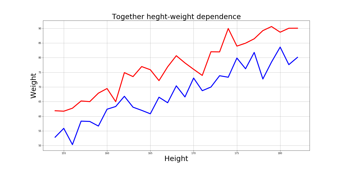
And of course it’s interesting how these graphs look together:
Answers on questions
- What is the range of weight and height for most men and women?
99.7% of men: from 154cm to 197cm and from 58kg to 112kg.
And 99.7% of women: from 141cm to 182cm and from 36kg to 87kg.
- What kind of “average” man and “average” woman are they?
The average man is 175cm and 85kg.
And the average woman is 162cm and 62kg.
- Can the simple KNN machine learning model from these data predict weight by height?
Yes, the model predicted 88kg, and I have 89.8kg.
All that I did, I collected here
Cons of the article
- There is no description of DataSet. Probably, age and other factors in people were different. Therefore, one cannot accept it on faith, but for the sake of experiment - please.
- In a good way - it was necessary to do a test for normality of distribution
Epilogue
Like if you hit the 99.7% interval