Those who work with data are well aware that happiness is not in the neural network, but in how to process the data correctly. But in order to process them, you must first analyze the correlations, select the necessary data, throw out the unnecessary, and so on. For such purposes, visualization using the matplotlib library is often used.
Meet me "inside"!
Customization
Run the following code to configure. Individual charts, however, override their settings themselves.
Correlation
Correlation plots are used to visualize the relationship between 2 or more variables. That is, how one variable changes in relation to another.
1. Scatter plot
Scatteplot is a classic and fundamental chart view used to examine the relationship between two variables. If you have several groups in your data, you can visualize each group in a different color. In matplotlib you can easily do this using plt.scatterplot ().

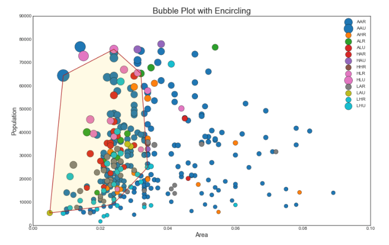
2. Bubble chart with group capture
Sometimes you want to show a group of points inside the border to emphasize their importance. In this example, we get the records from the data frame to be allocated, and pass them to encircle () described in the code below.
Show code from matplotlib import patches from scipy.spatial import ConvexHull import warnings; warnings.simplefilter('ignore') sns.set_style("white")
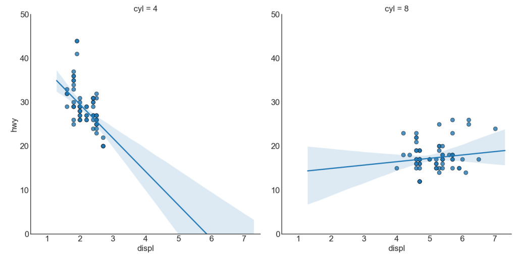
3. Best fit linear regression graph
If you want to understand how two variables change in relation to each other, the best fit line is best. The graph below shows how best fit differs among different data groups. To disable groupings and simply draw one best fit line for the entire dataset, remove the hue = 'cyl' parameter from sns.lmplot () below.

Each regression row in its own column
In addition, you can show the best fit line for each group in a separate column. You want to do this by setting the col = groupingcolumn parameter inside sns.lmplot ().
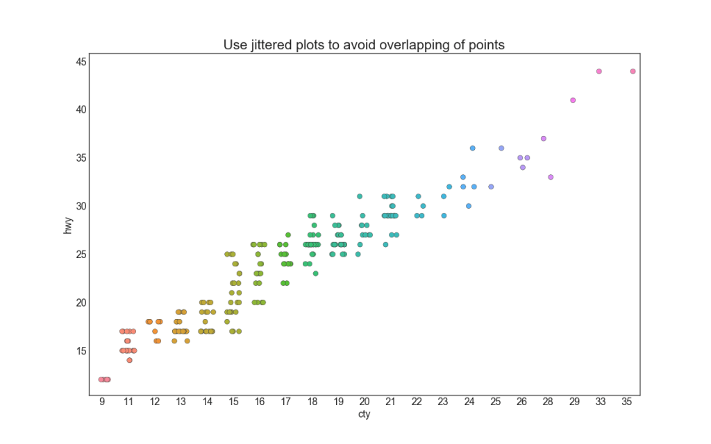
4. Stripplot
Often multiple data points have the same X and Y values. As a result, multiple data points are plotted on top of each other and hidden. To avoid this, move the dots slightly apart so you can see them visually. This is conveniently done using stripplot ().
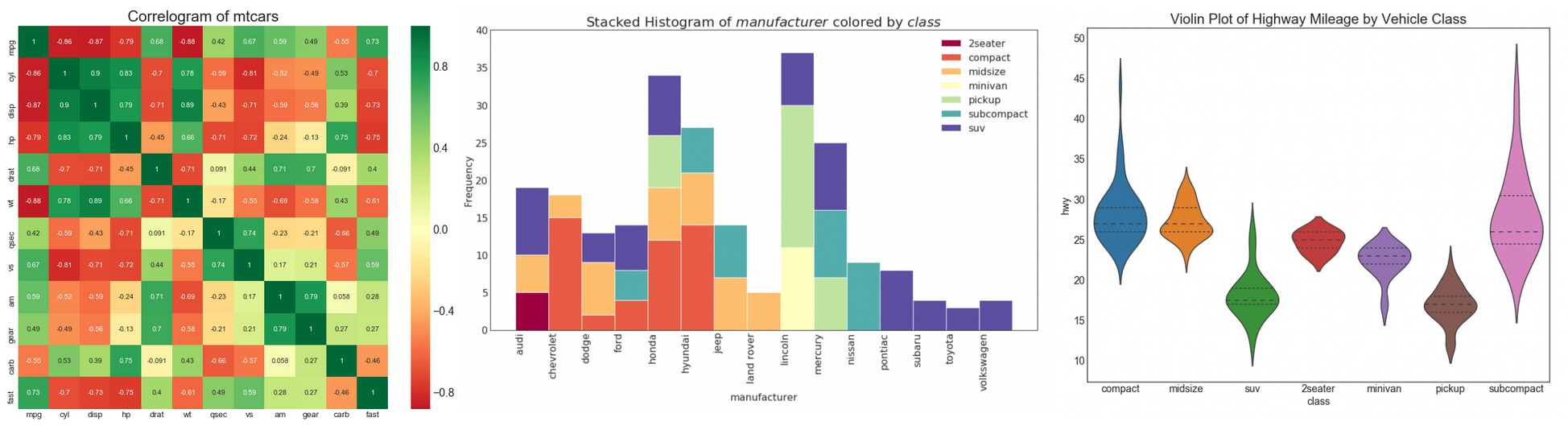
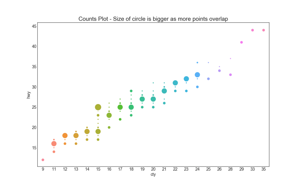
5. Counting Plot
Another option to avoid the problem of overlapping points is to increase the size of the point depending on how many points lie in this place. Thus, the larger the point size, the greater the concentration of points around it.
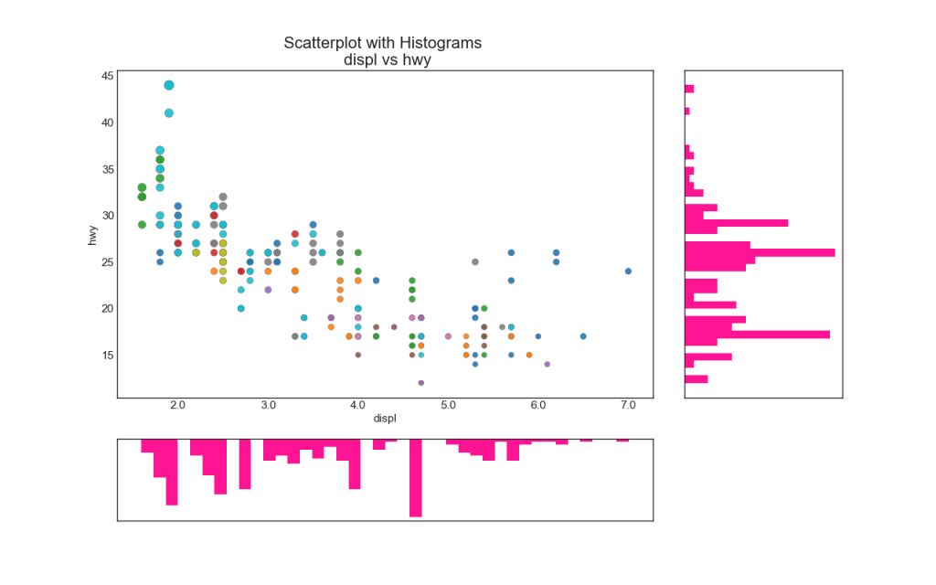
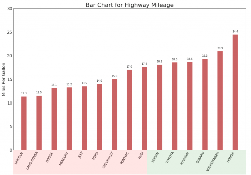
6. A bar chart
Line histograms have a histogram along the X and Y axis variables. This is used to visualize the relationship between X and Y together with the one-dimensional distribution of X and Y individually. This graph is often used in data analysis (EDA).
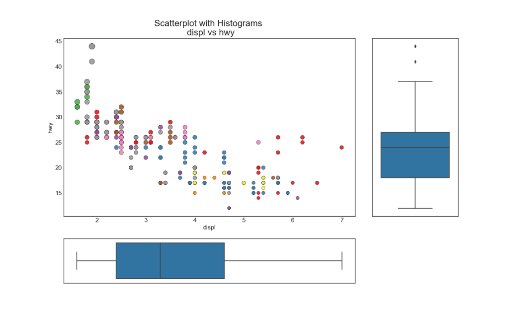
7. Boxplot
Boxplot serves the same purpose as a line-by-line histogram. However, this graph helps pinpoint the median, 25th and 75th percentiles of X and Y.
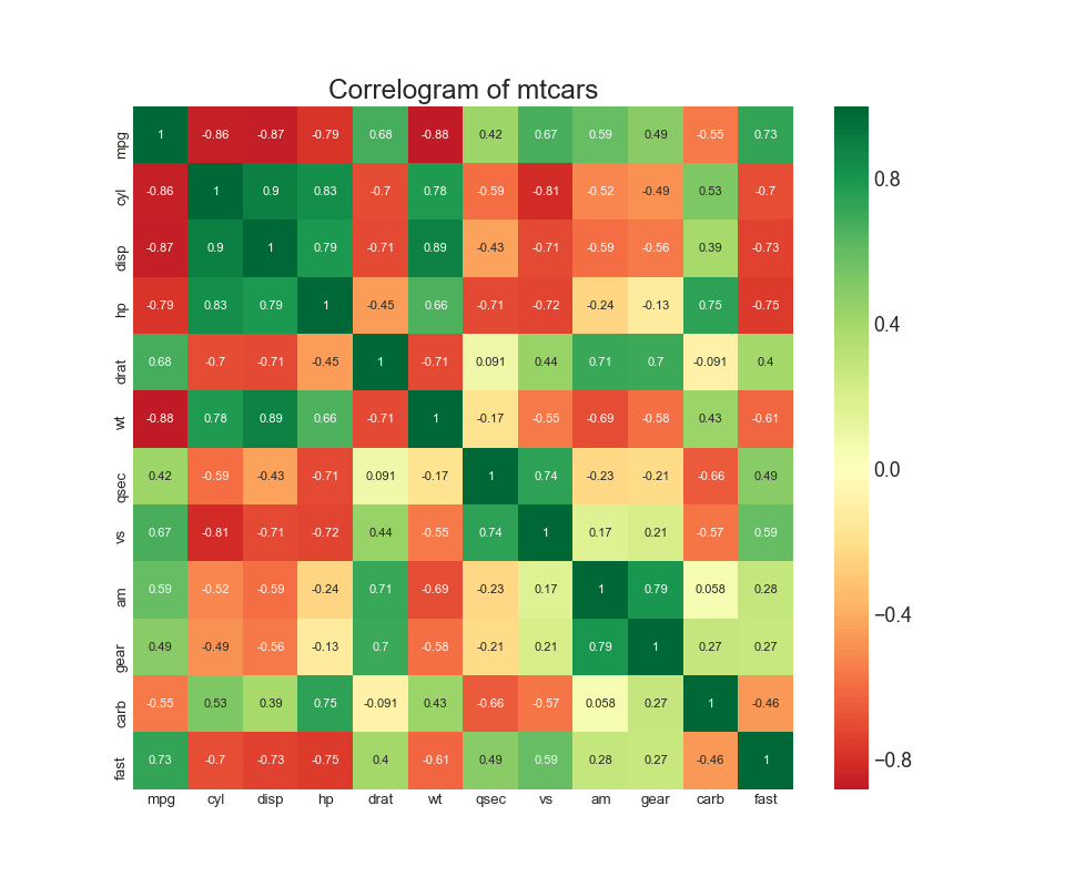
8. The correlation diagram
The correlation diagram is used to visually view the correlation metric between all possible pairs of numeric variables in a given dataset (or two-dimensional array).
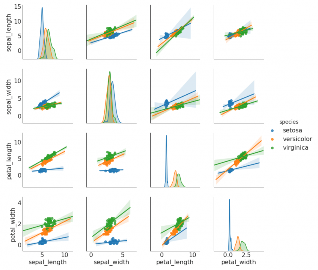
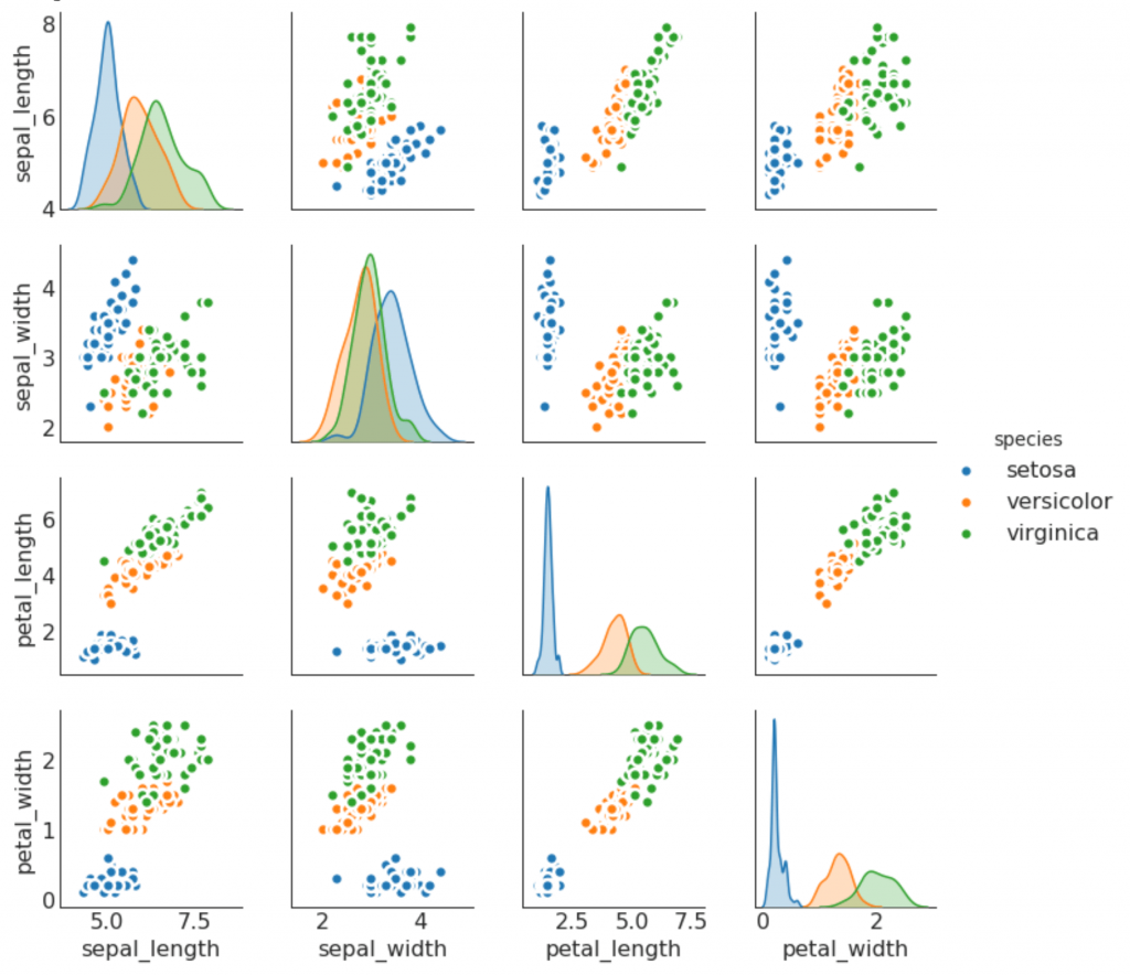
9. Pair schedule
Often used in research analysis to understand the relationship between all possible pairs of numeric variables. This is a required tool for two-dimensional analysis.
Deviation
10. Diverging columns
If you want to see how the elements change depending on one metric, and to visualize the order and magnitude of this dispersion, diverging columns are a great tool. It helps to quickly differentiate the performance of groups in your data, is quite intuitive and instantly conveys meaning.

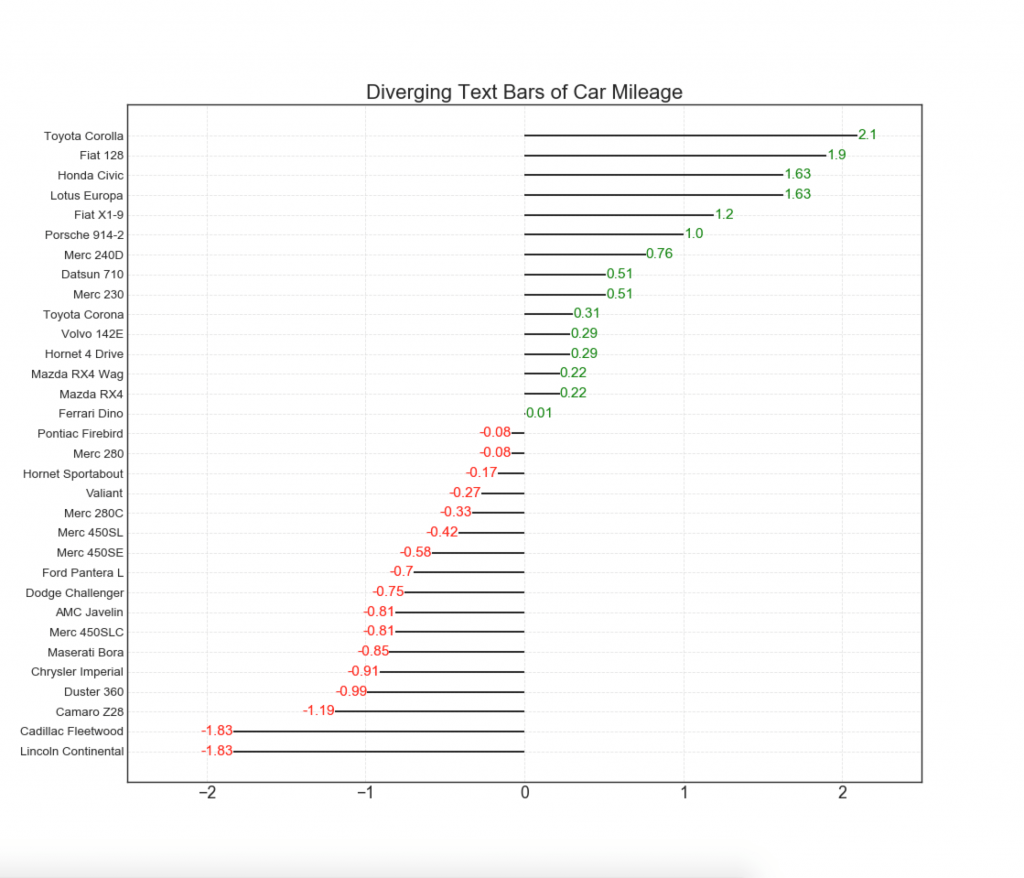
11. Diverging columns with text
- similar to diverging columns, and it is preferable if you want to show the significance of each element in the diagram in a good and presentable form.
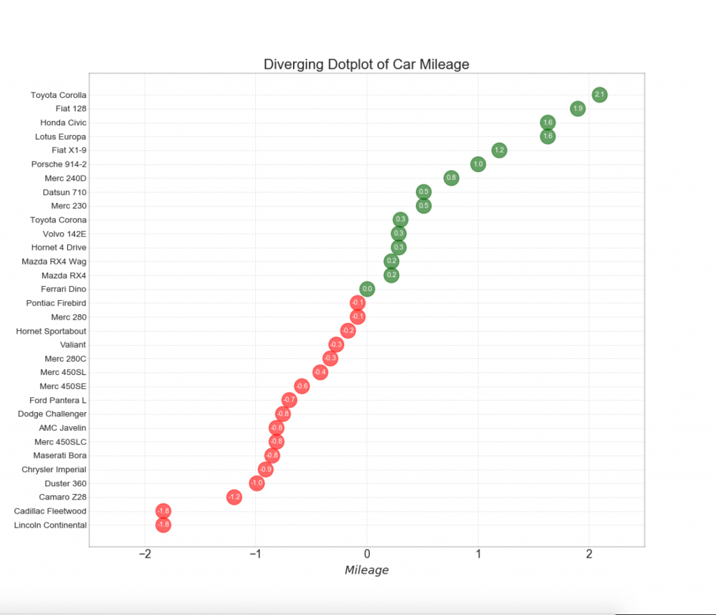
12. Divergent points
The graph of diverging points is also similar to diverging columns. However, compared to diverging columns, the absence of columns reduces the degree of contrast and discrepancy between the groups.
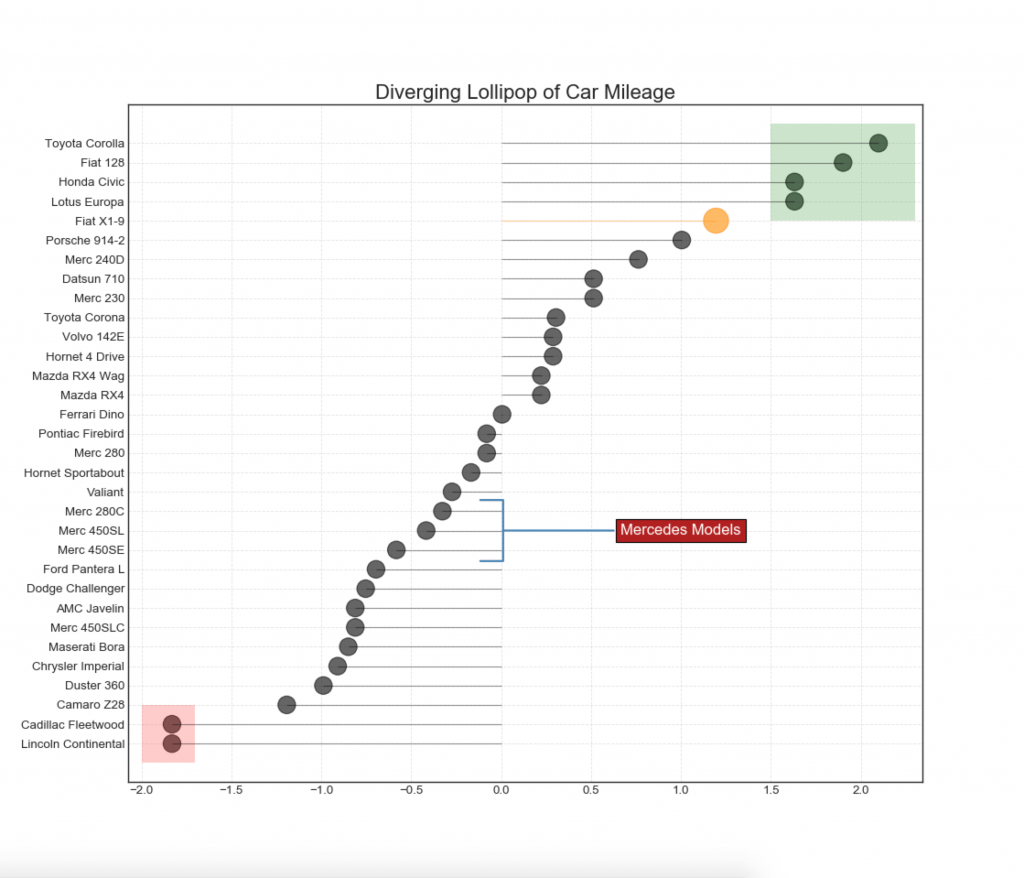
13. Divergent Lollipop chart with markers
Lollipop provides a flexible way to visualize discrepancies, focusing on any relevant data points that you want to pay attention to.
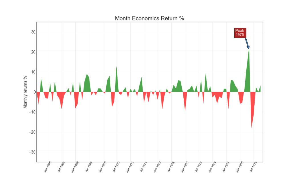
14. Area chart
Coloring the area between the axis and the lines, the area diagram emphasizes the peaks and troughs, but also on the duration of the highs and lows. The longer the peaks, the larger the area under the line.
Show code import numpy as np import pandas as pd
Ranging
15. Ordered histogram
An ordered histogram effectively conveys the ranking order of elements. But by adding a metric value above the chart, the user receives accurate information from the chart itself.
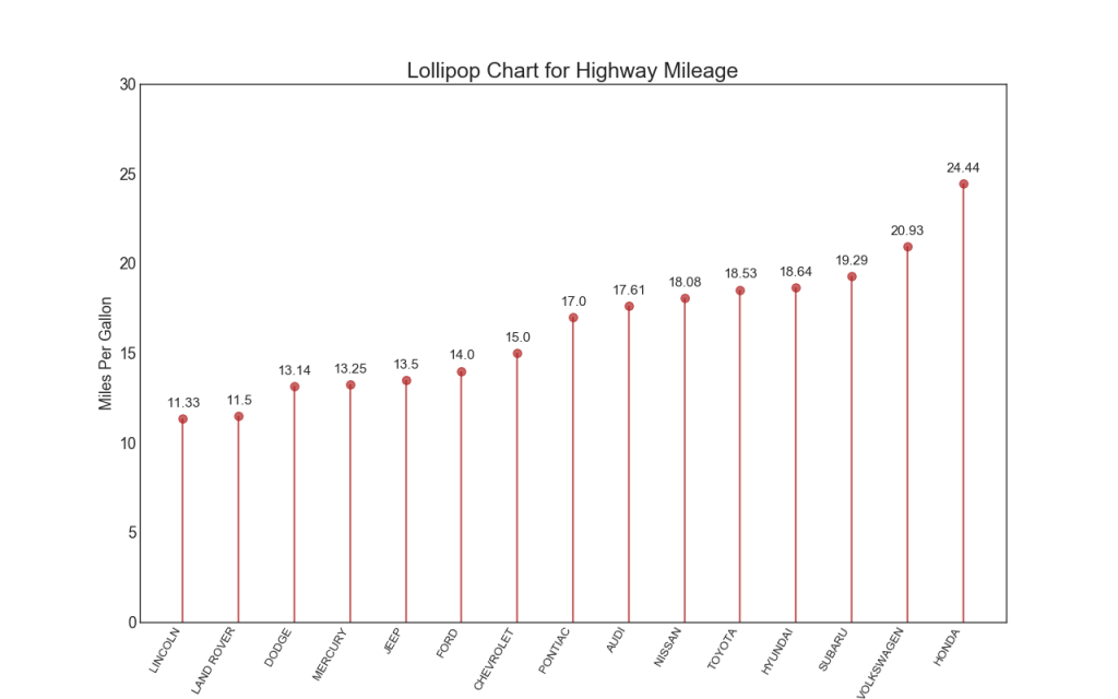
16. Lollipop chart
The Lollipop chart serves a similar purpose as an ordered histogram in a visually pleasing way.
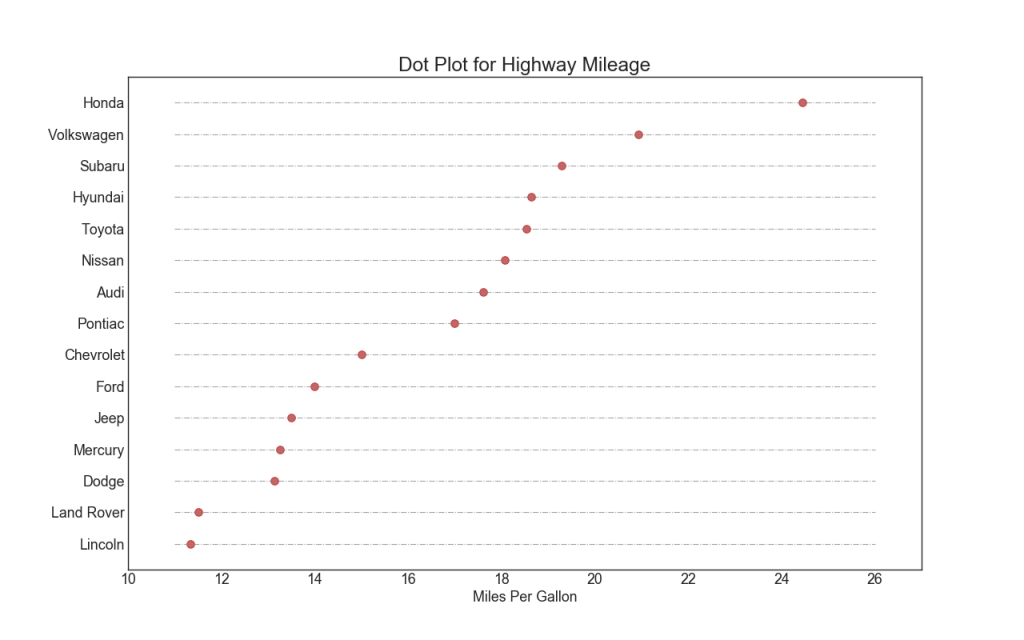
17. Dotted chart with signatures
A scatter plot conveys the ranking of items. And since it is aligned along the horizontal axis, you can visually assess how far the points are from each other.
18. Inclined map
The slope chart is most suitable for comparing the “Before” and “After” positions of a given person / subject.
Show code import matplotlib.lines as mlines

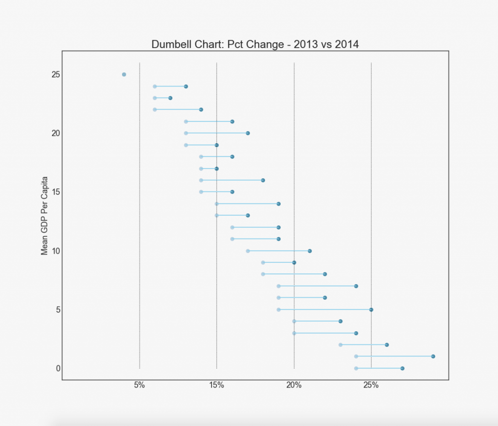
19. "Dumbbells"
The “Dumbbell” graph conveys the “before” and “after” positions of various influences, as well as the ranking order of items. This is very useful if you want to visualize the effect of something on different objects.
Show code import matplotlib.lines as mlines
Distribution
20. Histogram for a continuous variable
The histogram shows the frequency distribution of this variable. The following presentation groups frequency bands based on a categorical variable.
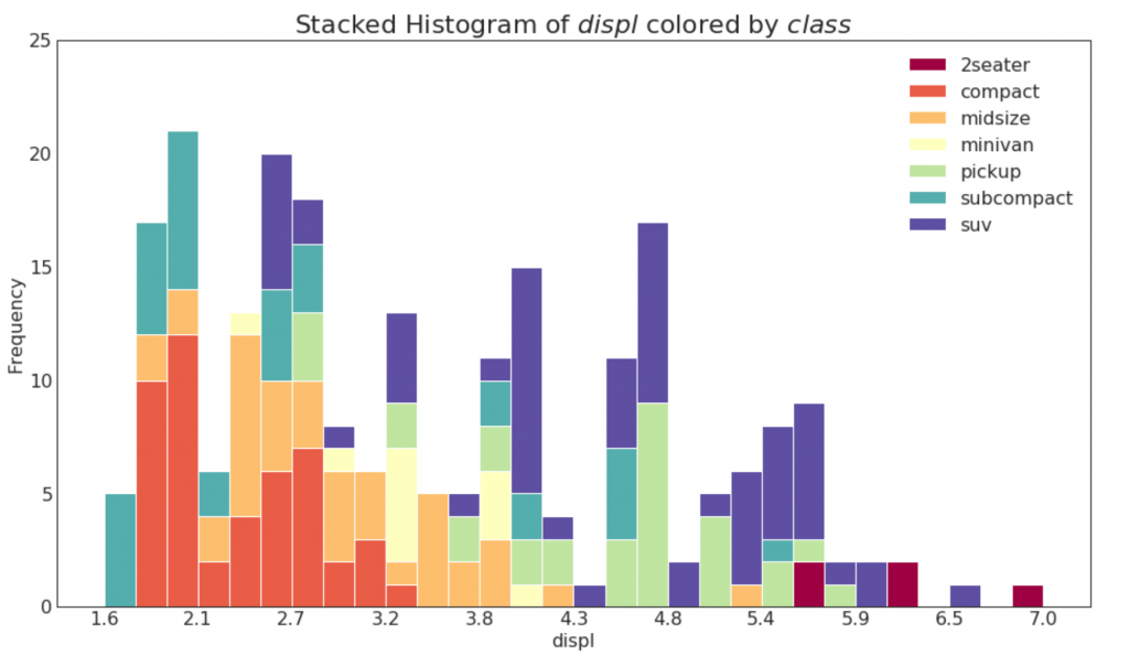
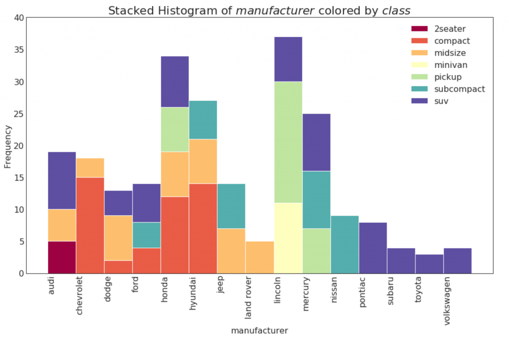
21. Histogram for a categorical variable
The histogram of a categorical variable shows the frequency distribution of this variable. By coloring the columns, you can visualize the distribution in relation to another categorical variable representing colors.
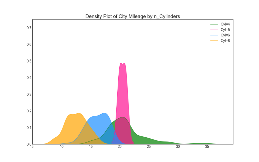
22. Density graph
Density graphs are a widely used tool for visualizing the distribution of a continuous variable. Having grouped them by the variable “response”, you can check the relationship between X and Y. The following is an example if, for clarity, we describe how the distribution of mileage in the city varies depending on the number of cylinders.
23. Density Curves with a Histogram
The density curve with a histogram combines the summary information transmitted by the two graphs, so you can see both in one place.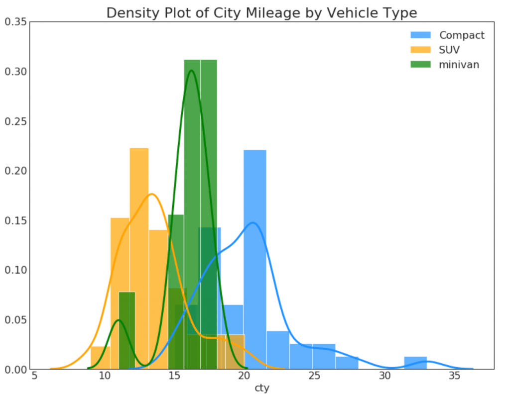
24. Joy chart
Joy chart allows you to overlap the density curves of different groups, this is a great way to visualize the distribution of a large number of groups in relation to each other. It looks pleasing to the eye and clearly conveys only the correct information.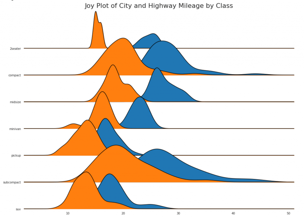
25. Distributed Scatter Chart
The distributed scatter plot shows a one-dimensional distribution of points segmented into groups. The darker the points, the greater the concentration of data points in this region. In different ways, coloring the median, the real arrangement of groups becomes obvious instantly.Show code import matplotlib.patches as mpatches

26. Charts with rectangles
Such graphs are a great way to visualize the distribution, knowing the median, the 25th, 75th quartiles and highs with lows. However, you should be careful when interpreting the size of the fields, which can potentially distort the number of points contained in this group. Thus, manual indication of the number of observations in each cell will help to overcome this drawback.For example, the first two rectangles on the left are the same size, although they have 5 and 47 data elements, respectively. Therefore, it is necessary to note the number of observations.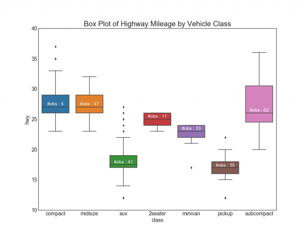
27. Charts with rectangles and dots
Dot + Box plot transmits similar information, like boxplot, divided into groups. In addition, dots give an idea of the number of data items in each group.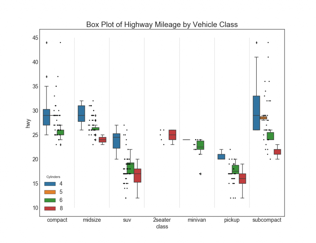
28. Schedule “violins”
Such a schedule is a visually pleasing alternative to boxplot. The shape or area of the “violin” depends on the amount of data in this group. However, such graphics can be more difficult to read, and they are usually not used in professional settings.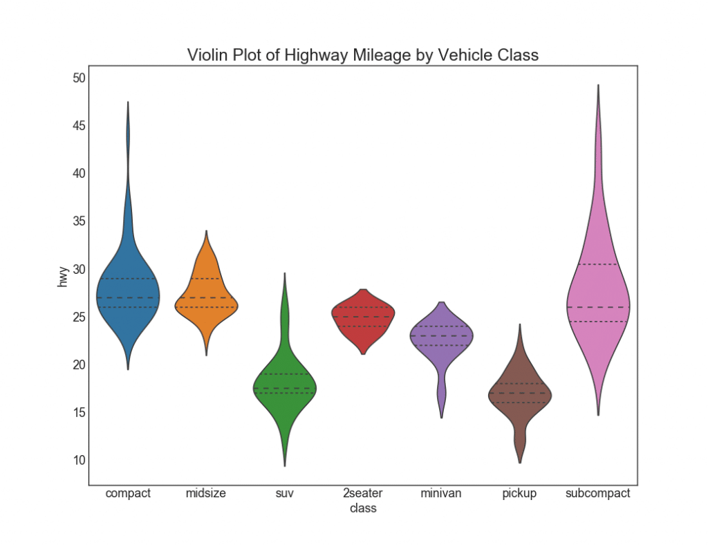
29. Pyramid of population
A population pyramid can be used to show the distribution of groups ordered by volume, or to show phased filtering of the population, as shown below, to visualize how many people go through each stage of the marketing funnel.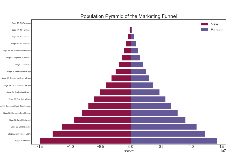
30. Categorical charts
The categorical graphs provided by the seaborn library can be used to visualize the distribution of the number of two or more categorical variables relative to each other.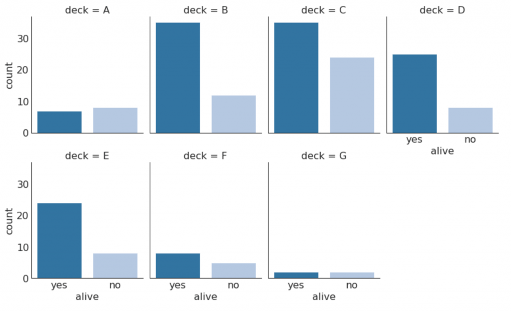
Assembly, composition
31. Waffle diagram
A waffle graph can be created using the pywaffle package and is used to display group compositions in most of the population.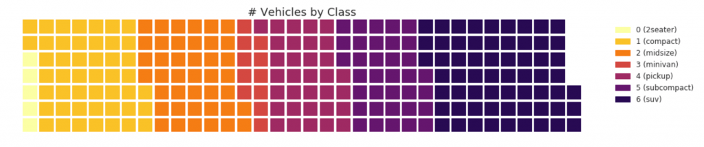
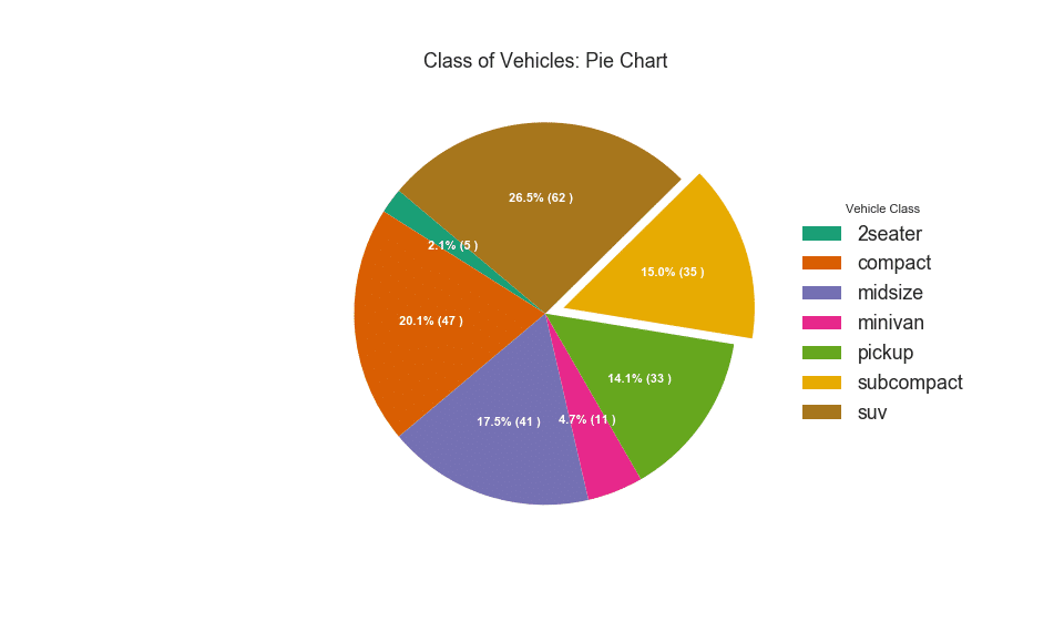
32. Pie chart
Pie chart is a classic way to show the composition of groups. However, it is currently generally not recommended to use this graph because the area of the segments can sometimes be misleading. Therefore, if you want to use a pie chart, it is strongly recommended that you explicitly record the percentage or number for each part of the pie chart.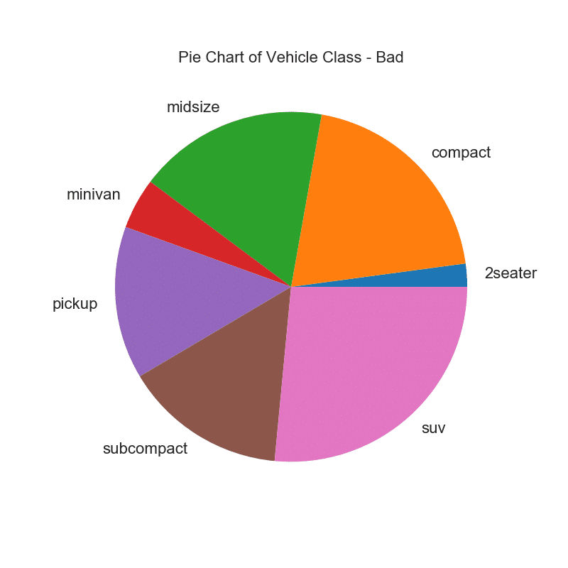
33. Tree map
A tree map is similar to a pie chart and works better without misleading the share of each group.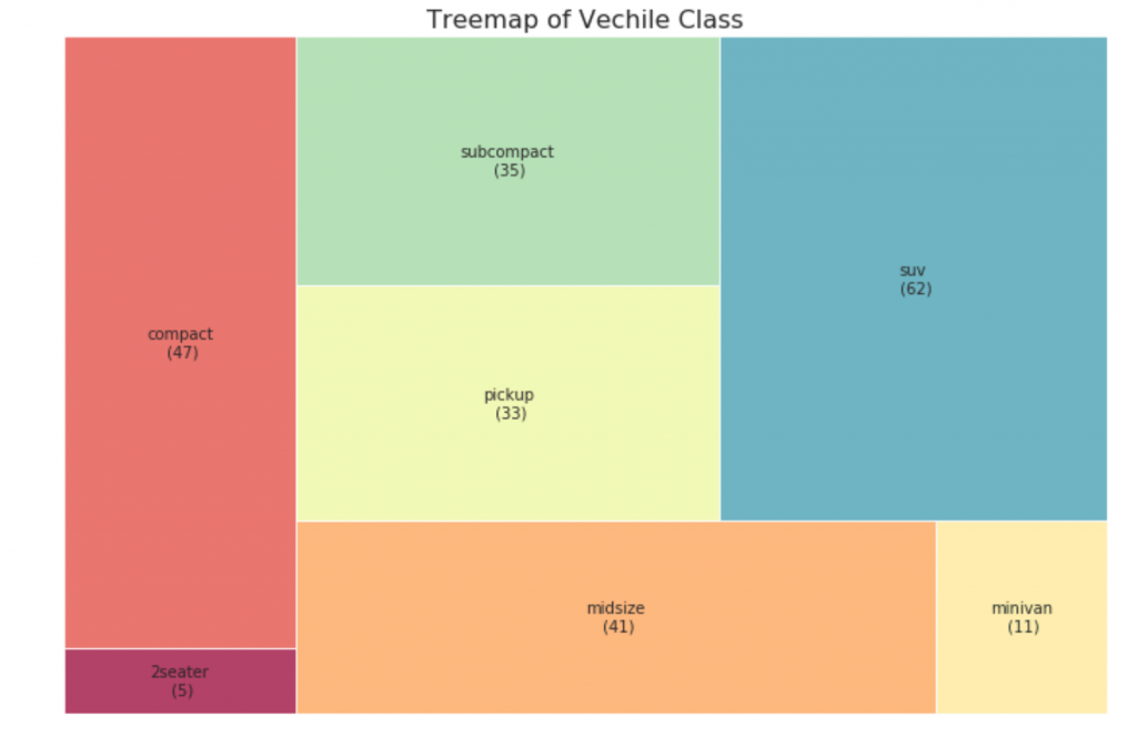
34. Histogram
A histogram is a classic way to visualize elements based on quantity or any given metric. In the diagram below, I used different colors for each element, but you can choose one color for all elements if you do not want to colorize them in groups. The color names are stored inside all_colors in the code below. You can change the color of the stripes by setting the color parameter in .plt.plot ()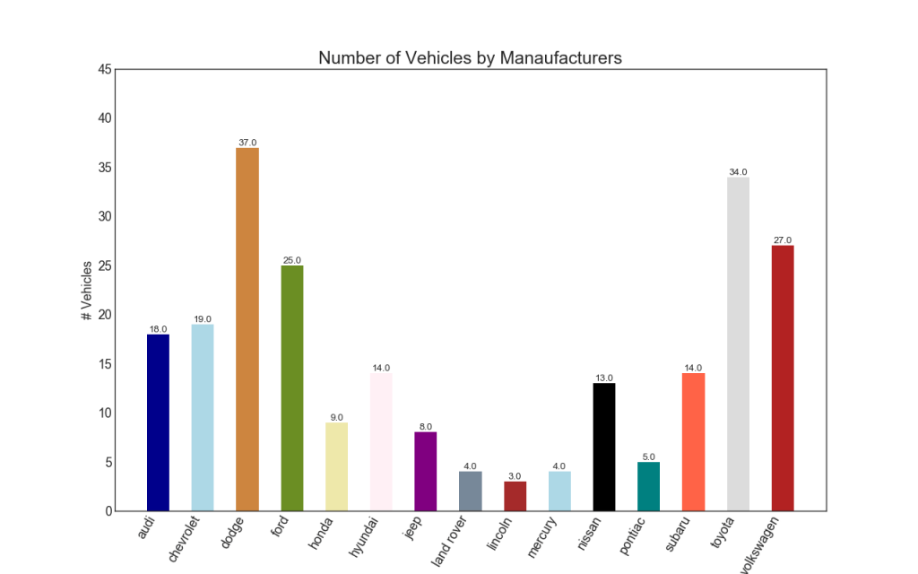
Change tracking
35. Time series chart
A time series chart is used to visualize how a given indicator changes over time. Here you can see how passenger flow has changed from 1949 to 1969.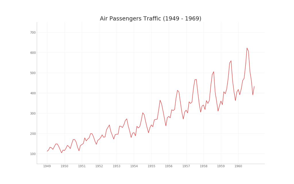
36. Time series with peaks and troughs
The time series below shows all peaks and troughs and marks the occurrence of individual special events.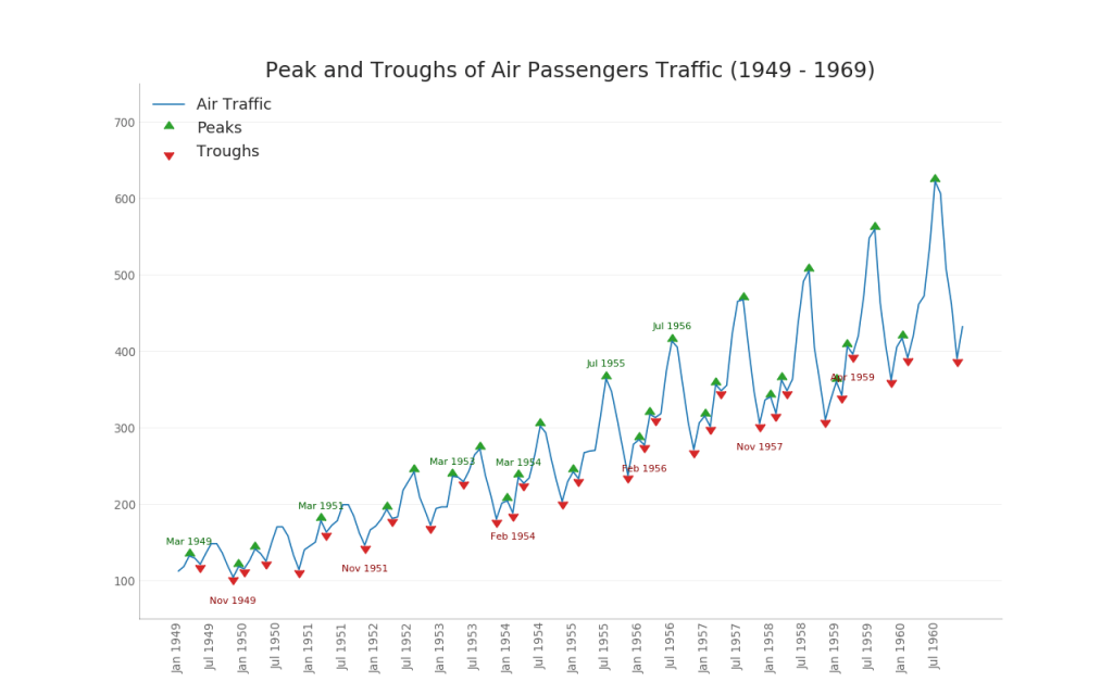
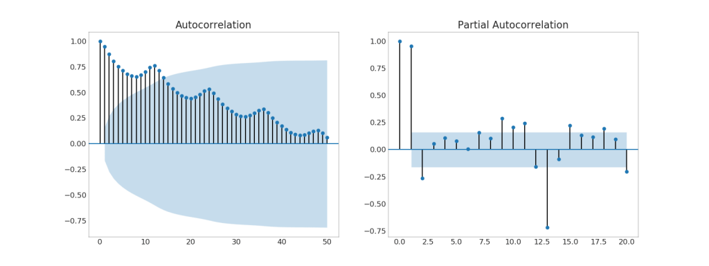
37. (ACF) (PACF)
The ACF graph shows the correlation of a time series with its own time. Each vertical line (on the autocorrelation graph) represents a correlation between the series and its time, starting at time 0. The blue shaded area on the graph is a significance level. Those moments that lie above the blue line are significant.So how do you interpret this?For AirPassengers, we see that at x = 14, the “lollipops” crossed the blue line and are thus of great importance. This means that passenger traffic observed up to 14 years ago has an impact on the traffic observed today.PACF, on the other hand, shows autocorrelation of any given time (time series) with the current series, but with the removal of influences between them.Show code from statsmodels.graphics.tsaplots import plot_acf, plot_pacf
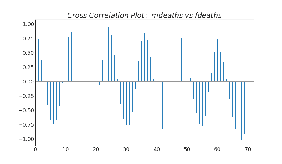
38. Cross-correlation graph
The cross-correlation graph shows the delays of two time series with each other.Show code import statsmodels.tsa.stattools as stattools
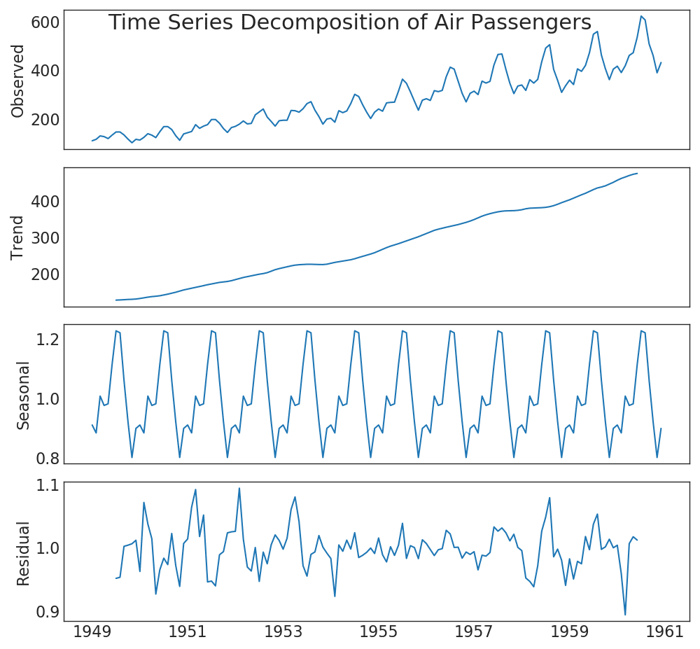
39. Expansion of time series
The time series expansion chart shows the breakdown of time series into trend, seasonal and residual components.Show code from statsmodels.tsa.seasonal import seasonal_decompose from dateutil.parser import parse
40. Several time series
You can build multiple time series that measure the same value on a single graph, as shown below.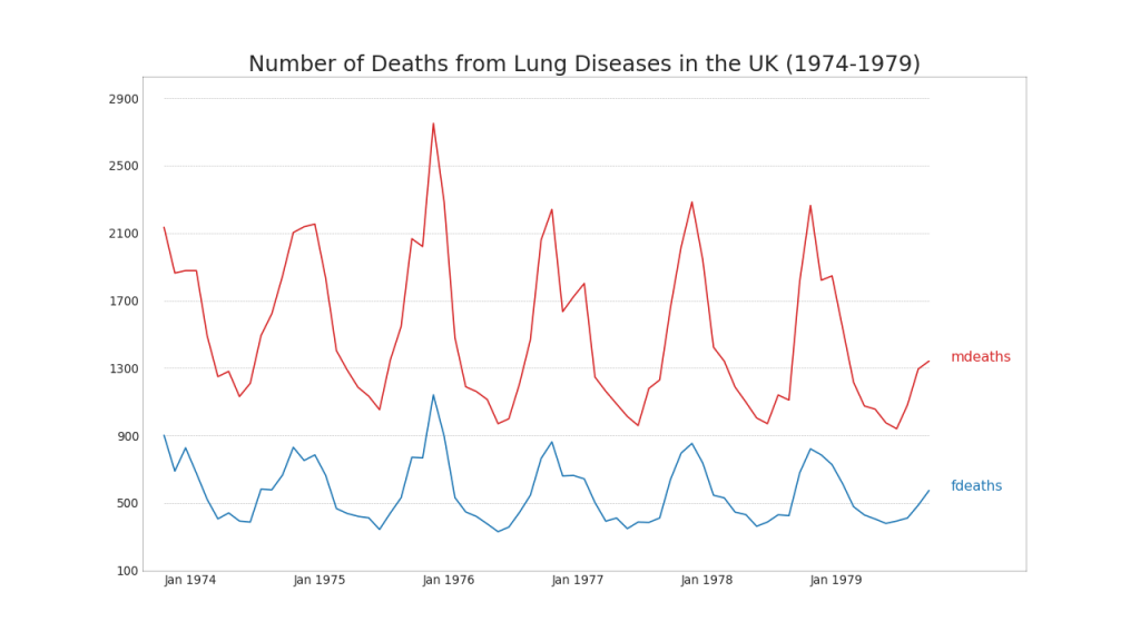
41. Construction at different scales using the secondary axis Y
If you want to show two time series that measure two different quantities at the same time, you can build the second series again on the secondary Y axis on the right.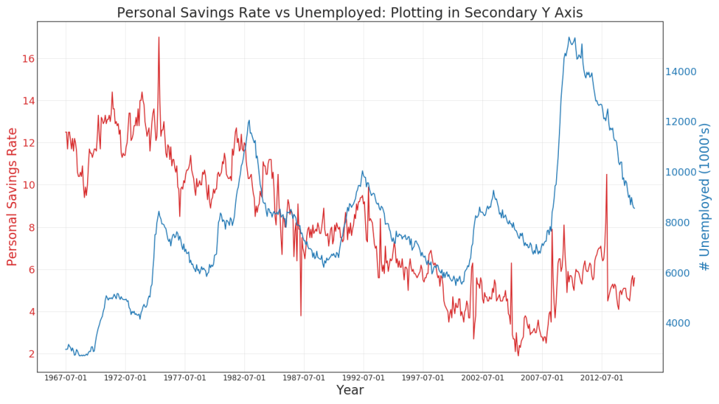
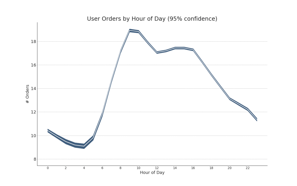
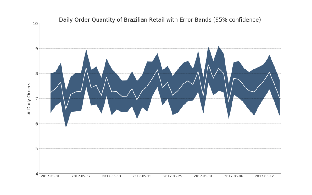
42. Time series with error bars
Time series with error bars can be constructed if you have a time series data set with several observations for each time point (date / time stamp). Below you can see some examples based on the receipt of orders at different times of the day. And another example of the number of orders received within 45 days.With this approach, the average number of orders is indicated by a white line. And 95% intervals are calculated and plotted around the average.Show code from scipy.stats import sem
Show code "Data Source: https://www.kaggle.com/olistbr/brazilian-ecommerce#olist_orders_dataset.csv" from dateutil.parser import parse from scipy.stats import sem
43. Chart with accumulation
The stacked area chart provides a visual representation of the degree of contribution from multiple time series.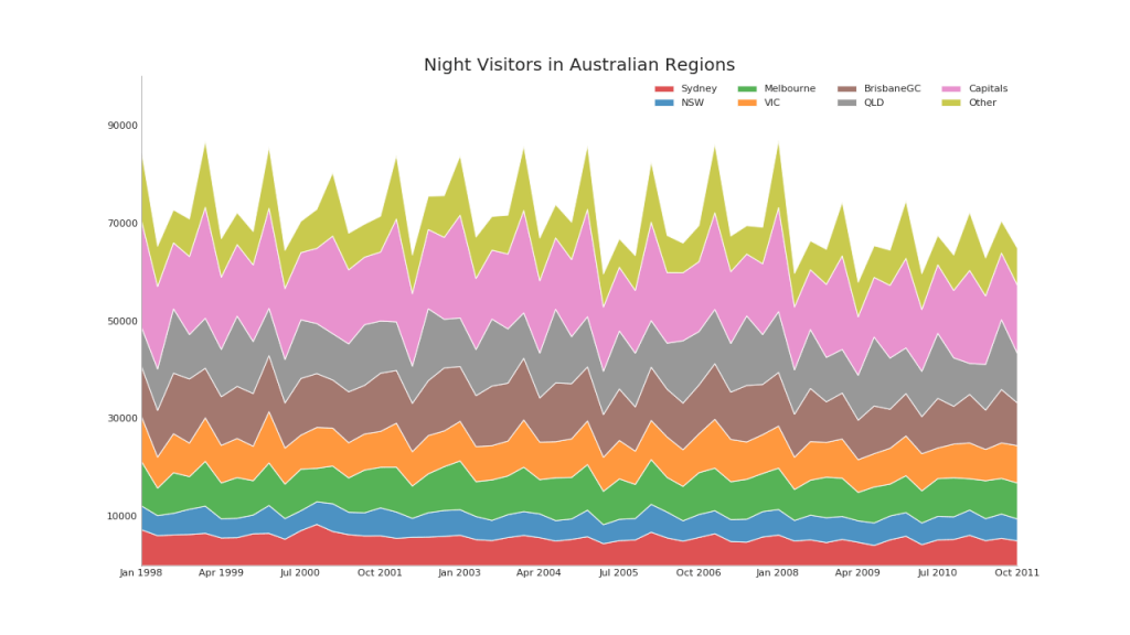
44. Unstacked Area Chart
An open area chart is used to visualize the progress (ups and downs) of two or more rows relative to each other. In the diagram below, you can clearly see how the personal savings rate decreases with an increase in the average duration of unemployment. A diagram with open sections shows this phenomenon well.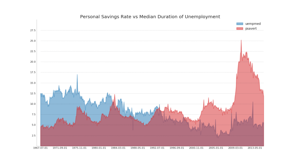
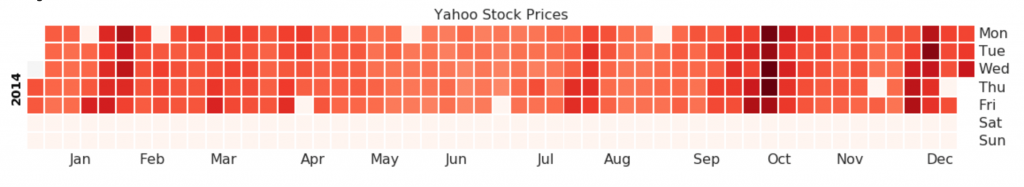
45. Calendar heatmap
A calendar map is an alternative and less preferred option for visualizing data based on time compared to a time series. Although they may be visually appealing, the numerical values are not entirely obvious.Show code import matplotlib as mpl import calmap
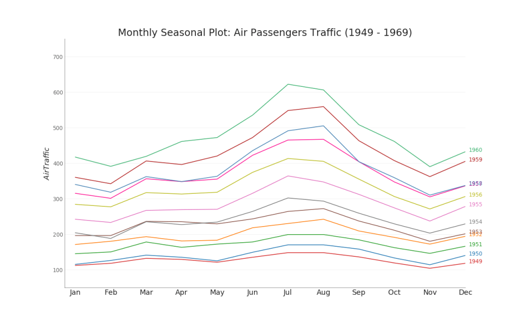
46. Season chart
A seasonal schedule can be used to compare time series performed on the same day in the previous season (year / month / week, etc.).Show code from dateutil.parser import parse
Groups
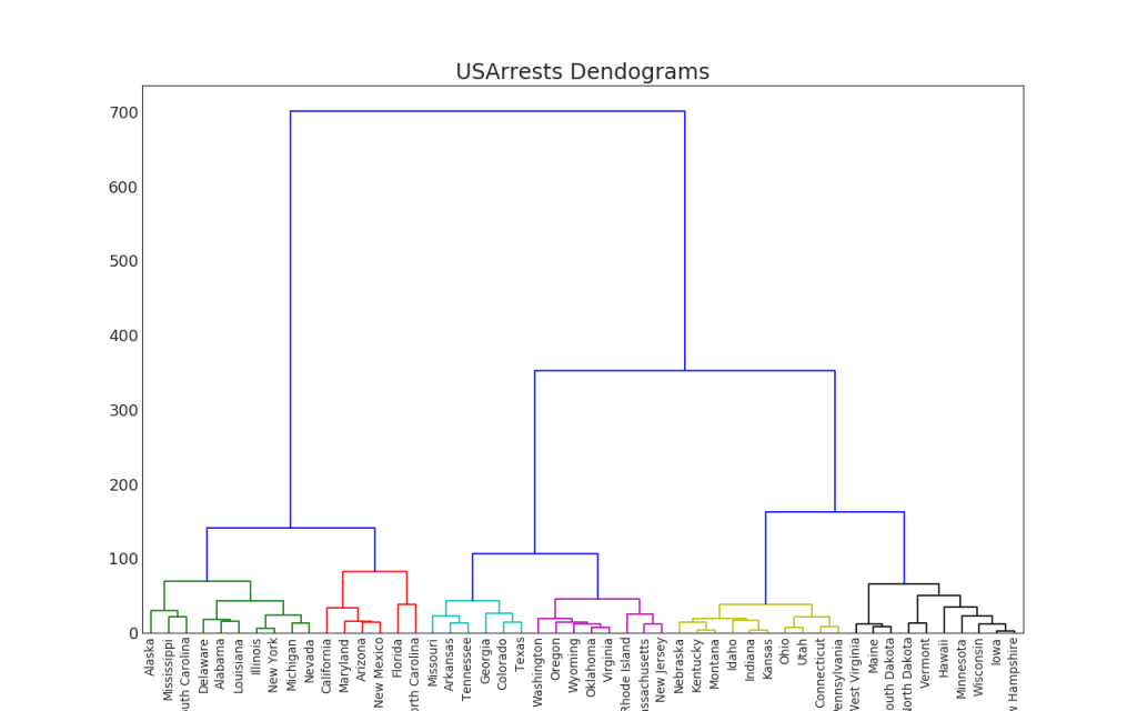
47. Dendrogram
The dendrogram groups similar points on the basis of a given distance metric and arranges them in the form of tree links based on the similarity of points.Show code import scipy.cluster.hierarchy as shc
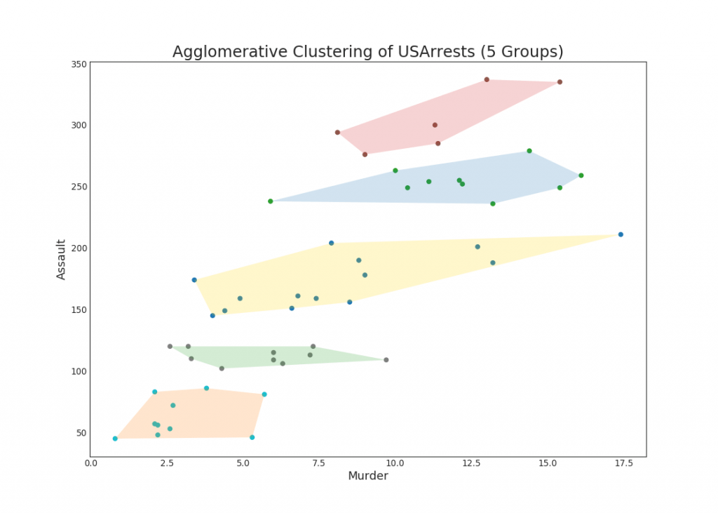
48. Cluster diagram
The cluster graph can be used to distinguish points belonging to one cluster. The following is an illustrative example of grouping US states into 5 groups based on the USArrests dataset. This cluster graph uses the “kill” and “attack” columns as the X and Y axes. Alternatively, you can use the first to main components as the X and Y axes.Show code from sklearn.cluster import AgglomerativeClustering from scipy.spatial import ConvexHull
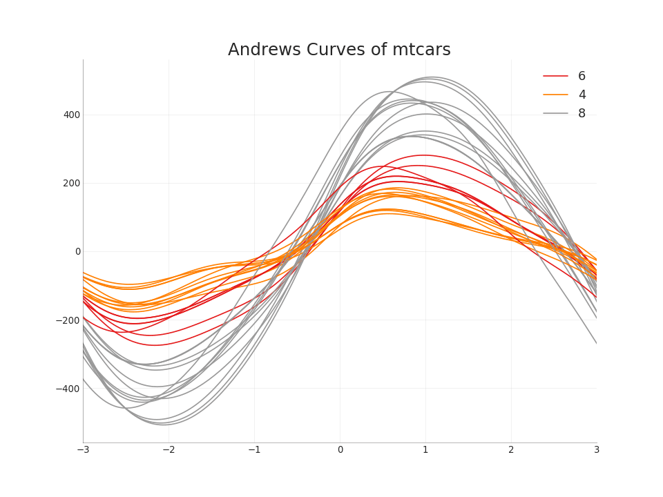
49. Andrews Curve
The Andrews curve helps to visualize whether there are numerical characteristics inherent in the group based on the group. If the objects (columns in the dataset) do not help distinguish the group, then the lines will not be well separated, as shown belowShow code from pandas.plotting import andrews_curves
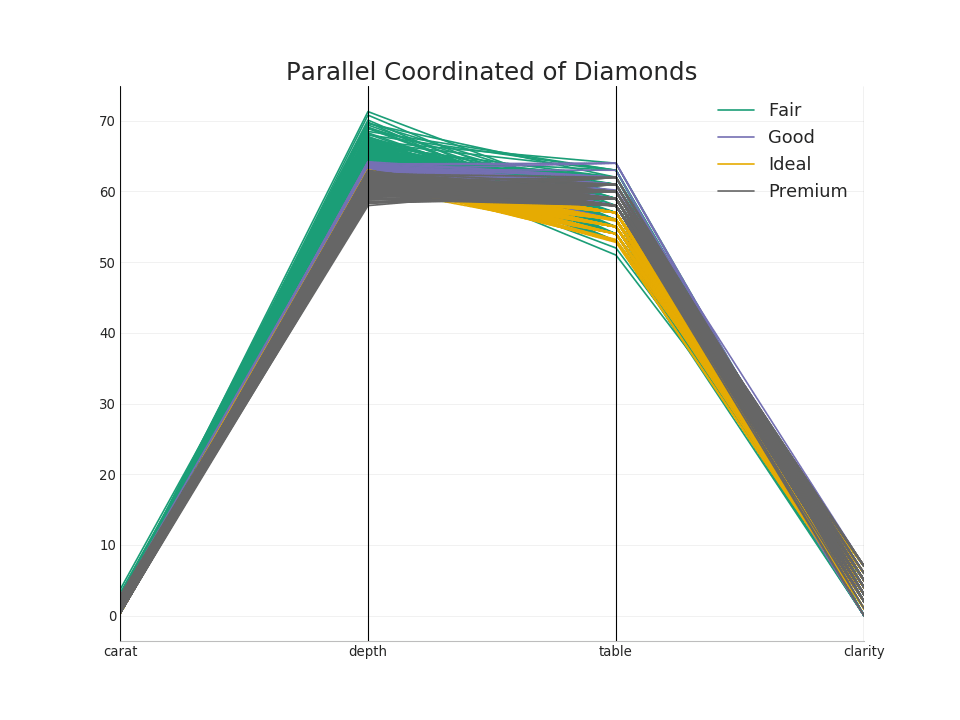
50. Parallel coordinates
Parallel coordinates help visualize whether a function helps to effectively separate groups. If segregation occurs, this feature is likely to be very useful for predicting this group.Show code from pandas.plotting import parallel_coordinates
 Bonus code in Jupiter
Goose, you promised vibes!