
I’ll start with the remark that the application discussed in this article requires
Xcode 11 and
MacOS Catalina if you want to use
Live Previews , and
Mojave if you use the simulator. The application code is on
Github .
This year at
WWDC 2019 ,
Apple announced
SwiftUI , a new declarative way to build a user interface (UI) on all
Apple devices. This is almost a complete departure from the usual
UIKit , and I - like many other developers - really wanted to see this new tool in action.
This article presents the experience of solving with
SwiftUI a problem whose code within
UIKit incomparably more complex and cannot be
UIKit in my opinion in a readable way.
The task is related to the last
Telegram competition for
Android ,
iOS and
JS developers, which was held from March 10 to March 24, 2019. In this competition, a simple task was proposed to graphically display the intensity of use of a certain resource on the Internet depending on time based on
JSON data. As an
iOS developer, you should use
Swift to submit code written from scratch to the competition without using any extraneous specialized graphing libraries.
This task required skills for working with the graphics and animation capabilities of iOS:
Core Graphics ,
Core Animation ,
Metal ,
OpenGL ES . Some of these tools are low-level, non-object-oriented programming tools. Essentially, in
iOS there were no acceptable templates for solving such seemingly light at first glance graphical tasks. Therefore, each competitor invented his own animator (
Render ) based on
Metal ,
CALayers ,
OpenGL ,
CADisplayLink . This generated tons of code from which it was not possible to borrow and develop anything, since these are purely “copyrighted” works that only authors can really develop. However, this should not be so.
And in early June at
WWDC 2019 ,
SwifUI appears - a new
framework developed by
Apple , written in
Swift and designed to declaratively describe the user interface (
UI ) in the code. You determine which
subviews shown in your
View , what data causes these
subviews to change, what modifiers you need to apply to them, to make them position in the right place, to have the right size and style. An equally important element of
SwiftUI is the control of the flow of user-modifiable data, which in turn updates the
UI .
In this article I want to show how the very task of the
Telegram contest on
SwiftUI is solved quickly and easily. In addition, this is a very exciting process.
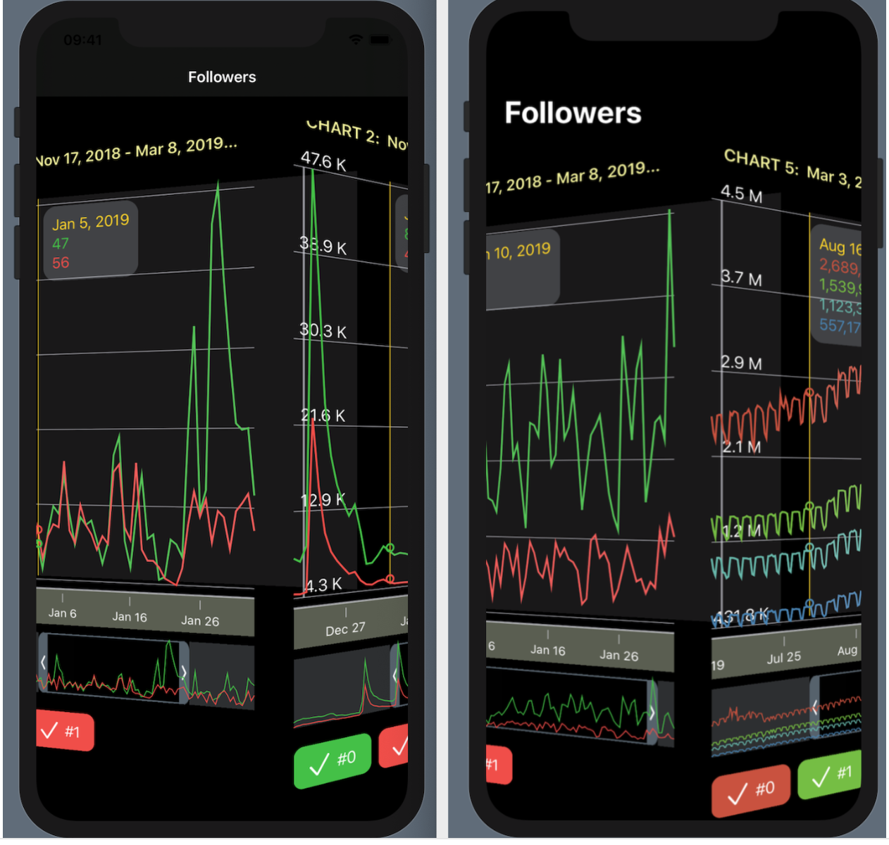
The task
The competitive application should simultaneously display on the screen 5 "sets of Charts" using the data provided by
Telegram . For one “set of Charts”, the
UI as follows:
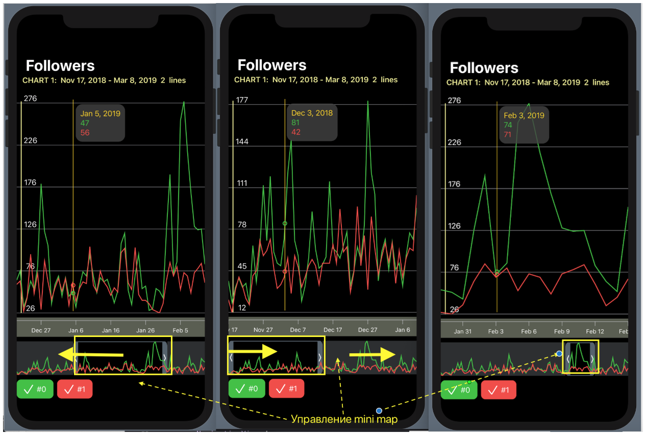
In the upper part there is a “Chart zone” with a common scale along the normal Y axis with marks and horizontal grid lines. A “creeping line” with timestamps along the X axis in the form of dates is located a little lower.
Even lower is the so-called “mini map” (as in
Xcode 11 ), that is, a transparent “window” that defines that part of the time period of our “Charts”, which is presented in more detail in the upper “Charts zone”. This “mini map” can not only be moved along the
X axis, but also its width can be changed, which affects the time scale in the “Charts area”.
With the help of
checkboxs painted in the colors of “Charts” and provided with their names, you can refuse to show the “Graphics” corresponding to this color in the “Charts zone”.
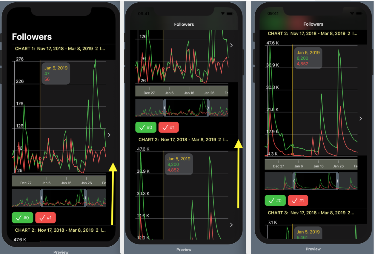
There are many such “sets of Charts”, in our test example there are 5 of them, for example, and they should all be located on one screen.
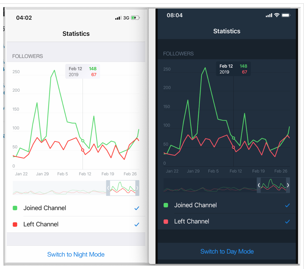
In the
UI designed using
SwiftUI there is no need for a button to switch between
Dark and
Light modes, this is already built into
SwiftUI . In addition,
SwiftUI far more options for combining “sets of Charts” (that is, the sets of screens presented above) than just a scrolling table down, and we will look at some of these very interesting options.
But first, let's focus on displaying one “
SwiftUI set” for which
SwiftUI will create a
ChartView :

SwiftUI allows you to create and test a complex
UI in small pieces, and then it is very easy to assemble these pieces into a puzzle. We will do so. Our
ChartView very well into these small pieces:
GraphsForChart - these are the graphs themselves, built for one specific "set of Graphs". "Charts" are shown for the time range controlled by the user using the "mini map" RangeView , which will be presented below.YTickerView is the Y axis with elevations and the corresponding horizontal grid.IndicatorView is a horizontally user-driven indicator that allows you to view the values of "Charts" and time for the corresponding indicator position on the time on the X axis.TickerView - “creeping line” showing timestamps on the X axis as dates,RangeView - a temporary “window”, customizable by the user using gestures, to set the time interval for “Charts”,CheckMarksView - contains “buttons” colored in the colors of “Charts” and allowing you to control the presence of “ ChartView ” on ChartView .
ChartView user can interact with
ChartView in three ways:
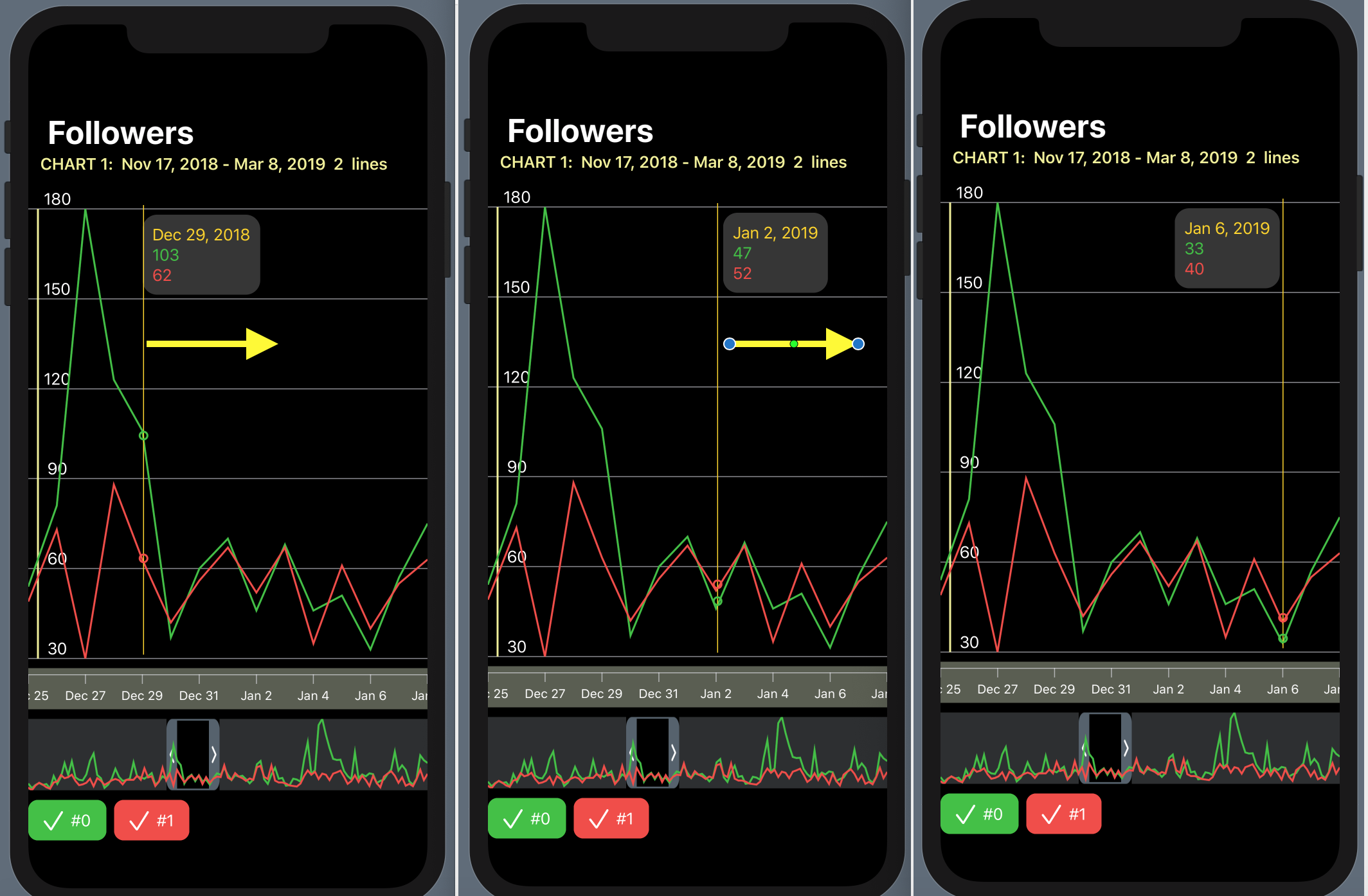
1. control the “mini map” using the
DragGesture gesture - it can shift the temporary “window” to the right and left and decrease / increase its size:
2. move the indicator in the horizontal direction, showing the values of the "Charts" at a fixed point in time:
3. hide / show certain “Charts” using buttons colored in the “Charts” colors and located at the bottom of the
ChartView :

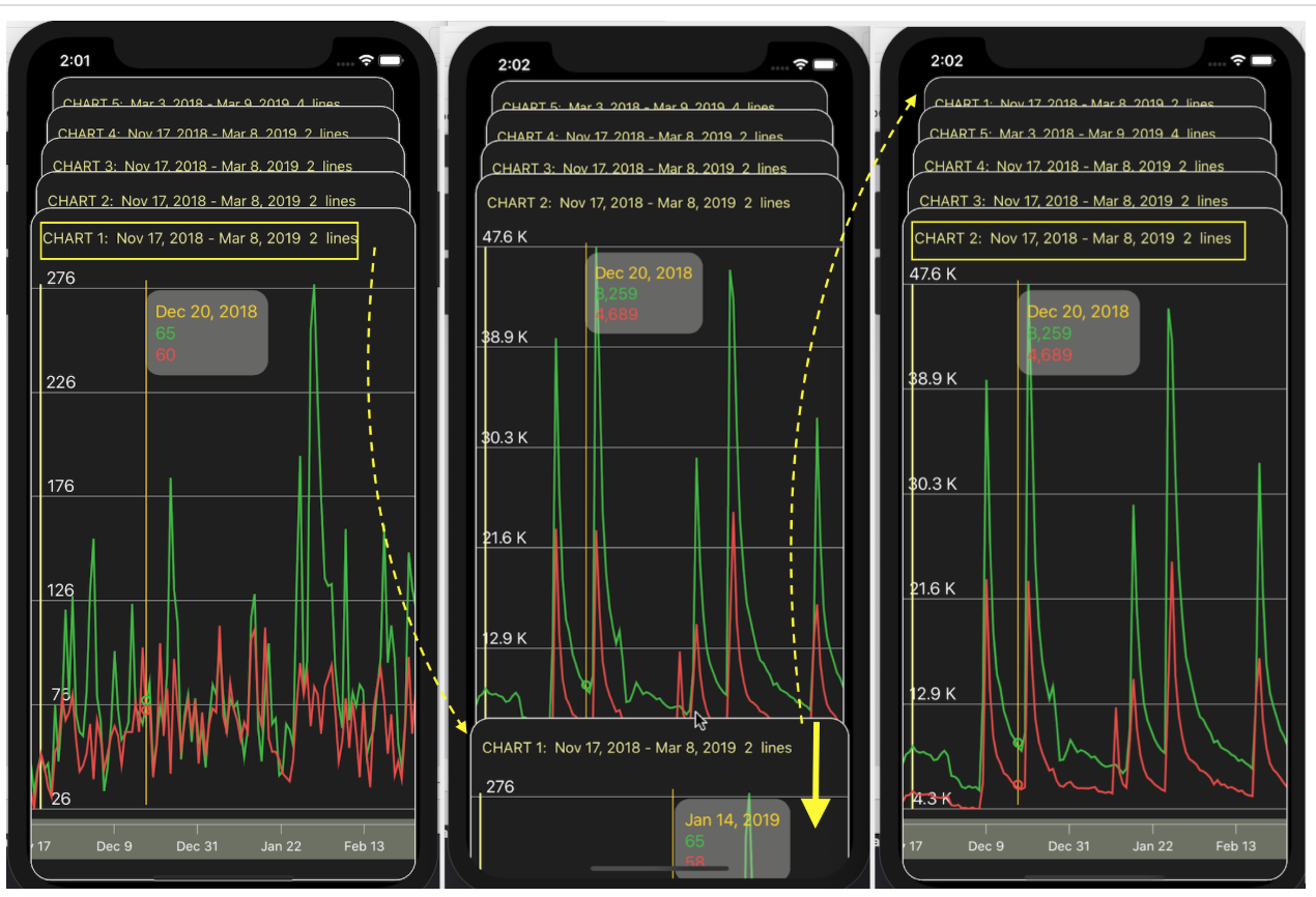
We can combine various “Chart Sets” (we have 5 of them in test data) in different ways, for example, by placing them all simultaneously on one screen using the
List list (like a table scrollable up and down):
or using
ScrollView and the horizontal
HStack stack with a 3D effect:
... or in the form of a
ZStack “cards” superimposed on one another, the order of which can be changed: the upper “card” with ““ a set of Charts ”can be pulled down far enough to look at the next card, and if you continue to drag it down, then it“ goes "to the last place in
ZStack , and this next" card "" goes ahead ":
In these complex
UI - a “scrollable table”, a horizontal stack with a
3D effect, a
ZStack “cards” superimposed on one another — all means of user interaction work fully: moving along the timeline and changing the “scale” of the
mini - map , indicator and hide buttons "Charts".
Further we will consider in detail the design of this
UI using
SwiftUI - from the simplest elements to their more complex compositions. But first, let's understand the data structure that we have.
So, the solution to our problem was divided into several stages:
- Download data from a
JSON file and present it in a convenient "internal" format - Create
UI for one “set of Charts” - Combine various “chart sets”
Download data
At our disposal,
Telegram provided
JSON data containing several “sets of Charts." Each individual “
chart set” of a
chart contains several “Charts” (or “Lines”) of
chart.columns . Each "Graphics" ("Lines") has a mark at position
0 -
"x" ,
"y0" ,
"y1" ,
"y2" ,
"y3" , followed by either time values on the X axis ("x") , or the values of "Graphics" ("Lines") (
"y0" ,
"y1" ,
"y2" ,
"y3" ) on the
Y axis:

The presence of all “Lines” in the “chart set” is optional. The values for the "column" x are UNIX timestamps in milliseconds.
In addition, each individual “
chart set” of the
chart is supplied with
chart.colors colors in the format of 6 hexadecimal digits (for example, “#AAAAAA”) and
chart.names .
To build the Data Model located in the
JSON file, I used the excellent
quicktype service. On this site, you insert a piece of text from a
JSON file and specify the programming language (
Swift ), the name of the structure (
Chart ), which will be formed after the “parsing” of this
JSON data and that’s it.
A code is generated in the central part of the screen, which we copy into our application in a separate file named
Chart.swift . This is where we will place the JSON format Data Model. Using the Loader of data from the
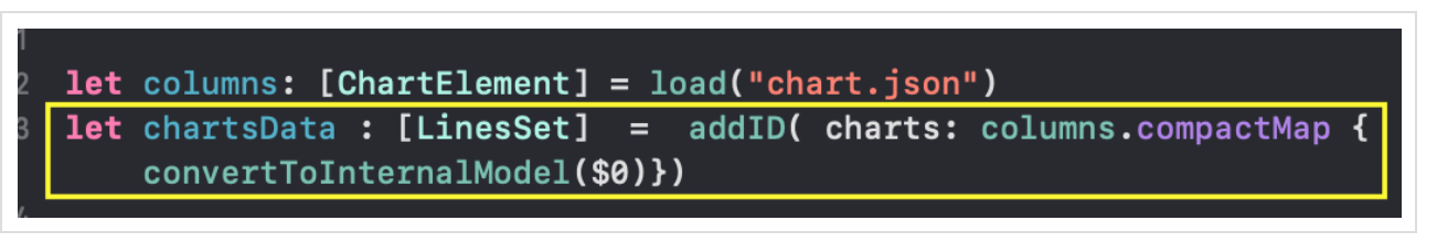
JSON file to the Model borrowed from the
SwiftUI Generic demo examples , I got an array of
columns: [ChartElement] , which is a collection of “
columns: [ChartElement] sets” in the
Telegram format.
The
ChartElement data
ChartElement , containing arrays of heterogeneous elements, is not very suitable for intensive interactive work with charts, in addition, timestamps are presented in
UNIX format in milliseconds (for example,
1542412800000, 1542499200000, 1542585600000, 1542672000000 ), and colors are in 6 hexadecimal format digits (for example,
"#AAAAAA" ).
Therefore, inside our application we will use the same data, but in a different “internal” and rather simple format
[LinesSet] . The
[LinesSet] array is a collection of
LinesSet “
LinesSet Sets”, each of which contains
xTime timestamps in the format
"Feb 12, 2019" (
X axis) and several “Charts”
lines (
Y axis):
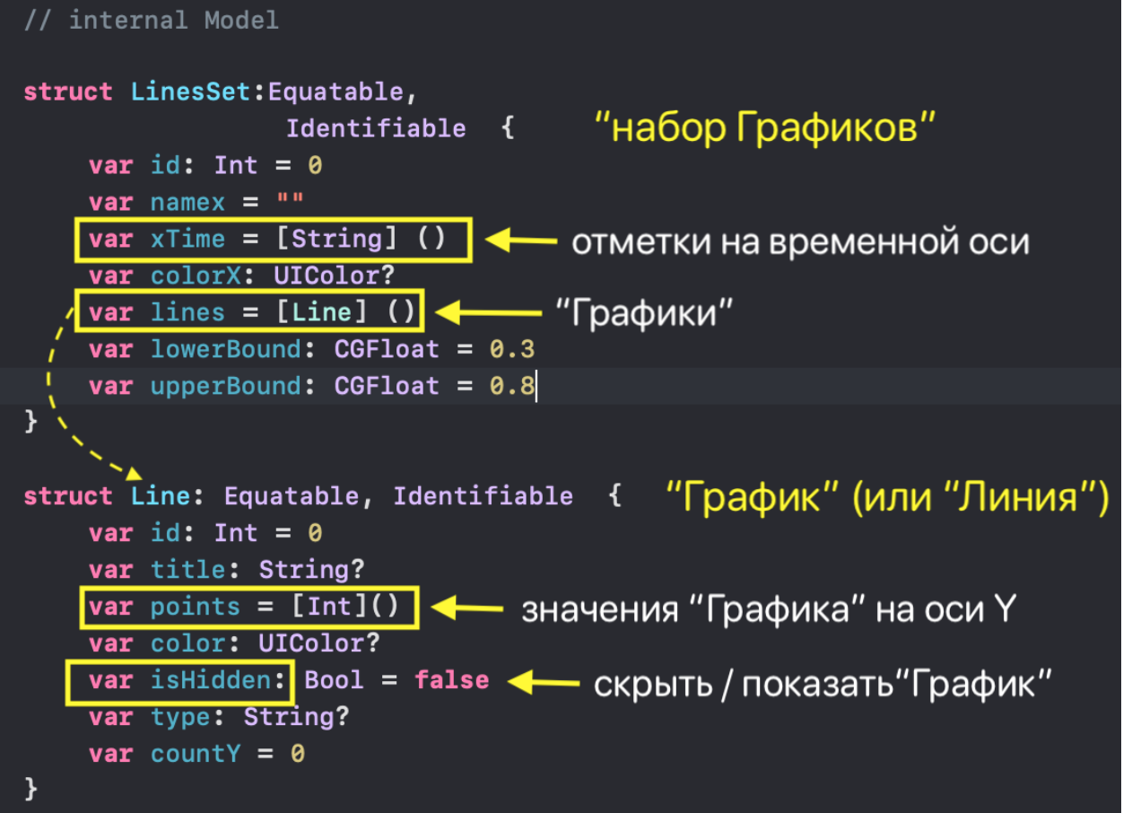
Data for each Line Chart (Line) is presented
- an array of integers
points: [Int] , - named "Graphics"
title: String , - type "Graphics"
type: String? , - color
color : UIColor in the Swift - UIColor format, - number of points
countY: Int .
In addition, any “Graph” can be hidden or shown depending on the value of
isHidden: Bool . The
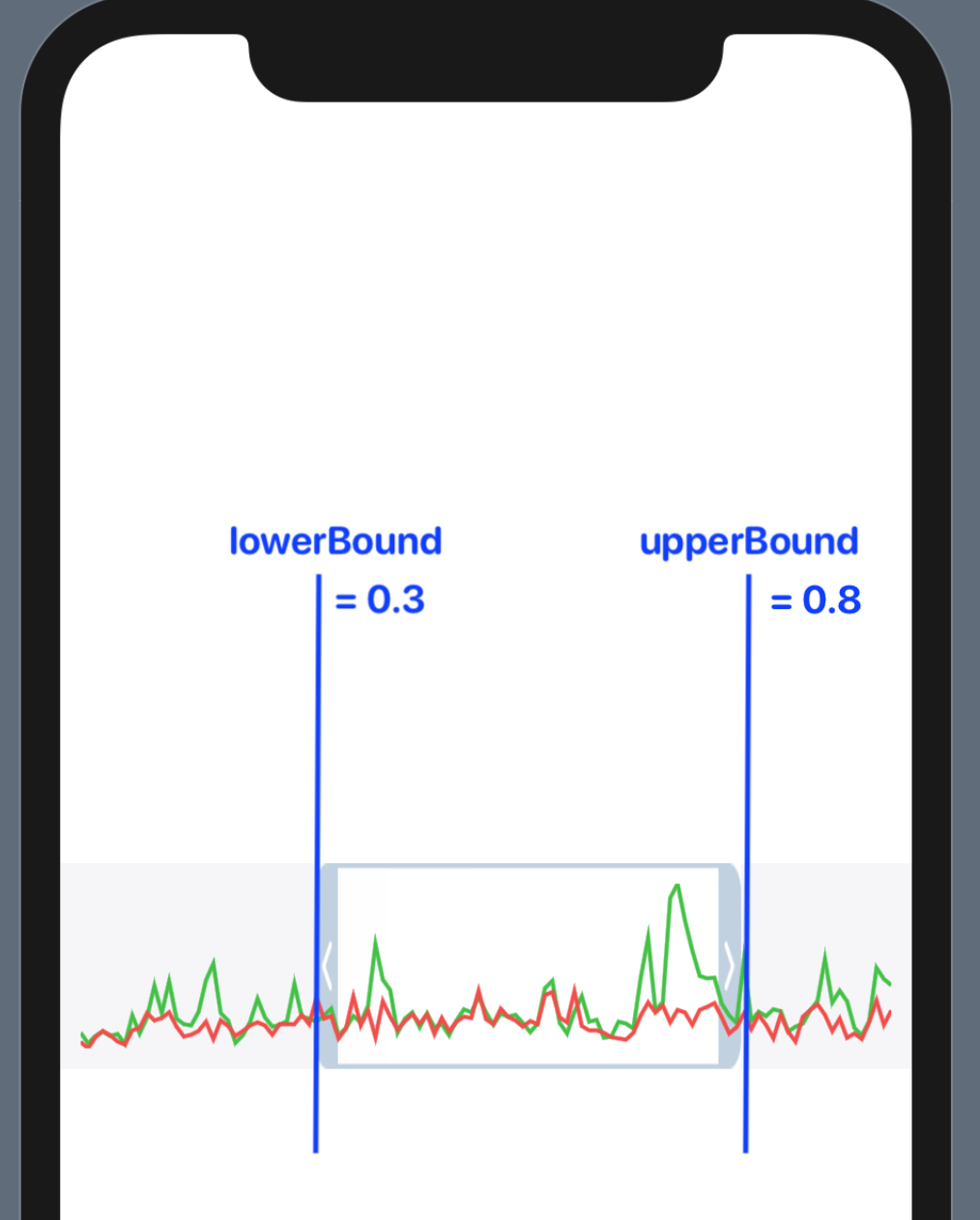
lowerBound and
upperBound adjusting the time range take values from
0 to
1 and show not only the size of the “mini map” temporary window (
upperBound -
lowerBound ), but also its location on the time axis
X :
The
JSON data structures
[ChartElement] and the data structures of the "internal"
LinesSet and
Line LinesSet are in the
Chart.swift file. The code for loading
JSON data and converting it to an internal structure is located in the
Data.swift file. Details about these transformations can be found
here .
As a result, we received data about the “Chart sets” in the internal format as an array of
chartsData .
This is our Data
, but to work in
SwiftUI it is necessary to make sure that any changes made by the user in the
chartsData array (changing the temporary “window”, hiding / showing “Charts”) lead to automatic updates of our
Views .
We will create
@EnvironmentObject . This will allow us to use the Data
wherever it is needed, and in addition, automatically update our
Views if the data changes. This is something like
Singleton or global data.
@EnvironmentObject requires us to create some
final class UserData , which is located in the
UserData.swift file, stores the
chartsData data and implements the
ObservableObject protocol:
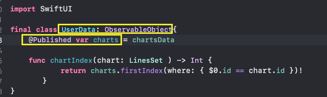
The presence of
@Published "wrappers" will allow you to post "news" that these properties of the
charts of the
UserData class have changed, so that any
Views "subscribed to this news" in
SwiftUI will be able to automatically select new data and update.
Recall that in the
charts property the
isHidden values can change for any “
isHidden ” (they allow you to hide or show these “Charts”), as well as the lower
lowerBound and upper
upperBound the time interval for each individual “set of Charts”.
We want to use the
charts property of the
UserData class throughout our application and we don’t have to synchronize them with the
UI manually thanks to
@EnvironmentObject .
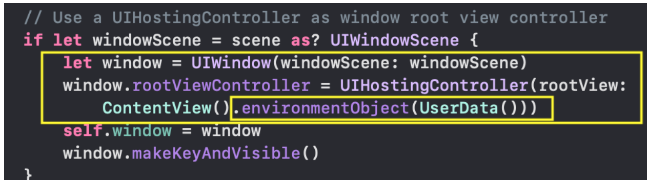
To do this, when starting the application, we must create an instance of the
UserData () class so that subsequently we can access it anywhere in our application. We will do this in the
SceneDelegate.swift file inside the
scene (_ : , willConnectTo: , options: ) method. This is where our
ContentView is created and launched, and it is here that we must pass the
ContentView any
@EnvironmentObject we
@EnvironmentObject so that
SwiftUI can make them available to any other
View :
Now, in any
View to access the
@Published data of the
UserData class, we need to create the
var variable using the
@EnvironmentObject wrapper. For example, when setting the time range in
RangeView we create the
var userData variable, which has the
UserData TYPE:

So, as soon as we have implemented some
@EnvironmentObject into the "environment" of the application, we can immediately start using it either at the highest level or at the 10th level below - it does not matter. But more importantly, whenever a
View changes the "environment", all
Views that have this
@EnvironmentObject will automatically
@EnvironmentObject , thereby ensuring synchronization with the data.
Let's move on to designing the user interface (
UI ).
User Interface (UI) for one “set of Graphs”
SwiftUI offers a composite technology for creating
SwiftUI from many small
Views , and we have already seen that our application falls very well on this technology, as it splits into small pieces: the “
ChartView Charts”, “Graphs”
GraphsForChart , the
Y -axis marks -
YTickerView , user-driven indicator value for “Charts”
IndicatorView , “
TickerView ”
TickerView with time
TickerView on the
X axis, user-controlled “time window”
RangeView , marks for hiding / showing “Charts”
CheckMarksView . We can not only create all these
Views independently of each other, but also immediately test in
Xcode 11 using
Previews (preliminary “live” views) on test data. You will be surprised how simple the code is to create them from other more basic
Views .
GraphView - “Graph” (“Line”)
The first
View , with which we will begin, is actually the “Graph” itself (or “Line”). We will call it
GraphView :

Creating a
GraphView , as usual, starts with creating a new file in
Xcode 11 using the menu
File →
New →
File :
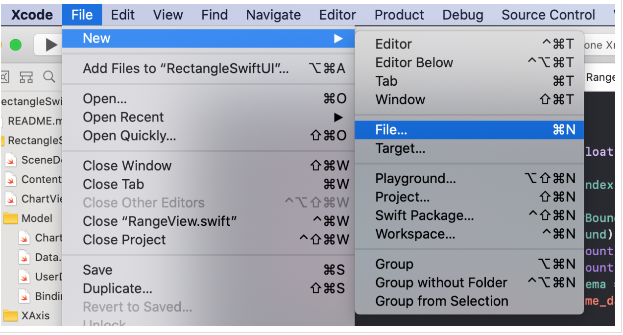
Then we select the desired TYPE of the file - this is the
SwiftUI file:
... give the name "GraphView" to our
View and indicate its location:

Click on the
"Create" button and get a standard
View with
Text ( "Hello World!") In the middle of the screen:

Our task is to replace the text
Text ("Hello World!") With "Graph", but first, let's see what initial data we have to create the "Graph":
- we have the values of
line.points "Graphics" line: Line , - time range
rangeTime , which is a range of indexes Range time stamps xTime on the X-axis, - range of values
rangeY: Range “Graphics” for the Y rangeY: Range , - thickness of the “Graphics” stroke line
lineWidth .
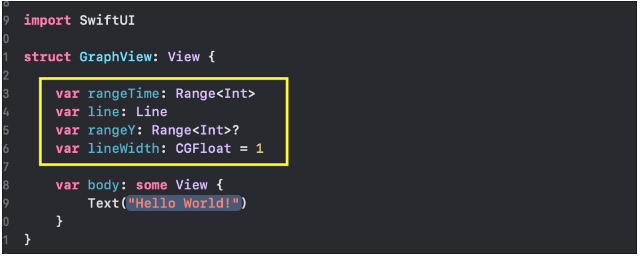
Add these properties to the
GraphView structure:
If we want to use for our "Graphics"
Previews (previews), which are possible only for
MacOS Catalyna , then we must initiate a
GraphView with the range of indexes
rangeTime and the
line data of the "Graphics" itself:

We already have the
chartsData test data that we got from the
chart.json JSON file, and we used it for
Previews .
In our case, this will be the first "
chartsData[0] set"
chartsData[0] and the first "Chart" in this set
chartsData[0].lines[0] , which we will provide
GraphView as the
line parameter.
As the time interval
rangeTime we will use the full range of indices
0..<(chartsData[0].xTime.count - 1) .
The
rangeY and
lineWidth can be set externally, or not, since they already have initial values:
rangeY is
nil , and
lineWidth is
1 .
We intentionally made a TYPE of the
rangeY Optional property with a TYPE, because if
rangeY not set externally and
rangeY = nil , then we calculate the minimum
minY and maximum
maxY the “Graphics” value directly from
line.points data:

This code compiles, but we still have a standard
View on screen with the text
Text ("Hello World!") In the middle of the screen:

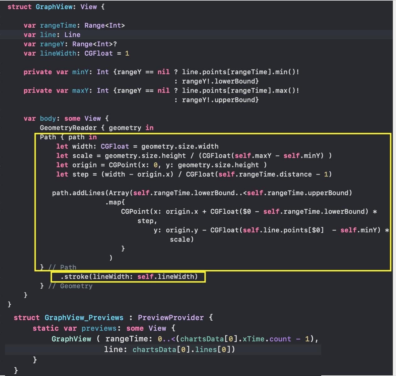
Because in the
body we have to replace the text
Text ("Hello World!") With
Path , which on the
line.points using the
addLines(_:) command (almost like in
Core Graphics ) will build our “Graph:

We will circle
stroke (...) our
Path line whose thickness is
lineWidth , and the color of the stroke line will correspond to the color “default” (that is, “black”):
We can replace the black color for the stroke line with the color specified in our particular “Line”
line.color “Color”:

In order for our “Graph” to be placed in rectangles of any size, we use the
GeometryReader container. In the
Apple documentation
Apple GeometryReader is a “container”
View , which defines its contents as a function of its own size,
size and coordinate space. Essentially,
GeometryReader is another
View ! Because almost EVERYTHING in
SwiftUI is
View !
GeometryReader will allow YOU, unlike other
Views to access some additional useful information that you can use when designing your custom
View .
We use the
GeometryReader and
Path containers to create
GraphView adaptable to any size. And if we look carefully at our code, we will see in the closure for the
GeometryReader variable called
geometry :
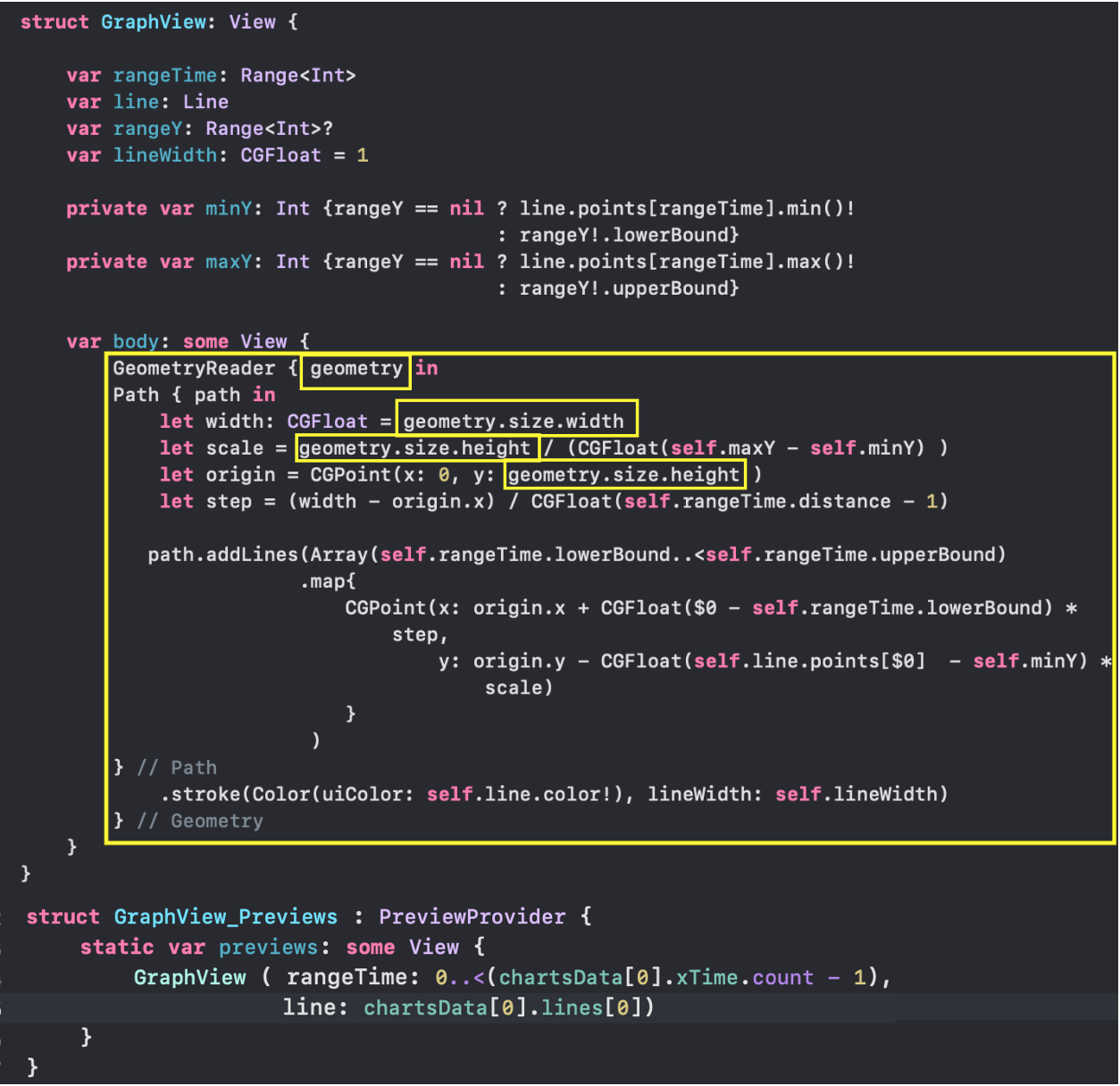
This variable has the
GeometryProxy TYPE, which in turn is a
struct structure with many "surprises":
public var size: CGSize { get } public var safeAreaInsets: EdgeInsets { get } public func frame(in coordinateSpace: CoordinateSpace) -> CGRect public subscript<T>(anchor: Anchor<T>) -> T where T : Equatable { get }
From the
GeometryProxy definition, we see that there are two computed variables
var size and
var safeAreaInsets , one function
frame( in:) and a
subscript getter . We only needed the
size variable to determine the width of the
geometry.size.width and the height of the
geometry.size.height “Graphics” drawing area.
In addition, we enable our “Graph” to animate using the
animation (.linear(duration: 0.6)) modifier
animation (.linear(duration: 0.6)) .

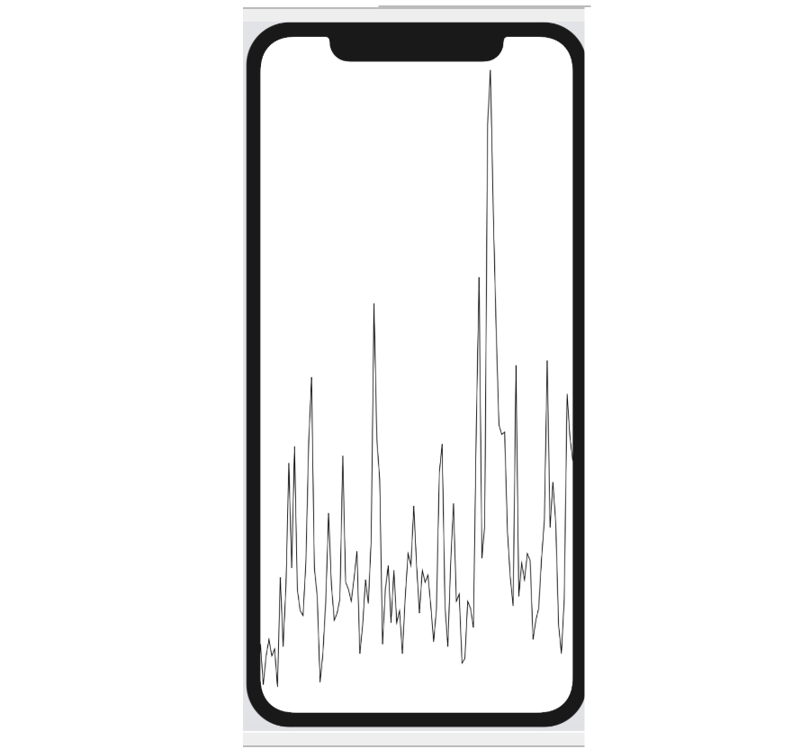
GraphView_Previews allows us to very easily test any “Charts” from any “set”. Below is the “Chart” from the “chart set” with index 4:
chartsData[4] and index 0 “Graphics” in this set:
chartsData[4].lines[0] :

We set the
height “Graphics” to 400 using
frame (height: 400) , the width remains the same as the width of the screen. If we did not use
frame (height: 400) , then the "Graph" would occupy the entire screen.
We did not specify a range of values rangeYand GraphViewused the nildefault value , in this case the “Chart” takes its minimum and maximum values in the time interval rangeTime: Although we used a
 Pathmodifier for our model animation (.linear(duration: 0.6)), no animation will occur, for example, when changing the rangeYvalue range “ Graphic arts". A “chart” will simply “jump” from one value of a range rangeYto another without any animation.The reason is simple: we taught SwiftUIhow to draw a “Graph” for a specific range rangeY, but we did not teach SwiftUIhow to reproduce a “Graph” multiple times with intermediate values of the range rangeYbetween the start and end, and for that inSwiftUImeets protocol Animatable.Fortunately, if yours Viewis a “figure,” that is View, that implements a protocol Shape, then a protocol has already been implemented for it Animatable. This means that there is a computed property animatableDatawith which we can control the animation process, but by default it is set to EmptyAnimatableData, that is, no animation occurs.In order to solve the problem with animation, we first need to turn our “Graph” GraphViewinto Shape. It is very simple, we only need to implement the function func path (in rect:CGRect) -> Paththat we essentially already have and indicate with the help of the calculated property animatableDatawhat data we want to animate: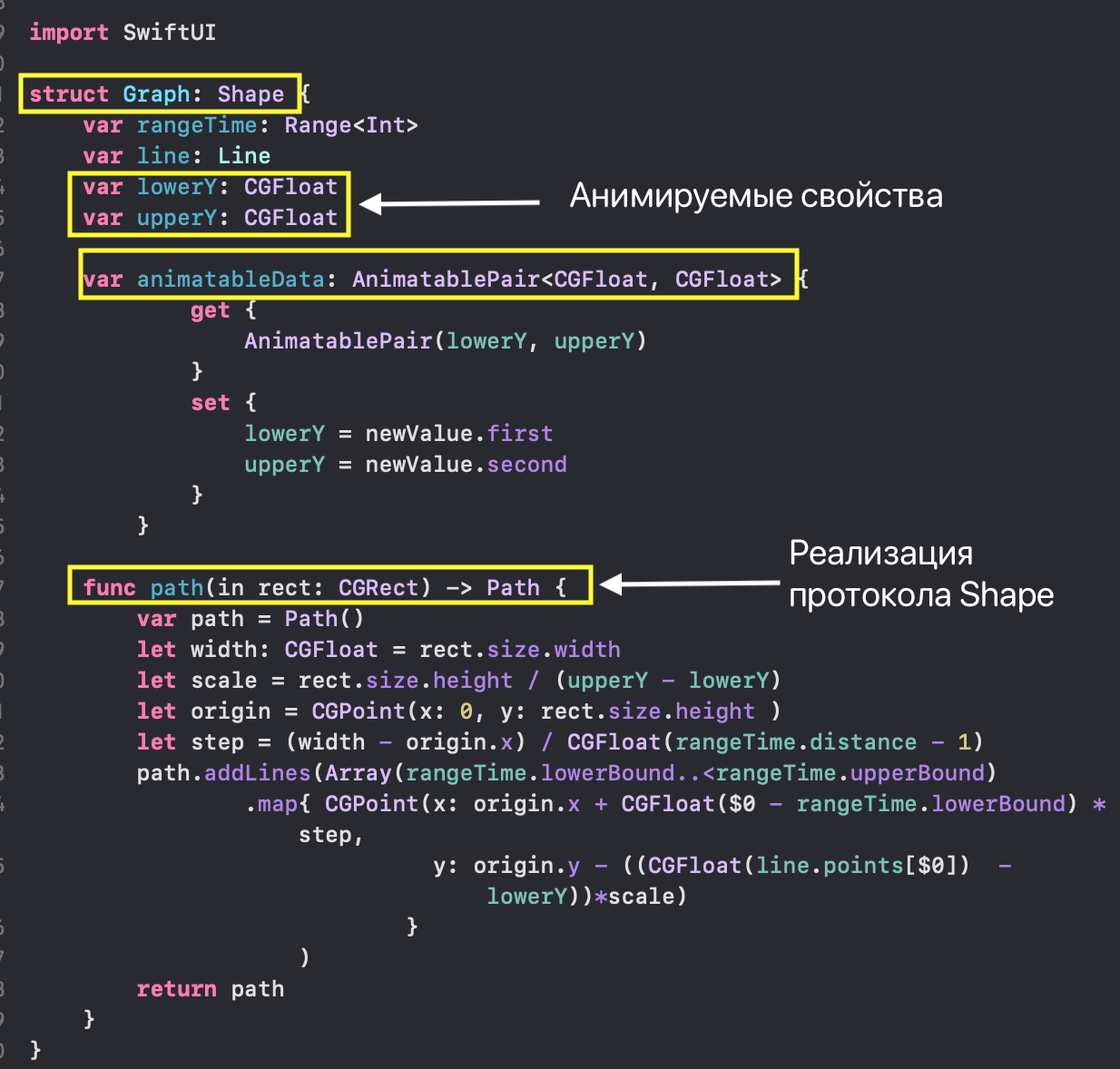 Note that the theme of animation control is an advanced topic in
SwiftUIand you can learn more about it in the article “Advanced SwiftUI Animations - Part 1: Paths” . We can use theresulting “figure” Graphin a much simpler GraphViewNew“Graphics” with animation: you see that we did not need
 GeometryReaderour new “Graphics” GraphViewNew, because thanks to the protocol Shapeour “figure” Graphwill be able to adapt to any size of the parent View.Naturally, Previewswe got the same result as in the case with GraphView: In the following combinations, we will use the
 GraphViewNewsame “Graphics” to display the values.GraphsForChart - set of “Graphs” (“Lines”)
The task of this Viewis to display ALL “Charts” (“Lines”) from the “set of Charts” chartin a given time range rangeTimewith a common axis Y, and the width of the “Lines” is lineWidth: As for
 GraphViewand GraphViewNew, we will create a GraphsForChartnew file for GraphsForChart.swiftand define the initial data for “Chart Set”:- the "set of Charts" itself
chart: LineSet(values on Y), - range
rangeTime: Range( X) of indices of the time stamps of “Charts”, - graph line stroke thickness
lineWidth
The range of values rangeY: Rangefor the “chart set” ( Y) is calculated as the union of the ranges of the individual unhidden ( isHidden = false) “Charts” included in this “set”: For this, we use the function
 rangeOfRanges: We show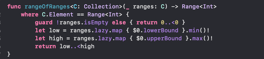 all NOT hidden “Charts” (
 isHidden = false) in ZStackthe construction ForEach, giving each “Graph” the possibility of appearing on the screen and leaving the screen “using the“ move ”modifier transition(.move(edge: .top)):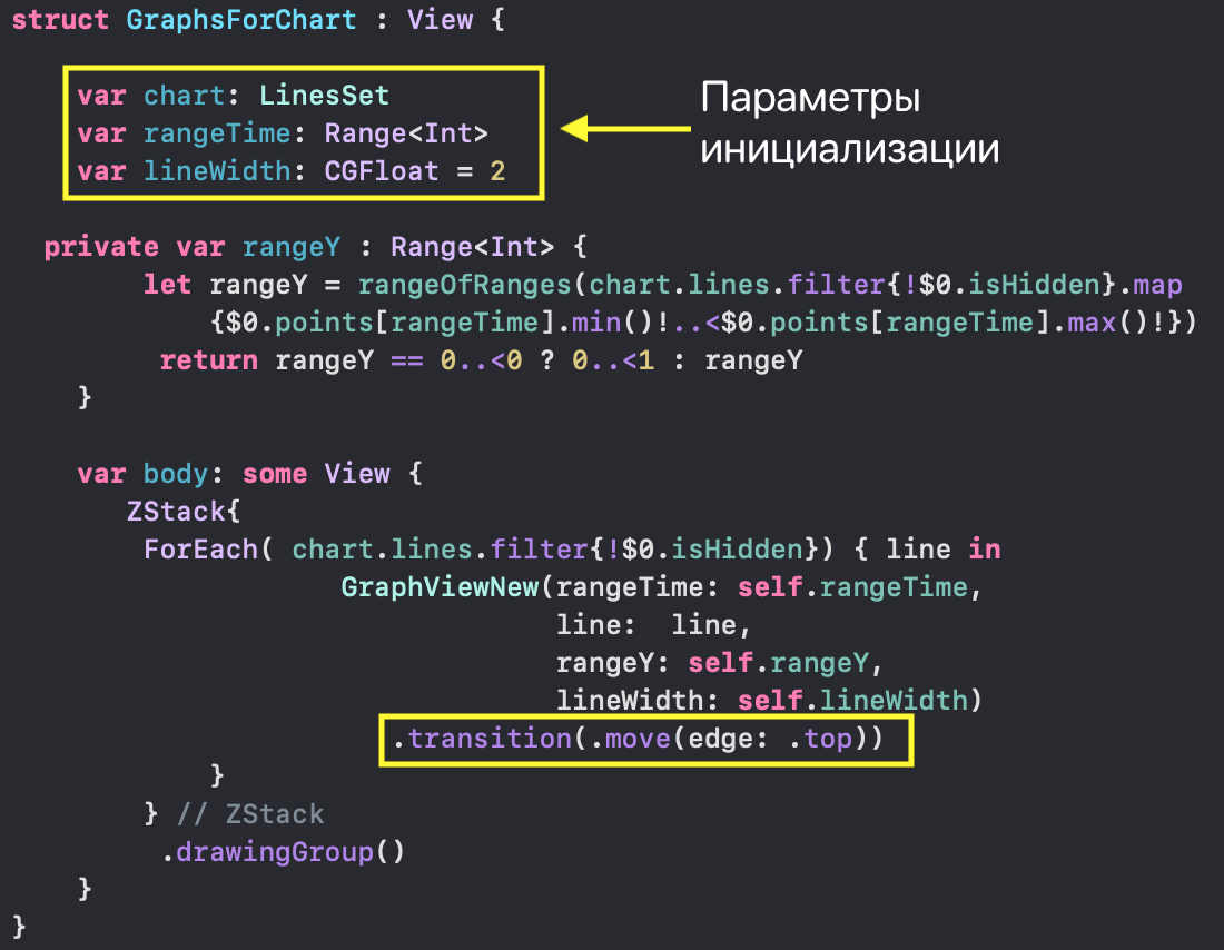 Thanks to this modifier, the process of hiding and returning the“ Graphics ”
 ChartViewto the screen will take place on the screen with animation and will make it clear to the user why the scale has changed Y.Use drawingGroup()means useMetalfor drawing graphic shapes. On our test data and on the simulator, you will not feel the difference in the speed of drawing with Metaland Metal, but if you reproduce a lot of rather cumbersome graphs on any iPhone, then you will notice this difference. For a more detailed introduction, when to use it drawingGroup(), you can see the article "Advanced SwiftUI Animations - Part 1: Paths" or watch the video session 237 WWDC 2019 ( Building Custom Views with SwiftUI ).As in the case with GraphViewNewtesting GraphsForChartusing previews, Previewswe can set any “set of Charts”, for example, with an index 0: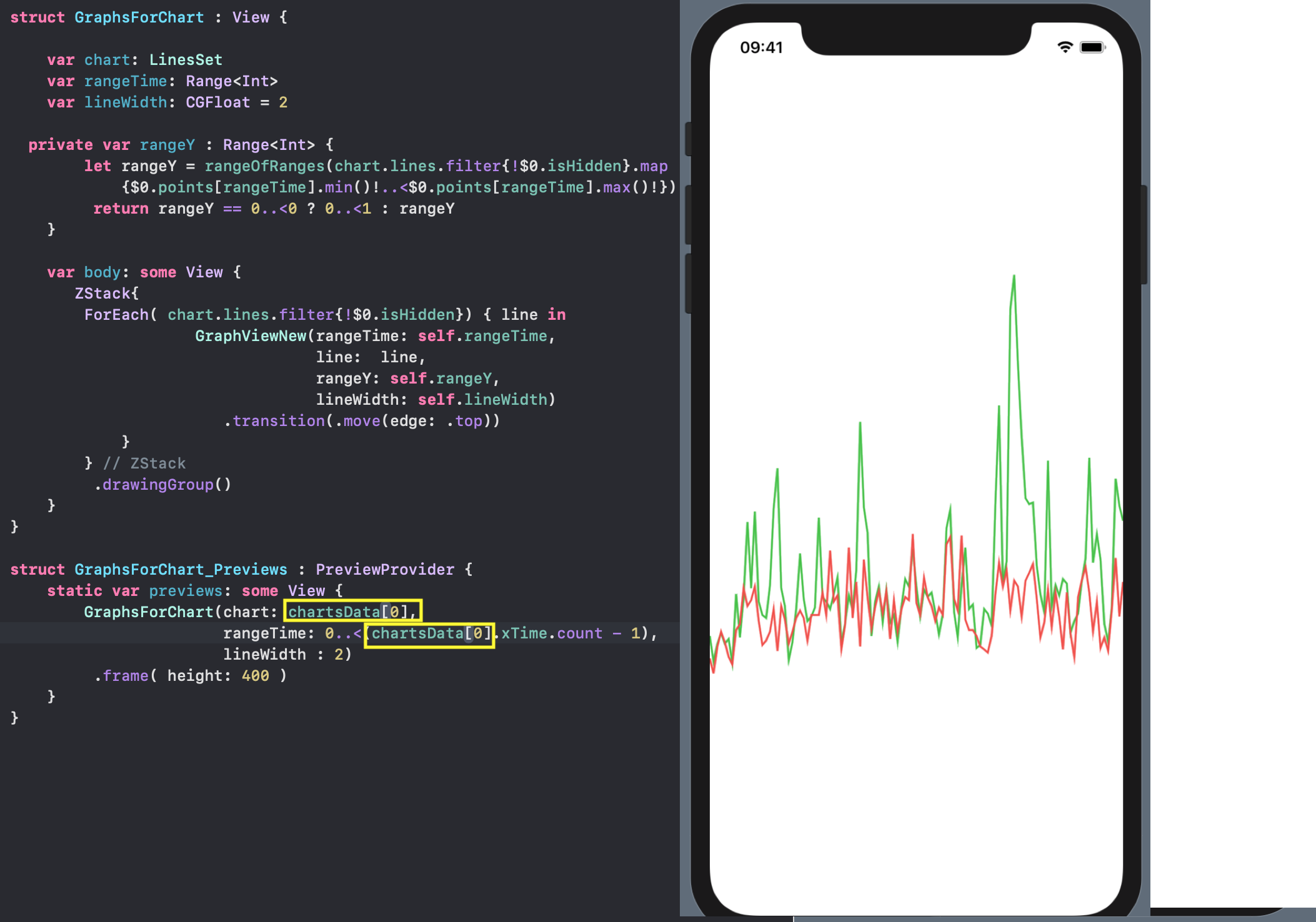
IndicatorView - horizontally moved indicator "Graphics".
This indicator allows you to get the exact values of the “Charts” and time for the corresponding point on the time on X: The indicator is created for a specific “set of Charts”
 chartand consists of a moving along the Xvertical LINE with MARKs on it in the form of “circles” in the place of the values of “Charts”. A small "POSTER" is attached to the top of this vertical line, containing the numerical values of the "Charts" and time. The indicator glides by the user using a gesture
 DragGesture: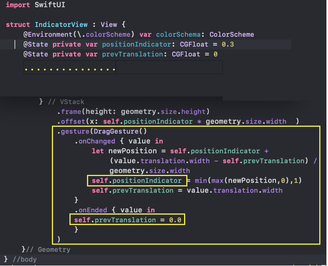 We use the so-called “incremental” gesture execution. Instead of a continuous distance from the starting point
 value.translation.width, we will onChangedconstantly receive the distance from the place where we were the last time we performed the gesture in the handler :value.translation.width - self.prevTranslation. This will provide us with a smooth movement of the indicator.To test the indicator IndicatorViewwith the help of a Previewsgiven “set of Charts”, chartwe can attract the ready-made Viewconstruction of “Charts” GraphsForChart: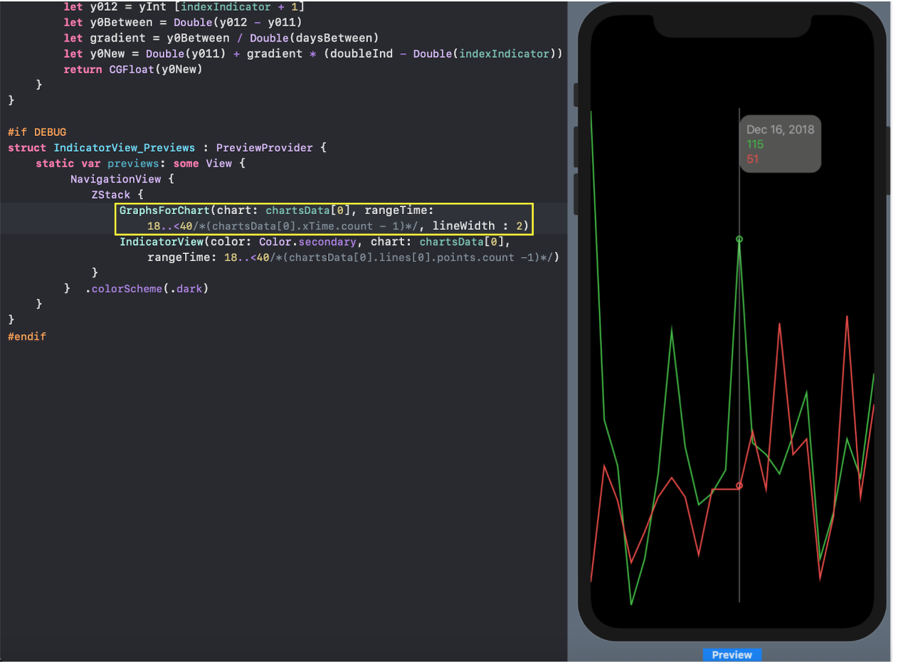 We can set any, but coordinated with each other, time range for
 rangeTimeboth the indicator IndicatorViewand “Charts” GraphsForChart. This will allow us to make sure that the "circles" indicating the values of the "Charts" are in the right places.TickerView- Xwith marks.
So far, our “Charts” are depersonalized in the sense that they DO NOT X Yhave the appropriate scales and marks. Let's draw Xwith timestamps TickerMarkViewon it. Sami mark TickerMarkVieware very simple Viewvertical stack VStackin which are arranged Pathand Text: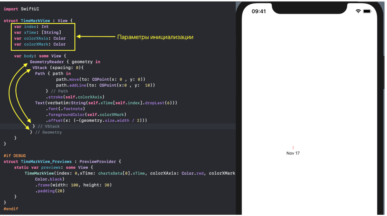 The set of marks on the time axis for a specific "Graphs set"
 chart : LineSetis formed TickerViewin accordance with the user-selected time range rangeTimeand approximate quantity of marks estimatedMarksNumber, which must be in the field of view of the user: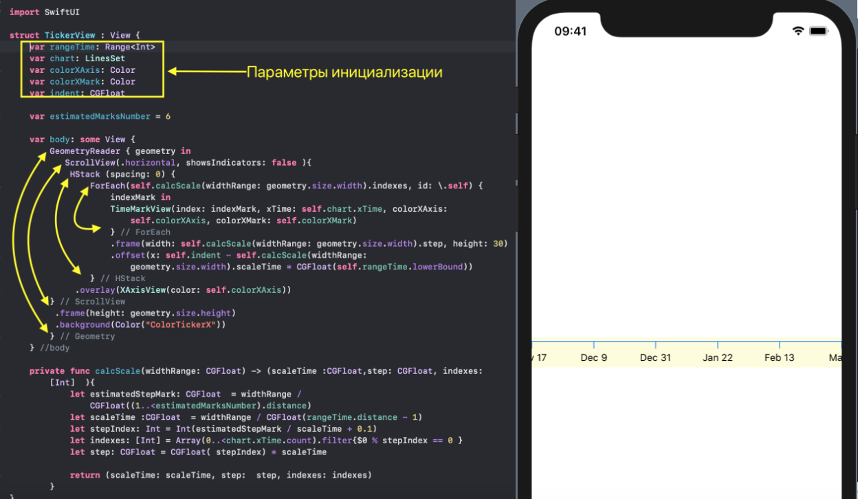 For arrangement “Running” timestamps we use a
 ScrollViewhorizontal stackHStack, which will shift as the time range changes rangeTime.In TickerViewwe form a step stepwith which time stamps appear TimeMarkView, based on a given time range rangeTimeand screen width widthRange... ... and then select timestamps in increments
 stepfrom the array chart.xTimeusing indexes indexes.Actually X- a horizontal line - we will put overlay... ... on a horizontal stack
 HStack, with timestamps TimeMarkView, which we advance with offset: In addition, we can set the colors of the
 X- itself colorXAxis, and the marks - colorXMark:
YTickerView- Ywith marks and a grid.
This one Viewdraws Ywith digital marks YMarkView. The marks themselves YMarkVieware very simple Viewwith a vertical stack VStackin which they are placed Path(horizontal line) and Textwith a number: A set of marks on
 Yfor a certain “set of Charts” chartis formed in YTickerView. The range of values is rangeYcalculated as the union of the ranges of values of all "Charts" included in this "set of Charts" using the function rangeOfRanges. The approximate number of marks on the Y-axis is set by the parameter estimatedMarksNumber: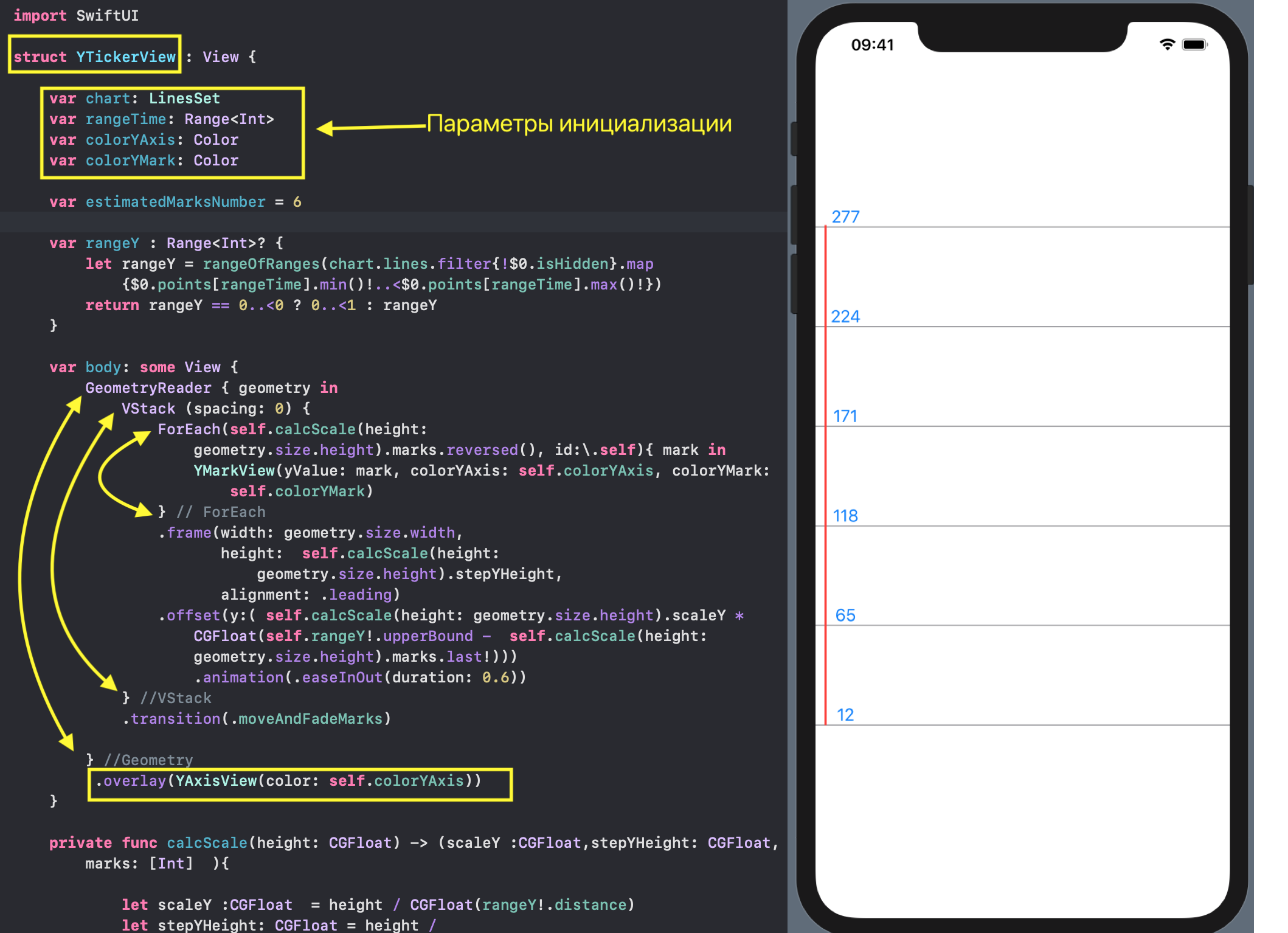
YTickerViewwe monitor the change in the range of “Graphs” values rangeY. Actually the Y-axis - the vertical line - we impose overlayon our marks ... In addition, we can set the colors of the Y - axis itself
 colorYAxis, and the - marks colorYMark: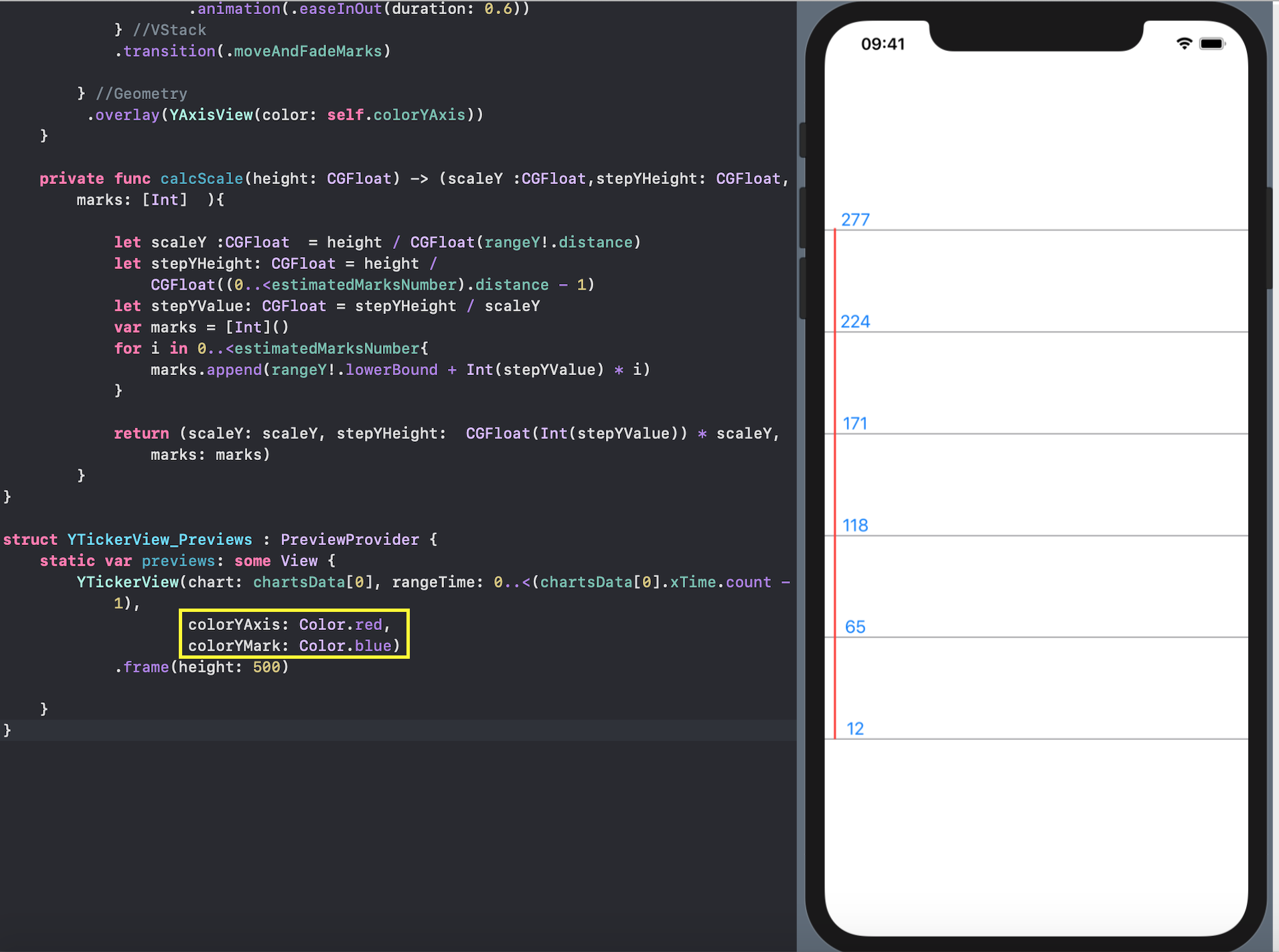
RangeView - setting the time range using the "mini-map".
The most moving part of our user interface is setting the time range ( lowerBound, upperBound) for displaying the “chart set”:
RangeViewit’s kind of mini - mapfor highlighting a certain time section for the purpose of more detailed consideration of the “chart set” in others Views.As in the previous ones View, the initial data for RangeVieware:
- the “set of Charts" itself
chart: LineSet(values Y), - height
height "mini-map" RangeView, - width
widthRange "mini-map" RangeView, - indent
indent "mini-map" RangeView.
Unlike the others discussed above Views, we must change the DragGesturetime range ( lowerBound, upperBound) with a gesture and immediately see its change, so the user-defined time range ( lowerBound, upperBound) with which we will work is stored in a variable variable @EnvironmentObject var userData: UserData: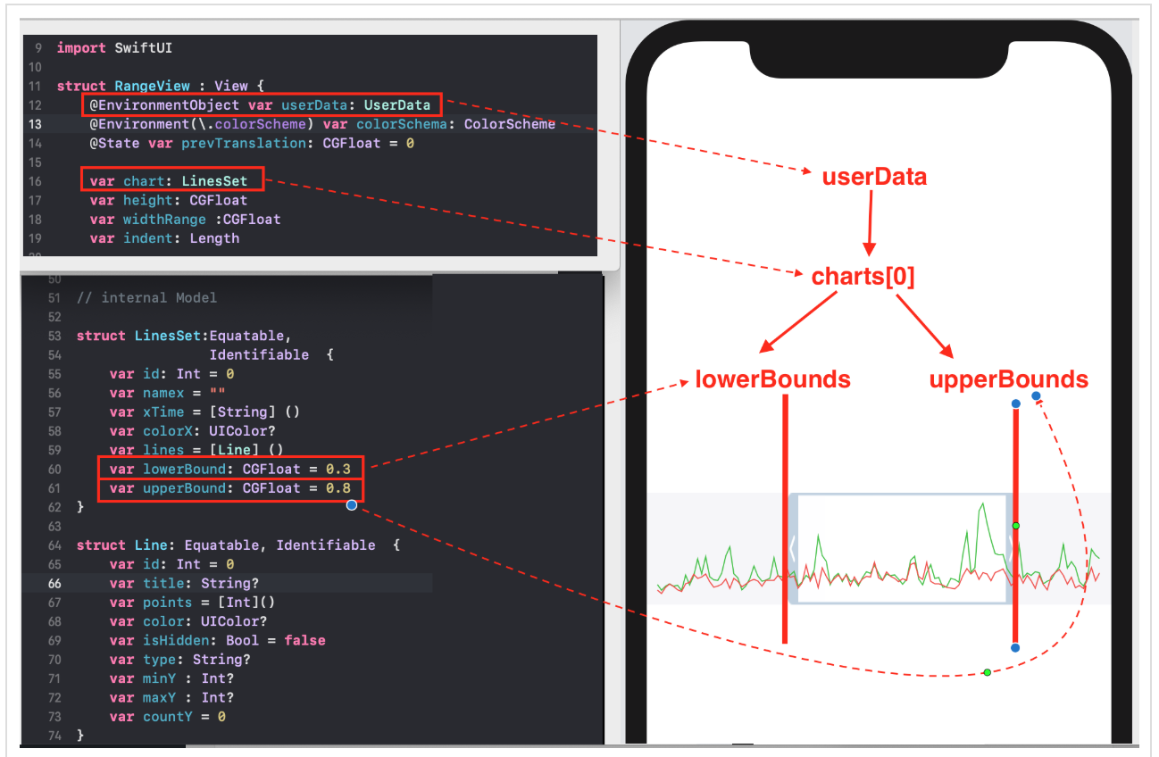 Any change to the variable
 var userDatawill lead to redrawing all Viewsthat depend on him.The main character in RangeViewis a transparent “window”, the position and size of which are regulated by the user with a gesture DragGesture:1. if we use the gesture inside a transparent “window”, the POSITION of the “window” along Xchanges, and its size does not change: 2. if we use a gesture in the left darkened part, then only the LEFT BORDER of the “window” changes
 lowerBound, allowing us to decrease or increase the width of the transparent “window”: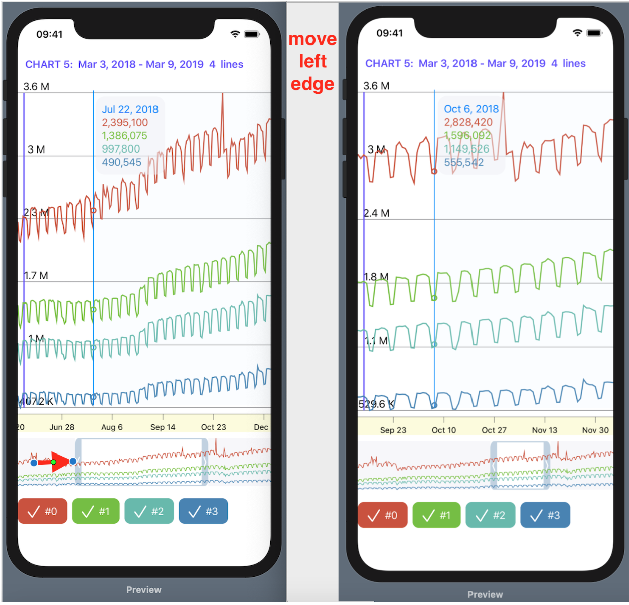 3. if we use a gesture in the right darkened part, only the RIGHT BORDER of the “window” changes
 upperBound, allowing you to decrease or increase the width of the transparent “window”:
RangeViewconsists of 3 basic very simple elements: two rectangles Rectangle ()and an image Image, the borders of which are determined by the properties lowerBoundand upperBoundfrom @EnvironmentObject var userData: UserDataand are adjusted using gestures DragGesture: We “overlay” (
 overlay) the familiar to this construction ( ) us GraphsForChartViewwith “Charts” from a given “set of Charts” chart: This will allow us to monitor how much of the “Charts” gets into the “window”.Any change in the transparent "window" (it is moved entirely or change of borders) is a consequence of changes in the properties
 lowerBoundand upperBoundin userData in the functions of onChangedsign processing DragGesturein the two boxes Rectangle ()and picture Image... This is, as we already know, will automatically lead to redrawing the other
 Views(in this case, “Charts”, X-axis with marks, Y-axis with marks and indicator c hartView): Since ours
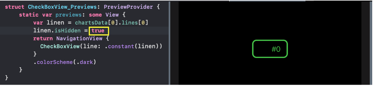
 Viewcontains a variable @EnvironmentObject userData: UserData, for previews Previews, we must set its initial value using .environmentObject (UserData()):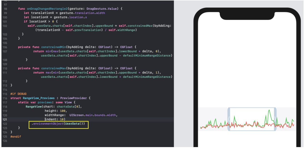
CheckMarksView - “hiding” and showing “Graphs”.
CheckMarksViewit is a horizontal stack HStackwith a row checkBoxesfor switching the properties of isHiddeneach individual “Graphics” in the “set of Graphs” chart: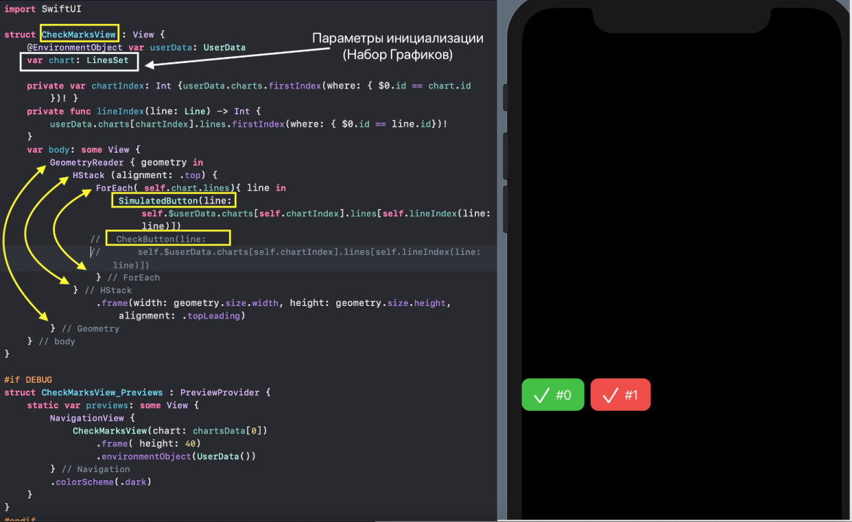
CheckBoxin our project it can be implemented either using a regular button Buttonand called CheckButton, or using a simulating button SimulatedButton. The button
 Buttonhad to be imitated because when placing several of these buttons in the Listone located higher in the hierarchy, they “refuse” to work correctly. This is a long-standing bug that has been stuck in Xcode 11 since beta 1 to the current version . The current version of the application uses a simulated button SimulatedButton.Both the simulated button SimulatedButtonand the real buttonCheckButtonuse the same thing Viewfor their "appearance" - CheckBoxView. This HStackcontaining Texand Image: Note that the initialization parameter
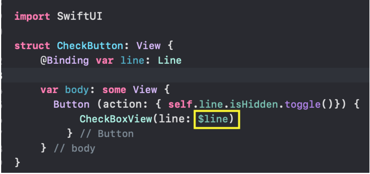
 CheckBoxViewis a @Bindingvariable var line: Line. The property of isHiddenthis variable defines the “appearance” CheckBoView: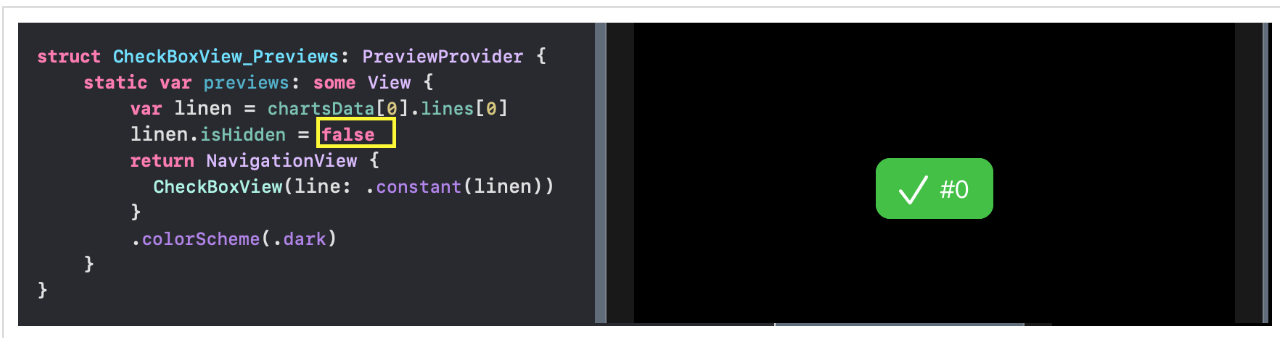
 When using
 CheckBoViewin SimulatedButtonand in, CheckButtonyou must use the sign $for lineduring initialization:
 The
The isHiddenvariable property is lineswitched in SimulatedButtonwith onTapGesture... ... and in
 CheckButton- with the usual actionbutton Button: Note that the initialization parameter for
 SimulatedButtonand is CheckButtonalso@Bindinga variable var line: Line. Therefore, their use should be applied $to the CheckMarksViewswitching variable userData.charts[self.chartIndex].lines[self.lineIndex(line: line)].isHidden, which is stored in a variable global variable @EnvironmentObject var userData: We have kept unused in the project is currently
 CheckButtonon the case, if you suddenly Applewill correct this error. In addition, you can try using CheckButtonin CheckMarksViewinstead SimulatedButtonand make sure that it does not work for the case of composing many “sets of Charts” ChartViewusing Listc ListChartsView.Since ours Viewcontains a variable @EnvironmentObject var userData: UserData, for previews Previews, we must set its initial value with .environmentObject(UserData()):
Combination of various Views.
SwiftUI- this is, first of all, a combination of various small ones Viewsinto large ones, and large ones Viewsinto very large ones, etc., as in a game Lego. In SwiftUIthere are many means of such a combination Views:- a vertical stack
VStack, - horizontal stack
HStack, - "Depth" of the stack
ZStack, - group
Group, ScrollView ,- list
List, - form
Form, - bookmark container
TabView - etc.
We start our combination with the simplest one GraphsViewForChart, which gives the “faceless” “chart set” GraphsForChartAXIS Y and an indicator moving along the X-axis using the “deep” stack ZStack: We added a
 Previewsnew GraphsViewForChartcontainer NavigationViewto our new container in order to display it in Darkmode using a modifier .collorScheme(.dark).We continue the combination and attach to the “chart set” obtained above with AXIS Y and an indicator, AXIS X in the form of a “creeping line”, as well as controls: the “mini-map” time range RangeViewand the CheckMarksView“Charts” display switches .As a result, we get the one stated above ChartView, which displays a “set of Charts” and allows you to control its display on the time axis: In this case, we perform the combination using the vertical stack
 VStack: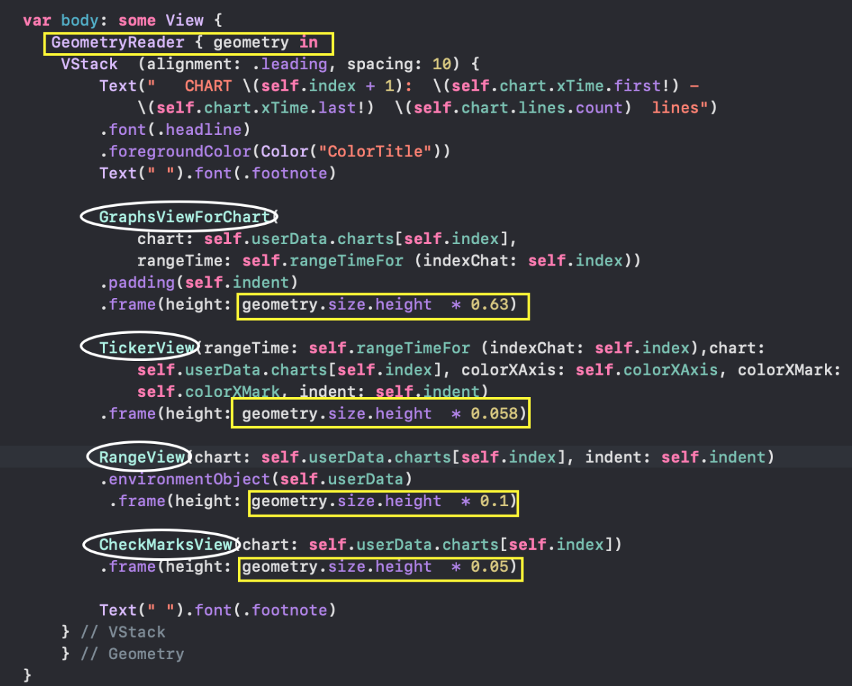 Now we will consider 3 options for combining the set of already received ChartView “Chart Sets”:
- "Scrollable table"
List, - horizontal stack
HStackwith 3D effect, ZStack superimposed "cards"
A “scrollable table” isListChartsView organized using a list List: A horizontal stack with a 3D effect is organized using a
 ScrollViewhorizontal stack HStackand a list in the form ForEach: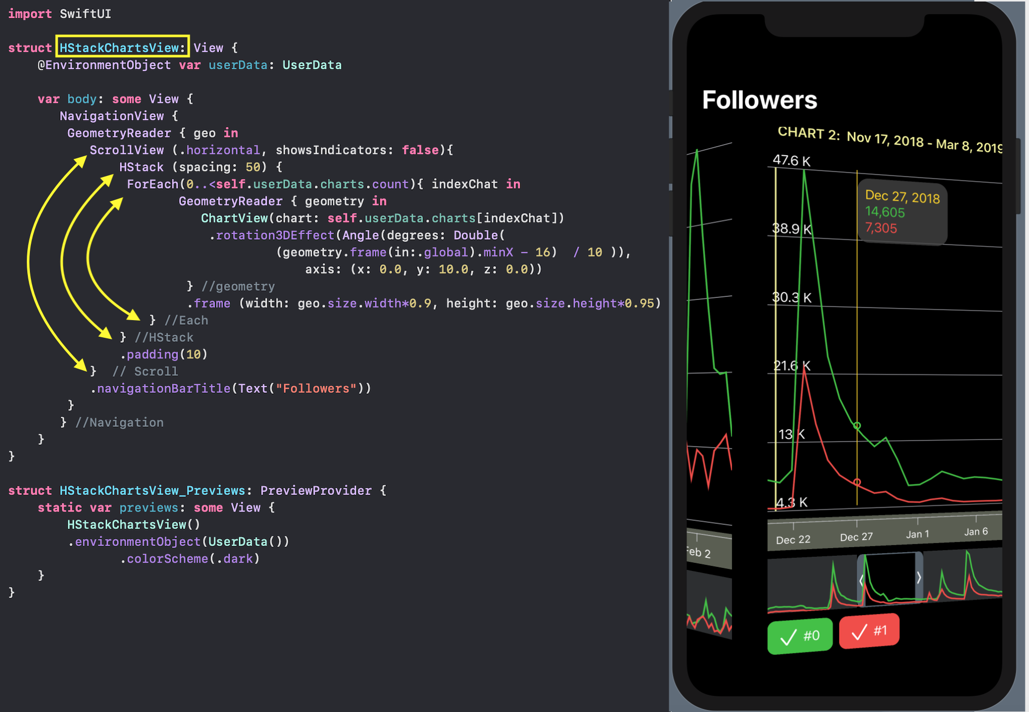 In this view, all means of user interaction work fully: moving along the timeline and changing the “scale”
 mini- map, indicator and hide buttons "Charts".ZStack superimposed "cards".
First, we create CardViewfor the “map” - this is a “set of Charts” with the AXIS X and Y, but without controls: without a “mini - map” and without buttons to control the appearance / hiding of charts. CardViewvery similar to ChartView, but since we are going to overlay “cards” on top of each other, we need them to be opaque. To this end, we use an additional ZStackcolor to be placed in the “background” cardBackgroundColor. In addition, we will make a frame with rounded edges for the “card”: Overlaid “cards” are organized using stacks
 VStack, ZStackand a list in the form ForEach: But we will overlap not just “cards” but “3D-scalable” on top of each other cards
 CardViewScalable, the size of which decreases with increasing indexindexChatand they shift a little vertically.The order of “3D-scalable cards” can be changed using the sequence ( sequenced) of gestures LongPressGestureand DragGesture, which acts only on the topmost “card” with indexChat == 0: You can click (
 LongPress) on the top “card” with a “set of Charts”, and then pull it ( Drag) down far enough to look at the next card, and if you continue to drag it down, then it “goes” to the last place in ZStack, and the next “card” comes forward: In addition, for the upper “card” we can apply
 TapGesturewhich will act along with gestures LongPressGestureand a DragGesture:
Tapa gesture will show the modal "set of graphics" ChartViewwith e ementami management RangeViewandCheckMarksView :
Application TabViewfor combining on one screen all 3 variants of the composition “chart set” ChartView.
 We have 3 bookmarks with image
 Imageand text Text, a vertical stack VStackis not needed for their joint presentation.They correspond to our 3 ways of combining “sets of Charts” ChartViews:- "Scrollable table"
ListChartViews, - horizontal stack with 3D effect
HStackChartViews, - ZStack superimposed "cards
OverlayCardsViews. "
All elements of user interaction: moving along the timeline and changing the “scale” using mini - map, indicator and buttons to hide the “Charts”. fully work in all 3 cases.The code is on Github .SwiftUI ...
You should get acquainted with video tutorials, books and blogs:Mang To , Lets Build That Application , as well as a description of some SwiftUI applications ,- a free book "SwiftUI by example" and a video www.hackingwithswift.com/quick-start/swiftui- paid book but half of it can be downloaded for free www.bigmountainstudio.com/swiftui-views-book- 100-day course with SwiftUI www.hackingwithswift.com/articles/201/start-the-100-days-of-swiftui , which starts now and will end on December 31, 2019,- impressive things in SwiftUI are done on swiftui-lab.com- Majid blog ,- on pointFree.cowww.pointfree.co the “marathon” of posts about using Reducers in SwiftUI (super interesting)is a wonderful MovieSwiftUI application that has borrowed a few ideas.