There are many different libraries for implementing a slider with all possible effects. Some of the best for React are: ReactSlick and Swiper . But when a horizontal sticky effect was required for my project, nothing suitable was found.
In this article we will try to gradually create such a slider, maybe you will need it too!
Install the required packages
We will use the Create React App to create the project .
Create an application:
npx create-react-app my-app
We will not do the slider from scratch, but take the Swiper library, there are the most suitable events for which you will need to hook up (more on that later). Then we will need to install the following packages:
npm i swiper react-id-swiper
And the last package (optional) to use the sass preprocessor:
npm i node-sass
The result is package.json:
package.json
{ "name": "sticky-slider", "version": "0.1.0", "private": true, "dependencies": { "node-sass": "^4.13.0", "react": "^16.11.0", "react-dom": "^16.11.0", "react-id-swiper": "^2.3.2", "react-scripts": "3.2.0", "swiper": "^5.2.0" }, "scripts": { "start": "react-scripts start", "build": "react-scripts build", "test": "react-scripts test", "eject": "react-scripts eject" }, "eslintConfig": { "extends": "react-app" }, "browserslist": { "production": [ ">0.2%", "not dead", "not op_mini all" ], "development": [ "last 1 chrome version", "last 1 firefox version", "last 1 safari version" ] } }
Great, now we are starting to implement the slider.
Create a simple slider
Let's start by creating a small file with our slides.
src/data.json
[ { "title": "Slide 1", "color": "#aac3bf" }, { "title": "Slide 2", "color": "#c9b1bd" }, { "title": "Slide 3", "color": "#d5a29c" }, { "title": "Slide 4", "color": "#82a7a6" }, { "title": "Slide 5", "color": "#e6af7a" }, { "title": "Slide 6", "color": "#95be9e" }, { "title": "Slide 7", "color": "#97b5c5" } ]
After that we’ll make a regular slider with default effects.
And accordingly, we create an index file for the component.
The only parameter that we described is slidesPerView (the number of visible slides). We don’t need anything else, but all possible parameters of the swiper can be found here .
Create a separate component Slide, so that the appearance of the slider is ready.
Styles for the slide.
// src/components/Slide/Slide.module.scss .container { margin: 0 1em; border-radius: 4px; overflow: hidden; background-color: #fff; } .content { box-sizing: border-box; padding: 50% 0; } .footer { color: #333; font-weight: 700; font-size: 1.25em; text-align: center; padding: 1em; }
And accordingly the index file:
And update StickySlider a bit.
Now insert this slider in App.jsx , at the same time lay the minimum page structure.
And in the corresponding scss file we will write some styles.
// App.module.scss .container { padding: 0 15px; } .title { font-weight: 700; font-size: 2.5em; text-align: center; margin: 1em 0; } .slider { margin: 0 -15px; }
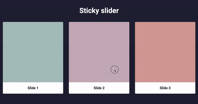
So far, we have such a slider:

Cool, a start has been made, we will continue to do what we need from this slider.
Add a sticky effect
The swiper has two setTranslate and setTransition events that setTranslate setTransition .
Add this to our StickySlider component and immediately forward it to Slider , there it will come in handy:
I advise you to move the slider and see in more detail what is displayed at this moment:
I use hooks to store state. If you are not familiar with them, I advise you to read the documentation (in Russian) .
Further, the most difficult will happen in the Slide component.
We need indentation states from the left border of the slider and the width of the current slide:
They are added once at element initialization and are not changed. Therefore we use useEffect with an empty array. At the same time, we get the parameters not of the slide itself, but its technical wrapper through parentElement , since we will convert the current wrapper using the transform property.
The most important moment. We consider this whole thing and throw it in the styles:
The translate property comes to us from the parent and it is the same for all slides. Therefore, to find an individual translate for one slide, subtract offsetLeft from it.
The variable k is a value from 0 to 1. Using this value, we will do the animation. This is a key variable, because it can be used to make any effects.
Now we compute the styles. The condition x >= -1 is fulfilled when the slide is in the animation zone, so when it is executed, we hang the styles on the side. The scale and opacity values can be selected as you wish. The following intervals seemed to me most suitable: [0.8 : 1] for scale and [0.5 : 1] for opacity .
The transition property is supplied directly from the library event.
Here's what happens after adding all of the above:
Now add and add the following properties to the slide styles file:
// src/components/Slide/Slide.module.scss .container { // ... transform-origin: 0 50%; // transition-property: opacity, transform; // , } // ...
Well, that’s it, our effect is ready! You can see the finished example on my github .
Thanks for attention!