画像でbox-shadowまたはborder-radiusプロパティを直接使用すると、ブラウザーは設定したCSSスタイルを正しく表示しない場合があります。これにより、ブロックの外観が意図したものと大きく異なります。 ただし、画像を背景として使用すると、この問題を簡単に回避できます。 この記事から、jQueryを使用して画像の完全に丸いコーナーを作成する方法、およびボックスシャドウ、境界線半径、トランジションなどのプロパティを使用して可能な他の設計方法を学習します。
デモを見る問題
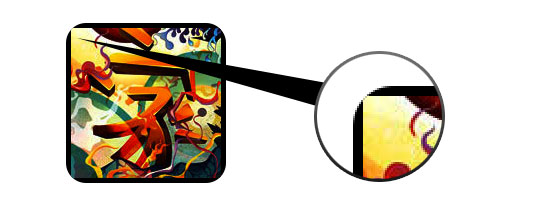
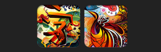
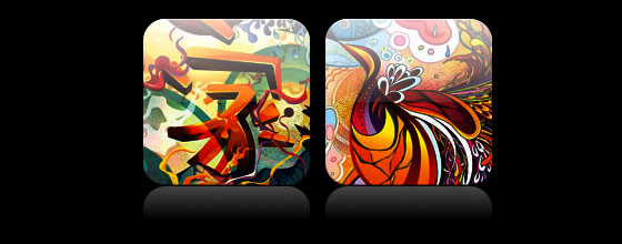
以下の例から、画像にcss-propertiesを適用するときに直面する可能性のある問題が明らかになります。 さらに、各ブラウザは完成したアイテムを独自の方法で表示します。 Firefoxは角を丸くしたくありませんが、要素に影を追加し、ChromeまたはSafariは両方を拒否します。
解決策
すべてのプロパティがすべてのブラウザで正しく機能するには、画像を背景として使用する必要があります。
<div style="background:url(image.jpg) no-repeat center center; width:150px; height:150px;"></div>
ダイナミクスを追加する
ダイナミクスを追加するには、元の画像をimage-wrapスタイルでspanタグでラップする小さなjQueryスクリプトを使用する必要があります。 スクリプトを使用すると、ソース画像の背景も作成され、幅と高さが設定されます。
<script type="text/javascript" src="http://ajax.googleapis.com/ajax/libs/jquery/1.5/jquery.min.js"></script> <script type="text/javascript"> $(document).ready(function(){ $("img").load(function() { $(this).wrap(function(){ return '<span class="image-wrap ' + $(this).attr('class') + '" style="position:relative; display:inline-block; background:url(' + $(this).attr('src') + ') no-repeat center center; width: ' + $(this).width() + 'px; height: ' + $(this).height() + 'px;" />'; }); $(this).css("opacity","0"); }); }); </script>
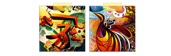
適用後、次の結果が得られます。
<span class="image-wrap" style="position:relative; display:inline-block; background:url(image.jpg) no-repeat center center; width:150px; height:150px;"> <img src="image.jpg" style="opacity:0;"> </span>
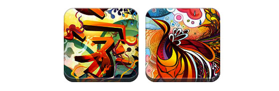
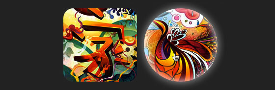
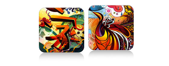
これで画像が背景として使用されたので、任意のスタイルを要素に追加できます。 以下は、画像の角を丸くする、円効果を作成する、影やその他の設計手法を追加する例です。
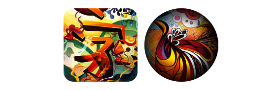
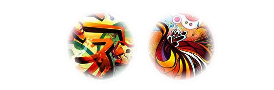
サークル効果円を作成するシンプルな効果。
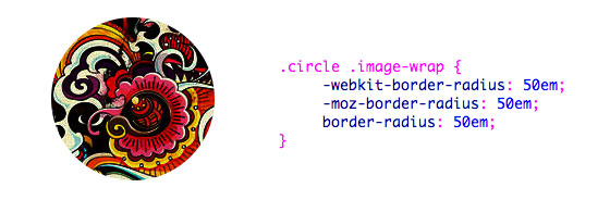
.circle .image-wrap { -webkit-border-radius: 50em; -moz-border-radius: 50em; border-radius: 50em; }
丸い角角が丸く、影を追加する例。
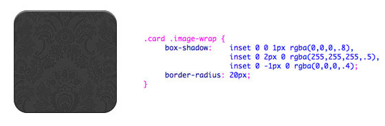
.card .image-wrap { -webkit-box-shadow: inset 0 0 1px rgba(0,0,0,.8), inset 0 2px 0 rgba(255,255,255,.5), inset 0 -1px 0 rgba(0,0,0,.4); -moz-box-shadow: inset 0 0 1px rgba(0,0,0,.8), inset 0 2px 0 rgba(255,255,255,.5), inset 0 -1px 0 rgba(0,0,0,.4); box-shadow: inset 0 0 1px rgba(0,0,0,.8), inset 0 2px 0 rgba(255,255,255,.5), inset 0 -1px 0 rgba(0,0,0,.4); -webkit-border-radius: 20px; -moz-border-radius: 20px; border-radius: 20px; }
エンボススタイル画像の下部に小さな突起(レリーフ)を追加します。
.embossed .image-wrap { -webkit-box-shadow: inset 0 0 2px rgba(0,0,0,.8), inset 0 2px 0 rgba(255,255,255,.5), inset 0 -7px 0 rgba(0,0,0,.6), inset 0 -9px 0 rgba(255,255,255,.3); -moz-box-shadow: inset 0 0 2px rgba(0,0,0,.8), inset 0 2px 0 rgba(255,255,255,.5), inset 0 -7px 0 rgba(0,0,0,.6), inset 0 -9px 0 rgba(255,255,255,.3); box-shadow: inset 0 0 2px rgba(0,0,0,.8), inset 0 2px 0 rgba(255,255,255,.5), inset 0 -7px 0 rgba(0,0,0,.6), inset 0 -9px 0 rgba(255,255,255,.3); -webkit-border-radius: 20px; -moz-border-radius: 20px; border-radius: 20px; }
エンボススムージングスタイル同じ効果ですが、1pxの下の境界線がぼやけています。

.soft-embossed .image-wrap { -webkit-box-shadow: inset 0 0 4px rgba(0,0,0,1), inset 0 2px 1px rgba(255,255,255,.5), inset 0 -9px 2px rgba(0,0,0,.6), inset 0 -12px 2px rgba(255,255,255,.3); -moz-box-shadow: inset 0 0 4px rgba(0,0,0,1), inset 0 2px 1px rgba(255,255,255,.5), inset 0 -9px 2px rgba(0,0,0,.6), inset 0 -12px 2px rgba(255,255,255,.3); box-shadow: inset 0 0 4px rgba(0,0,0,1), inset 0 2px 1px rgba(255,255,255,.5), inset 0 -9px 2px rgba(0,0,0,.6), inset 0 -12px 2px rgba(255,255,255,.3); -webkit-border-radius: 20px; -moz-border-radius: 20px; border-radius: 20px; }
埋め込みスタイルbox-shadowプロパティを使用すると、平面に埋め込まれた画像の効果を作成できます。
.cut-out .image-wrap { -webkit-box-shadow: 0 1px 0 rgba(255,255,255,.2), inset 0 4px 5px rgba(0,0,0,.6), inset 0 1px 0 rgba(0,0,0,.6); -moz-box-shadow: 0 1px 0 rgba(255,255,255,.2), inset 0 4px 5px rgba(0,0,0,.6), inset 0 1px 0 rgba(0,0,0,.6); box-shadow: 0 1px 0 rgba(255,255,255,.2), inset 0 4px 5px rgba(0,0,0,.6), inset 0 1px 0 rgba(0,0,0,.6); -webkit-border-radius: 20px; -moz-border-radius: 20px; border-radius: 20px; }
モーフとハイライトこの例では、遷移プロパティを追加します。 マウスをホバーすると、画像が強調表示され、その形状が円に変わります。 ハイライト効果は、box-shadowプロパティのおかげで作成されます。
.morphing-glowing .image-wrap { -webkit-transition: 1s; -moz-transition: 1s; transition: 1s; -webkit-border-radius: 20px; -moz-border-radius: 20px; border-radius: 20px; } .morphing-glowing .image-wrap:hover { -webkit-box-shadow: 0 0 20px rgba(255,255,255,.6), inset 0 0 20px rgba(255,255,255,1); -moz-box-shadow: 0 0 20px rgba(255,255,255,.6), inset 0 0 20px rgba(255,255,255,1); box-shadow: 0 0 20px rgba(255,255,255,.6), inset 0 0 20px rgba(255,255,255,1); -webkit-border-radius: 60em; -moz-border-radius: 60em; border-radius: 60em; }
光沢効果画像の上にグラデーションオーバーレイを使用した例。 これは、疑似要素の後:を使用して実現されます。
.glossy .image-wrap { -webkit-box-shadow: inset 0 -1px 0 rgba(0,0,0,.5); -moz-box-shadow: inset 0 -1px 0 rgba(0,0,0,.5); box-shadow: inset 0 -1px 0 rgba(0,0,0,.5); -webkit-border-radius: 20px; -moz-border-radius: 20px; border-radius: 20px; } .glossy .image-wrap:after { position: absolute; content: ' '; width: 100%; height: 50%; top: 0; left: 0; -webkit-border-radius: 20px; -moz-border-radius: 20px; border-radius: 20px; background: linear-gradient(top, rgba(255,255,255,0.7) 0%,rgba(255,255,255,.1) 100%); background: -moz-linear-gradient(top, rgba(255,255,255,0.7) 0%, rgba(255,255,255,.1) 100%); background: -webkit-gradient(linear, left top, left bottom, color-stop(0%,rgba(255,255,255,0.7)), color-stop(100%,rgba(255,255,255,.1))); }
反射効果グラデーションを使用した別の例ですが、今回は反射効果を作成します。
.reflection .image-wrap:after { position: absolute; content: ' '; width: 100%; height: 30px; bottom: -31px; left: 0; -webkit-border-top-left-radius: 20px; -webkit-border-top-right-radius: 20px; -moz-border-radius-topleft: 20px; -moz-border-radius-topright: 20px; border-top-left-radius: 20px; border-top-right-radius: 20px; background: -moz-linear-gradient(top, rgba(0,0,0,.3) 0%, rgba(255,255,255,0) 100%); background: linear-gradient(top, rgba(0,0,0,.3) 0%,rgba(255,255,255,0) 100%); background: -webkit-gradient(linear, left top, left bottom, color-stop(0%,rgba(0,0,0,.3)), color-stop(100%,rgba(255,255,255,0))); } .reflection .image-wrap:hover { position: relative; top: -8px; }
光沢と反射上記の2つの効果を組み合わせます。
.glossy-reflection .image-wrap { -webkit-box-shadow: inset 0 -1px 0 rgba(0,0,0,.5), inset 0 1px 0 rgba(255,255,255,.6); -moz-box-shadow: inset 0 -1px 0 rgba(0,0,0,.5), inset 0 1px 0 rgba(255,255,255,.6); box-shadow: inset 0 -1px 0 rgba(0,0,0,.5), inset 0 1px 0 rgba(255,255,255,.6); -webkit-transition: 1s; -moz-transition: 1s; transition: 1s; -webkit-border-radius: 20px; -moz-border-radius: 20px; border-radius: 20px; } .glossy-reflection .image-wrap:before { position: absolute; content: ' '; width: 100%; height: 50%; top: 0; left: 0; -webkit-border-radius: 20px; -moz-border-radius: 20px; border-radius: 20px; background: linear-gradient(top, rgba(255,255,255,0.7) 0%,rgba(255,255,255,.1) 100%); background: -moz-linear-gradient(top, rgba(255,255,255,0.7) 0%, rgba(255,255,255,.1) 100%); background: -webkit-gradient(linear, left top, left bottom, color-stop(0%,rgba(255,255,255,0.7)), color-stop(100%,rgba(255,255,255,.1))); } .glossy-reflection .image-wrap:after { position: absolute; content: ' '; width: 100%; height: 30px; bottom: -31px; left: 0; -webkit-border-top-left-radius: 20px; -webkit-border-top-right-radius: 20px; -moz-border-radius-topleft: 20px; -moz-border-radius-topright: 20px; border-top-left-radius: 20px; border-top-right-radius: 20px; background: linear-gradient(top, rgba(230,230,230,.3) 0%, rgba(230,230,230,0) 100%); background: -moz-linear-gradient(top, rgba(230,230,230,.3) 0%, rgba(230,230,230,0) 100%); background: -webkit-gradient(linear, left top, left bottom, color-stop(0%,rgba(230,230,230,.3)), color-stop(100%,rgba(230,230,230,0))); }
リボン効果擬似要素の後:を使用して、画像の上部にリボン効果を作成します。
.tape .image-wrap { -webkit-box-shadow: inset 0 0 2px rgba(0,0,0,.7), inset 0 2px 0 rgba(255,255,255,.3), inset 0 -1px 0 rgba(0,0,0,.5), 0 1px 3px rgba(0,0,0,.4); -moz-box-shadow: inset 0 0 2px rgba(0,0,0,.7), inset 0 2px 0 rgba(255,255,255,.3), inset 0 -1px 0 rgba(0,0,0,.5), 0 1px 3px rgba(0,0,0,.4); box-shadow: inset 0 0 2px rgba(0,0,0,.7), inset 0 2px 0 rgba(255,255,255,.3), inset 0 -1px 0 rgba(0,0,0,.5), 0 1px 3px rgba(0,0,0,.4); } .tape .image-wrap:after { position: absolute; content: ' '; width: 60px; height: 25px; top: -10px; left: 50%; margin-left: -30px; border: solid 1px rgba(137,130,48,.2); -webkit-box-shadow: inset 0 1px 0 rgba(255,255,255,.3), 0 1px 0 rgba(0,0,0,.2); background: linear-gradient(top, rgba(254,243,127,.6) 0%,rgba(240,224,54,.6) 100%); background: -moz-linear-gradient(top, rgba(254,243,127,.6) 0%, rgba(240,224,54,.6) 100%); background: -webkit-gradient(linear, left top, left bottom, color-stop(0%,rgba(254,243,127,.6)), color-stop(100%,rgba(240,224,54,.6))); }
モーフィングと調色画像にカーソルを合わせると、擬似要素の後:を使用して放射状グラデーションを追加します。
.morphing-tinting .image-wrap { position: relative; -webkit-transition: 1s; -moz-transition: 1s; transition: 1s; -webkit-border-radius: 20px; -moz-border-radius: 20px; border-radius: 20px; } .morphing-tinting .image-wrap:hover { -webkit-border-radius: 30em; -moz-border-radius: 30em; border-radius: 30em; } .morphing-tinting .image-wrap:after { position: absolute; content: ' '; width: 100%; height: 100%; top: 0; left: 0; -webkit-transition: 1s; -moz-transition: 1s; transition: 1s; -webkit-border-radius: 30em; -moz-border-radius: 30em; border-radius: 30em; } .morphing-tinting .image-wrap:hover:after { background: -webkit-gradient(radial, 50% 50%, 40, 50% 50%, 80, from(rgba(0,0,0,0)), to(rgba(0,0,0,1))); background: -moz-radial-gradient(50% 50%, circle, rgba(0,0,0,0) 40px, rgba(0,0,0,1) 80px); }
サークルぼかし効果放射状グラデーションは、滑らかなエッジの効果を作成するためのマスクとしても使用できます。
.feather .image-wrap { position: relative; -webkit-border-radius: 30em; -moz-border-radius: 30em; border-radius: 30em; } .feather .image-wrap:after { position: absolute; content: ' '; width: 100%; height: 100%; top: 0; left: 0; background: -webkit-gradient(radial, 50% 50%, 50, 50% 50%, 70, from(rgba(255,255,255,0)), to(rgba(255,255,255,1))); background: -moz-radial-gradient(50% 50%, circle, rgba(255,255,255,0) 50px, rgba(255,255,255,1) 70px); }
デモを見るブラウザー間の互換性
これらの例はすべてのブラウザ(Chrome、Firefox、Safari)で動作し、境界線半径、ボックスシャドウ、擬似要素の前と後をサポートしています。 他のブラウザでは、画像が表示されるだけで、効果はありません。