こんにちは、ハブラドラッグ! 今日は、CSS3ボリュームボタンの作成方法を学びます! これらは、Orman ClarkのPremium Pixels Webサイトで人気のある
PSD景品に基づいています。 最小限のHTMLコードでCSSを使用してこれらのボタンのコピーを作成しようとします。
 著者注:オーマンは、私たちが彼の景品のいずれかをエンコードすることを親切に許可してくれたので、将来、より多くのチュートリアルを期待してください!デモを見る
ステップ1: HTMLドキュメントを作成する
新しいHTMLドキュメントを作成することから始めます。
HTML5ボイラープレートに基づいているため、出発点として便利です。 次に、リンクを含むリストを追加します。 それは基本的にそれです。余分なdivとspanを使用しないCSS3に感謝します。
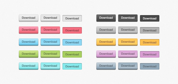
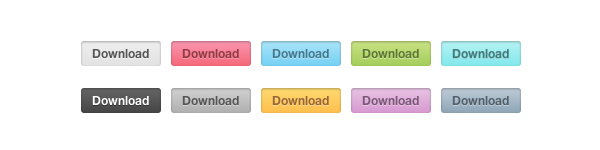
リスト内の各アイテムに対して、「ボタン」のクラスを割り当てます。 また、Ormanは異なる色を使用したため、各ボタンにクラスの形式で独自の色を割り当てます。
<ul class="buttons"> <li><a href="#" class="button gray">Download</a></li> <li><a href="#" class="button pink">Download</a></li> <li><a href="#" class="button blue">Download</a></li> <li><a href="#" class="button green">Download</a></li> <li><a href="#" class="button turquoise">Download</a></li> <li><a href="#" class="button black">Download</a></li> <li><a href="#" class="button darkgray">Download</a></li> <li><a href="#" class="button yellow">Download</a></li> <li><a href="#" class="button purple">Download</a></li> <li><a href="#" class="button darkblue">Download</a></li> </ul>
この段階で必要なのはそれだけです。
ステップ2:基本的なCSSルール
グラデーション、丸い角などを扱う前に、基本的なルールに注意する必要があります。 特別なものは何もありません、単純なCSS2:
ul { list-style: none; } a.button { display: block; float: left; position: relative; height: 25px; width: 80px; margin: 0 10px 18px 0; text-decoration: none; font: 12px "Helvetica Neue", Helvetica, Arial, sans-serif; font-weight: bold; line-height: 25px; text-align: center; }
次に、さまざまな色のルールを適用します。 たとえば、グレーの場合。 他の色はすべてデモで見ることができます。
.gray, .gray:hover { color: #555; border-bottom: 4px solid #b2b1b1; background: #eee; .gray:hover { background: #e2e2e2; } }
このようなものを取得する必要があります。 2008年の庭にいる場合、それはかなり堅実に見えます
ステップ3:ダブルフレーム!
最終結果を注意深く見ると、ボタンの周囲全体に細い線が配置されていることがわかります。 この効果を実装するには、疑似要素
:beforeおよび
:afterを使用します。
a.button { display: block; float: left; position: relative; height: 25px; width: 80px; margin: 0 10px 18px 0; text-decoration: none; font: 12px "Helvetica Neue", Helvetica, Arial, sans-serif; font-weight: bold; line-height: 25px; text-align: center; } a.button:before, a.button:after { content: ''; position: absolute; left: -1px; height: 25px; width: 80px; bottom: -1px; } a.button:before { height: 23px; bottom: -4px; border-top: 0; }
色を追加すると、ボタンの見た目が良くなります。
.gray, .gray:hover { color: #555; border-bottom: 4px solid #b2b1b1; background: #eee; } .gray:before, .gray:after { border: 1px solid #cbcbcb; border-bottom: 1px solid #a5a5a5; } .gray:hover { background: #e2e2e2; }
ステップ4: CSS3のちょっとした魔法
では、CSS3のすぐ前の部分に取りかかりましょう。 丸い角から始めましょう:
a.button { display: block; float: left; position: relative; height: 25px; width: 80px; margin: 0 10px 18px 0; text-decoration: none; font: 12px "Helvetica Neue", Helvetica, Arial, sans-serif; font-weight: bold; line-height: 25px; text-align: center; -webkit-border-radius: 3px; -moz-border-radius: 3px; border-radius: 3px; }
当然、
:: beforeおよび
:after要素にも丸い角が必要です。
a.button:before, a.button:after { content: ''; position: absolute; left: -1px; height: 25px; width: 80px; bottom: -1px; -webkit-border-radius: 3px; -moz-border-radius: 3px; border-radius: 3px; } a.button:before { height: 23px; bottom: -4px; border-top: 0; -webkit-border-radius: 0 0 3px 3px; -moz-border-radius: 0 0 3px 3px; border-radius: 0 0 3px 3px; -webkit-box-shadow: 0 1px 1px 0px #bfbfbf; -moz-box-shadow: 0 1px 1px 0px #bfbfbf; box-shadow: 0 1px 1px 0px #bfbfbf; }
最後に、テキストにグラデーション、内側の影、影を適用します。 IE6のバグを回避するために、state:visitedを追加します。
a.gray, a.gray:hover, a.gray:visited { color: #555; border-bottom: 4px solid #b2b1b1; text-shadow: 0px 1px 0px #fafafa; background: #eee; background: -webkit-gradient(linear, left top, left bottom, from(#eee), to(#e2e2e2)); background: -moz-linear-gradient(top, #eee, #e2e2e2); box-shadow: inset 1px 1px 0 #f5f5f5; } .gray:before, .gray:after { border: 1px solid #cbcbcb; border-bottom: 1px solid #a5a5a5; } .gray:hover { background: #e2e2e2; background: -webkit-gradient(linear, left top, left bottom, from(#e2e2e2), to(#eee)); background: -moz-linear-gradient(top, #e2e2e2, #eee); }
最終結果はそれほど悪くありません!
ステップ5:何も忘れていませんか?
その設計では、オーマンは状態も提供しました:アクティブ。 したがって、コードに追加するだけです。
コードのこの部分をさまざまな色のルールの下に配置します。
a.button:active { border: none; bottom: -4px; margin-bottom: 22px; -webkit-box-shadow: 0 1px 1px #fff; -moz-box-shadow: 0 1px 1px #fff; box-shadow: 1px 1px 0 #fff, inset 0 1px 1px rgba(0, 0, 0, 0.3); } a.button:active:before, a.button:active:after { border: none; -webkit-box-shadow: none; -moz-box-shadow: none; box-shadow: none; }
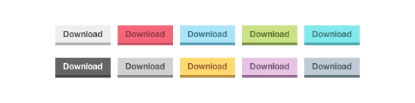
取得するものは次のとおりです。
ステップ6(オプション):古いブラウザー
そのため、最新のすべてのブラウザーで動作するCSS3ボタンを作成しました。 しかし、Internet Explorer 8以下についてはどうでしょう。 これらのブラウザは、テキストまたはグラデーションの影をサポートしていません。
この問題を解決するために、ブラウザがCSS3とHTML5をサポートしているかどうかを判断できるjavascriptライブラリ
Modernizrを使用できます。 ライブラリは問題を修正せず、代替スタイルのみを提供します。
まず、巨大なjavascriptを保持しないように、Modernizrの独自バージョンを作成します。 これは
彼らのウェブサイトで行うことができます。 ドキュメントにjavascriptを挿入したら、別のスタイルのさまざまなクラスのルールを定義する必要があります。 境界半径とグラデーションをサポートしていないブラウザには画像を使用します。
.no-cssgradients a.button, .no-cssgradients a.button:visited, .no-borderradius a.button, .no-borderradius a.button:visited, .no-generatedcontent a.button, .no-generatedcontent a.button:visited { background: url(images/sprite.png) no-repeat 0 0px; height: 32px; width: 82px; } .no-cssgradients a.button:hover, .no-borderradius a.button:hover, .no-generatedcontent a.button:hover { background: url(images/sprite.png) no-repeat 0 -32px; } .no-cssgradients a.button:active, .no-borderradius a.button:active, .no-generatedcontent a.button:active { background: url(images/sprite.png) no-repeat 0 -64px; bottom: 0; line-height: 35px; } .no-cssgradients a.gray, .no-cssgradients a.gray:visited, .no-cssgradients a.gray:hover { background-position-x: 0; } .no-cssgradients a.pink, .no-cssgradients a.pink:visited, .no-cssgradients a.pink:hover { background-position-x: -82px; } .no-cssgradients a.blue, .no-cssgradients a.blue:visited, .no-cssgradients a.blue:hover { background-position-x: -164px; } .no-cssgradients a.green,, .no-cssgradients a.green:visited, .no-cssgradients a.green:hover { background-position-x: -246px; } .no-cssgradients a.turquoise, .no-cssgradients a.turquoise:visited, .no-cssgradients a.turquoise:hover { background-position-x: -328px; } .no-cssgradients a.black, .no-cssgradients a.black:visited, .no-cssgradients a.black:hover { background-position-x: -410px; } .no-cssgradients a.darkgray, .no-cssgradients a.darkgray:visited, .no-cssgradients a.darkgray:hover { background-position-x: -492px; } .no-cssgradients a.yellow, .no-cssgradients a.yellow:visited, .no-cssgradients a.yellow:hover { background-position-x: -574px; } .no-cssgradients a.purple, .no-cssgradients a.purple:visited, .no-cssgradients a.purple:hover { background-position-x: -656px; } .no-cssgradients a.darkblue, .no-cssgradients a.darkblue:visited, .no-cssgradients a.darkblue:hover { background-position-x: -738px; } .no-cssgradients a.button, .no-cssgradients a.button:visited, .no-cssgradients a.button:hover, .no-cssgradients a.button:before, .no-cssgradients a.button:after, .no-borderradius a.button, .no-borderradius a.button:visited, .no-borderradius a.button:hover, .no-borderradius a.button:before, .no-borderradius a.button:after, .no-generatedcontent a.button, .no-generatedcontent a.button:visited, .no-generatedcontent a.button:hover, .no-generatedcontent a.button:before, .no-generatedcontent a.button:after { border: 0; }
おわりに
このようにして、クロスブラウザCSS3ボタンができました。 10個のボタンにはコードが多すぎることがわかるかもしれませんが、これはCSS3が可能または不可能な単なるデモンストレーションです。 あなたはそれで何でもできます! 私のレッスンがお役に立てば幸いです。ご清聴ありがとうございました!
デモ |
ソース |
JSFIDDLEPS喜んで翻訳に関するすべてのコメントを聞く準備ができました。