CSS3の新トピックである
マルチカラム、フレックスボックス、グリッドレイアウトの続きで、シンプルで明確な例を使用して、マルチ
カラムプロパティに深く没入した記事を翻訳することをお勧めします。
新聞や雑誌で実際に証明されているように、いくつかの列に分けられたテキストはずっと簡単に知覚されます。 最近まで、このような方法でWebページにコンテンツを表示することは問題でした;レイアウト設計者がテキストをいくつかのdivに分割するようになりました。 ただし、CSS3 Multi Column Moduleを使用すると、作業がはるかに簡単になります。
公式仕様 、
ブラウザサポート 。
複数列のコンテンツを作成する
HTML5
記事タグを使用します。
<article> Lorem ipsum dolor sit amet, consectetur adipiscing elit. Nunc libero magna, venenatis quis aliquet et, rutrum in augue. Donec vel tempor dolor. Donec volutpat fringilla porta. Suspendisse non nulla tortor. Quisque commodo ornare mi, sit amet aliquet justo bibendum non. Integer bibendum convallis sapien, sit amet tincidunt orci placerat in. Integer vitae consequat augue. // .. </article>
テキストを2列に分割します。
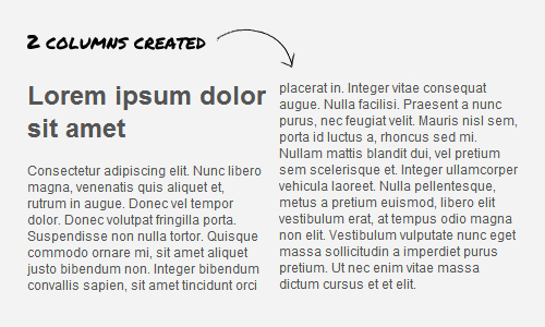
article { -webkit-column-count:2; -moz-column-count:2; column-count:2; }
列幅プロパティを使用して、列を必要な幅に設定できます。
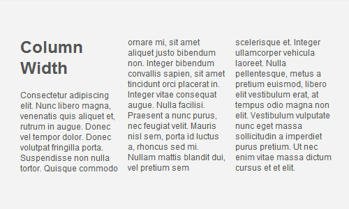
article { -moz-column-width: 150px; -webkit-column-width: 150px; column-width: 150px; }
列間隔
間隔はpxまたはemの
column-gapプロパティによって設定され、負にはできません。
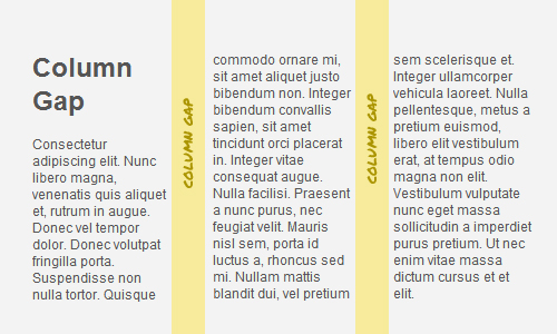
article { -webkit-column-gap: 30px; -moz-column-gap: 30px; column-gap: 30px; }
列区切り
column-ruleプロパティを使用すると、列間にセパレータを追加できます。操作の原理は
borderに似てい
ます 。
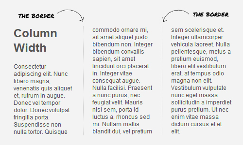
article { -moz-column-rule: 1px dotted #ccc; -webkit-column-rule: 1px dotted #ccc; column-rule: 1px dotted #ccc; }
列の関連付け
column-spanプロパティは、目的の列を組み合わせた
tableの colspanと同様に
機能します。
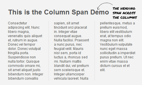
article h1 { -webkit-column-span: all; column-span:all; }
+
ソースコード 。
まとめ
CSS3 Multi Column Moduleのおかげで、テキストを非常に簡単かつ迅速に人間が読める列に分割できます。 サポートされているブラウザのリストは、作業中のプロジェクトで複数列を試すのに十分です。 レガシーブラウザの場合、特別な
javascriptライブラリを使用できます。