通常の影は、box-shadowまたはtext-shadowを使用して簡単に実装できます。 しかし、内側の影を作る必要がある場合はどうでしょうか? この記事では、ほんの数行のコードでこのような影を作成する方法について説明します。
構文
まず、CSSに影を実装する2つの主な方法を見てみましょう。
箱影
box-shadowコンストラクトには、いくつかの異なる値が含まれます。
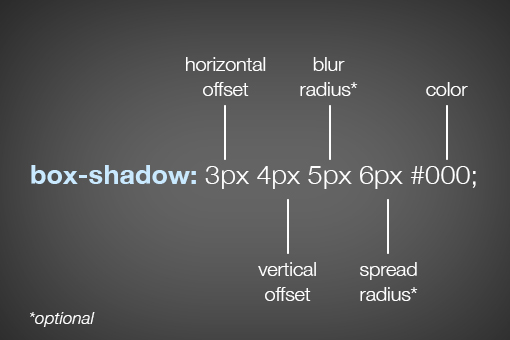 水平オフセット
と
垂直オフセット -それぞれ
水平オフセットと
垂直オフセット 。 これらの値は、オブジェクトが影を落とす方向を示します。
 ぼかし半径
ぼかし半径と
広がり半径は少し複雑です。 彼らの違いは何ですか?
ぼかしの半径の値が異なる2つの要素の例を見てみましょう。
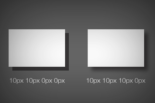
影の端がぼやけています。
スプレッド半径の値が異なると、次のことがわかります。

この場合、影が広い範囲に散らばっていることがわかります。
blur radiusと
spread radiusの値を指定しない場合、それらは0になります。
テキスト影
構文は
box-shadowに非常に似てい
ます :

値は似ていますが、
spread-shadowはありません。 使用例:

ボックスシャドウのインセット
オブジェクト内の影を「回転」させるには、CSSに
インセットを追加する必要があります。
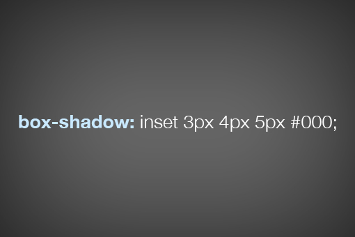
ボックスシャドウの基本的な構文を理解したので、内部シャドウの実装方法を理解するのは非常に簡単です。 値は同じで、色を追加できます(RGBを16進数):

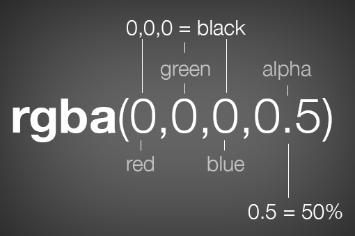
RGBカラー、アルファ値は影の透明度に関与します:
影のある画像
画像に内側の影を追加することは、通常の
divよりも少し複雑です。 はじめに、通常の画像コードを次に示します。
<img src="1450826938745827786460" alt="airplane">
次のようなシャドウを追加できると想定するのは論理的です。
img { box-shadow: inset 0px 0px 10px rgba(0,0,0,0.5); }
しかし、影は見えません:

この問題を解決するにはいくつかの方法があり、それぞれに長所と短所があります。 それらのうちの2つを検討してください。 最初の方法は、画像を通常の
divにラップすることです。
<div> <img src="1450826938745827786460" alt="airplane"> </div>
div { height: 200px; width: 400px; box-shadow: inset 0px 0px 10px rgba(0,0,0,0.9); } img { height: 200px; width: 400px; position: relative; z-index: -2; }

すべて動作しますが、HTMLとCSSマークアップを少し追加する必要があります。 2番目の方法は、目的のブロックの背景画像を設定することです。
<div> </div>
div { height: 200px; width: 400px; background: url(http://lorempixum.com/400/200/transport/2); box-shadow: inset 0px 0px 10px rgba(0,0,0,0.9); }
内側のシャドウを使用すると、次のことが起こります。

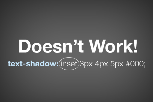
テキスト影のインセット
テキストの内側の影を実装するには、コードに
インセットを追加するだけで
は機能しません。
解決するには、最初に
h1見出しに適用して、暗い背景と明るい影を設定します。
h1 { background-color: #565656; color: transparent; text-shadow: 0px 2px 3px rgba(255,255,255,0.5); }
結果は次のとおりです。

秘密の成分
background-clipを追加し
ます 。これは、テキストを超えるすべてのものをカットします(暗い背景上):
h1 { background-color: #565656; color: transparent; text-shadow: 0px 2px 3px rgba(255,255,255,0.5); -webkit-background-clip: text; -moz-background-clip: text; background-clip: text; }

ほとんど必要なものが判明しました。 ここで、テキストを少し暗く(アルファ)すると、結果は次のようになります。

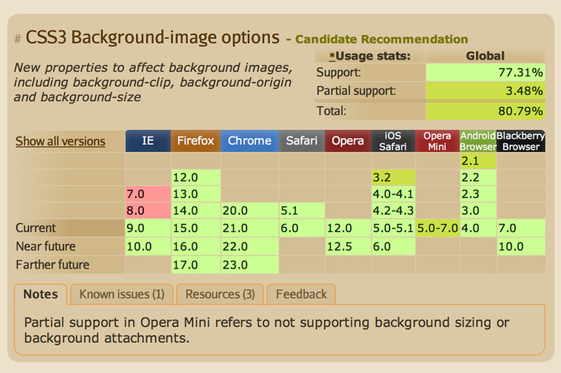
ブラウザのサポート
caniuseのブラウザによるバックグラウンドクリップのサポートを確認してください。