こんにちは 今日、私は自分の小さなプロジェクト、つまりマテリアルデザインのスタイルのHTMLフレームワークについて話すことにしました。 GitHub:
linkからダウンロードできます。 Webkitブラウザーで最適に動作します。 それでは、詳しく見てみましょう。
material.cssとmaterial.jsをドキュメントに接続したら、次のスクリプトをヘッダーに追加します。
function main () { setTheme ("Blue"); setAccentColor("Pink"); }
このコードは、ドキュメントのプライマリカラーとセカンダリカラーを設定します。 あなたはそれが何であるか、そしてどんな配色が利用できるかについて
公式のマニュアルで読むことができ
ます 。
これで、ページに要素を追加する準備ができました。 ライブラリには、マテリアルデザインコンセプトで説明されている基本要素が含まれています。
- 材料カード:
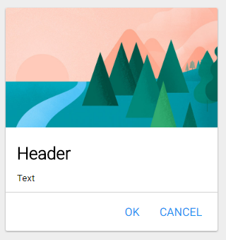
コード:
<div class="mcard" style="position: absolute; width:300px;top:200px;"> <image style="max-width: 100%; position: relative;"> <h2>Header</h2> <p>Text</p> <div class="buttons-container"> <div class="flatbutton"><p>CANCEL</p></div> <div class="flatbutton"><p>OK</p></div> </div> </div>
- 2種類のボタン:通常およびフラット:


コード:
<div class="button ripple-effect"> <p>PRESS</p> </div> <div class="flatbutton ripple-effect" > <p>Flat button</p> </div>
どちらのタイプのボタンも波効果をサポートしています。 正しく動作しない場合は、リップル効果クラスを削除して無効にすることができます。
- スライダー:

<div class="slider" value="50" min="0" max="100" step="1"></div>
div要素には、無効な属性値min、max、stepが割り当てられていることに注意してください。 ただし、ページがロードされると、入力要素が自動的に作成され、これらの属性を受け取るため、エラーは発生しません。
- テキストを入力するためのフィールド:

コード:
<div class ="mtextfield" label="Enter your text here"></div>
- ラジオボタンのフラグとスイッチ:

コード:
<input class="checkbox" type="checkbox" id="raz" ><label for="raz">Check me</label> <input class="checkbox" type="checkbox" id="raz2" ><label for="raz2">Check me</label> <input class="radio" type="radio" name="raz" id="raz3" value="1" checked="" /><label for="raz3">Switch me1</label> <input class="radio" type="radio" name="raz" id="raz4" value="2" /><label for="raz4">Switch me2</label> <input class="switch" type="checkbox" id="switch1" value="2"/><label for="switch1">Switch me 3</label> <input class="switch" type="checkbox" id="switch2" value="2"/><label for="switch2">Switch me 4</label>
ここでは要素の一部のみを紹介し、残りはこのデモで見つけることができます:
link 。 このフレームワークに興味がある人は、他の利用可能な要素とライブラリの追加機能について別の記事を書きます。
PSフレームワークを書くとき、私はサイトの資料を使用しました:
→
WebReference.ru→
最新のJavaScriptチュートリアル→
材料設計ガイドライン